check out over 200+
Page 6 - Blog
-
- May 12, 2026 64
Retail store design is not merely about aesthetics; it is a strategic tool that shapes customer experience, drives foot traffic, and maximizes product visibility and sales. As a customized commercial furniture factory, our role goes beyond manufacturing fixture furniture; we partner with retailers to deliver complete store design solutions that are tailored to their brand, products, and target audience...
-
- May 12, 2026 64
The design of this store is entirely in line with the positioning of "Chocolat du Jour" (Daily Chocolate). It does not follow the luxurious route that makes people feel intimidated and reluctant to enter, but instead aims to make high-quality chocolate become a small but delightful surprise in everyone's daily life.
Therefore, the entire space conveys a feeling: "Buying chocolate is not a troublesome...
-
- May 12, 2026 99
As a specialized factory with years of experience manufacturing custom commercial furniture for retail spaces, we've supported numerous home appliance store projects from concept to completion. If you're planning to open a home appliance store but are unsure how to get started, feel free to ask us. Simply provide us with your concept, and we'll assist you through the entire project. Here are some steps...
-
- May 11, 2026 58
The first morning light creeps through the floor-to-ceiling glass, soft and golden, hitting the warm orange curved cabinets just right—they glow like something you’d want to reach out and touch. The air’s all mixed up with coffee’s rich aroma and the fresh, yeasty scent of just-baked bread, It’s not just a bakery; it’s this little corner where you can slow down, taste something good, and actually feel...
-
- May 11, 2026 64
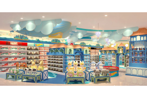
Walk through any shopping mall, and it’s hard to pass up a lovely candy shop. The warm, sweet atmosphere always draws people in right away. The Candy Dream store is exactly such a charming spot—it turns the romantic idea of a candy-themed wonderland into a real, walk-in space. Today we’d like to share how tailored furniture design helps a candy shop win instant popularity among visitors.
Design for...
-
- May 09, 2026 63
Walk into this coffee store, and the first thing you notice isn’t the coffee smell—it’s the light. Not the harsh, flickering kind that makes your eyes tired, but these honeycomb-shaped LED panels strung across the ceiling, casting a soft, futuristic glow that feels like being wrapped in warm city neon, but way cozier. The walls are deep navy, with crisp paneling and those long, thin wall sconces that...
-
- May 09, 2026 72
When we first started daydreaming about this space, opening just another jewelry store was never the goal. What we really wanted was a little quiet haven—somewhere you could slow down, take a deep breath, and actually connect with the pieces that might one day become part of your own story. No rush, no pretense, just you and something beautiful.
Light & Jewel Serenity
Walk through the door, and the...
-
- May 09, 2026 70
Many people assume that a "high-end restaurant" means spending money on marble and installing ostentatious crystal chandeliers. However, this design completely breaks this stereotype - the design of LEVEL 9 Restaurant does not have dazzling glossy stones or overly aggressive elements of Internet celebrities. Instead, from the moment the door is pushed open, one can sense a relaxed yet restrained sense...
-
- May 08, 2026 86
When it comes to creating retail Spaces with marble and gold, many people's first reaction is, "Wouldn't it be too rustic?" "Too much like a hotel?" But the design of this boutique that I recently followed up on has directly broken my stereotypical impression of this kind of combination - it strikes the right balance between light luxury, being high-end yet not ostentatious, practical yet enduring...
-
- May 07, 2026 79
The core of this shoe store lies in its theme style. It mainly features soft and misty pink, not the eye-catching "death Barbie pink", but a light pink with a hint of gray. It's like crushing cherry blossom pink and gently spreading it throughout the space, looking particularly gentle and not cheap at all. It doesn't just rely on pink to make a big splash; it also pairs several auxiliary colors, creating...
-
- April 30, 2026 51When you walk into a jewelry store, what’s the first thing that really sticks with you? Is it the diamonds in the window, shining so bright they catch your eye right away? Or the gold jewelry lined up neatly in the cases? Truth is, most of the time, it’s the store’s vibe that does the talking—quietly letting customers know what the brand’s all about, its taste, its style, and how much it cares about...
-
- April 30, 2026 77
The moment I clicked on the picture, I was immediately caught by this gentle red bean paste powder. Unlike the common "Death Barbie pink" on the market, the main color of this store is a nude pink with a hint of gray. Its low-saturation texture is like melted strawberry milk, sweet yet restrained and gentle. The large area of pink covers the display cabinets, bar counter and walls, yet it is not at...
-
- April 29, 2026 83
The overall main color of this mobile phone store is pure white, almost covering the walls, floors, ceilings and most of the cabinets. This large area of white first gives people a clean and refreshing feeling, which is perfectly in line with the "simplicity and purity" tone pursued by digital products. The wall is not a monotonous plain white but features a three-dimensional diamond-shaped relief...
-
- April 29, 2026 82
I have visited many optical stores in Dubai before. They were either chain brands in shopping malls, with uniform pale lighting and cold metal shelves, just like being in a hospital's optometry room. Either it's a small street-side store, with goods piled up so densely that it's hard to even turn around. It takes a long time to find a pair of glasses. There are also some popular online stores that...
-
- April 29, 2026 62The value of jewelry lies not only in the gemstones themselves—the sparkle of diamonds, the depth of colored stones, the warmth of precious metals—but also in the context in which they are seen, perceived, and treasured. A good jewelry store design is never just a cold, functional display shelf, but a thoughtfully crafted "stage" tailor-made for the jewelry: a space where soft light dances on facets...
-
- April 29, 2026 53
In the offline flagship stores of this renowned Danish premium candy brand, we witness the ultimate and refined expression of the timeless Nordic design philosophy of "less is more". Every corner of the retail space is carefully curated, blending minimalist furniture layouts, artistic display structures and soft ambient details in perfect harmony. It fully demonstrates how sophisticated physical retail...
-
- April 28, 2026 76
Many people's impression of optical stores still remains on "functionality first" : they first plan the optometry room, the eyewear fitting area, and the inventory room, and then just place the white cabinets purchased uniformly in the remaining space, and that's it. When a customer goes in and wants to find a certain brand of glasses, they have to flip through the labels one by one. They get tired...
-
- April 27, 2026 41
As the first rays of morning sunlight stream through the high windows, softly illuminating the light-wood bar, muted gray walls, and freshly baked fluffy bread filling the air, this cozy bakery tucked away in the quiet corner of the city begins its gentle yet vibrant day. Supporting this warm and relaxing atmosphere are the carefully custom-designed furniture pieces throughout the space; every refined...
-
- April 24, 2026 91
The countertop of the bakery bar of "Warm Luxury" is a warm off-white marble with a faint light grey texture. It doesn't feel that icy cold white, but rather a soft temperature as if it had been baked by warm light. The counter is neatly arranged with a cash register, a coffee machine and a small bread tray, not at all messy. The most wonderful part is the facade of the bar counter, which uses deep...
-
- April 23, 2026 54
Pushing open this warm-toned door in the shopping mall, like a piece of butter cookie softened by the sunlight, gently catches all the hurried footsteps. The entire space is dominated by cream white and warm brown, like a cup of hot latte sprinkled with cinnamon powder, soft and healing. The brand logo with sharp metal lines outlines the gentle shape, and the slogan quietly announces the romantic persistence...

Recent Posts