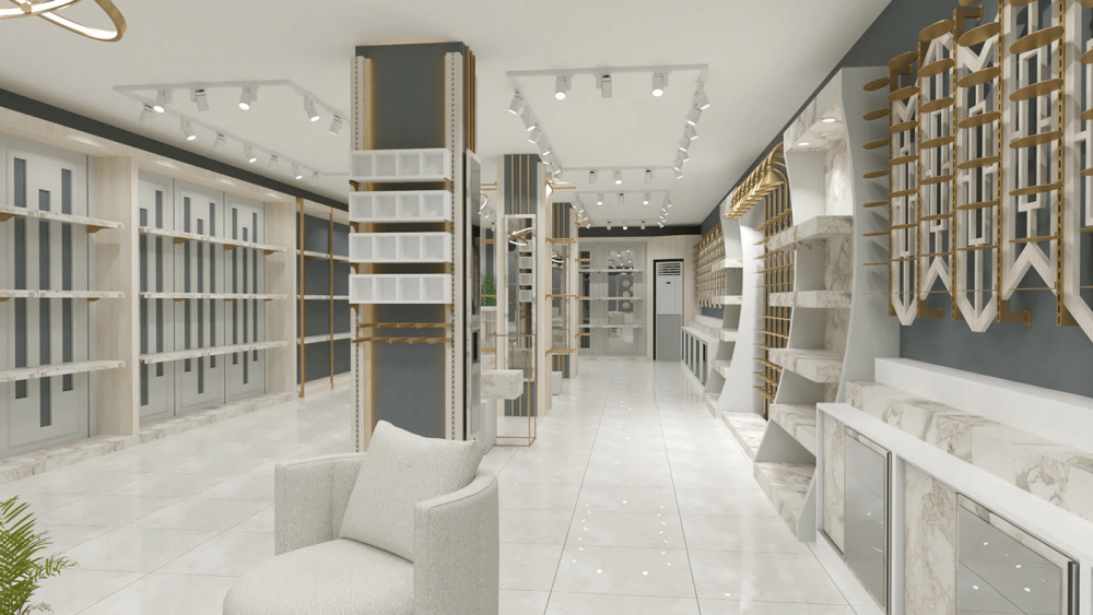
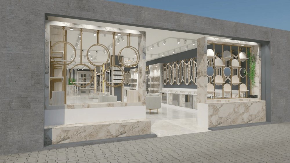
When it comes to creating retail Spaces with marble and gold, many people's first reaction is, "Wouldn't it be too rustic?" "Too much like a hotel?" But the design of this boutique that I recently followed up on has directly broken my stereotypical impression of this kind of combination - it strikes the right balance between light luxury, being high-end yet not ostentatious, practical yet enduring. Today, let's take a good look at the little tricks in this design.
How to use marble and gold without looking outdated?
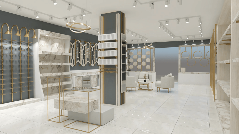
First, let's talk about the color tone. The base of the entire space is a low-saturation three-color combination: the floor and soft packaging in cream white, the walls in high-grade gray, and the light beige marble with natural texture. Matte light gold is used as an accent. There are no dazzling bright colors or dull dark colors. The overall effect is soft and clean. Just like dressing up, a basic white and grey base is used, and then a small golden accessory is added to brighten it up. It's neither monotonous nor ostentatious.
Then there is the collision of materials. The marble is not a smooth solid color plate, but a natural texture with light gray. Each piece has a different pattern, naturally exuding a casual sense of luxury, which just neutralizes the coldness and hardness of the metal. The gold color is not the kind of mirror-like bright gold, but rather a matte light gold that is not eye-catching. It only shows up in the details - such as the crossbars of the display stands, the frames of the cabinets, and the lines of the lamps. It is like the finishing touch, not overshadowing the main elements. The addition of the cream-colored velvet sofa in the middle rest area, with its soft texture, balances the coldness and hardness of the marble and metal. The entire space does not appear cold and impersonal; instead, it exudes a comfortable and high-end feel. Customers do not feel distant when they come in and are willing to stay a little longer.
Every display cabinet is tailor-made for retail
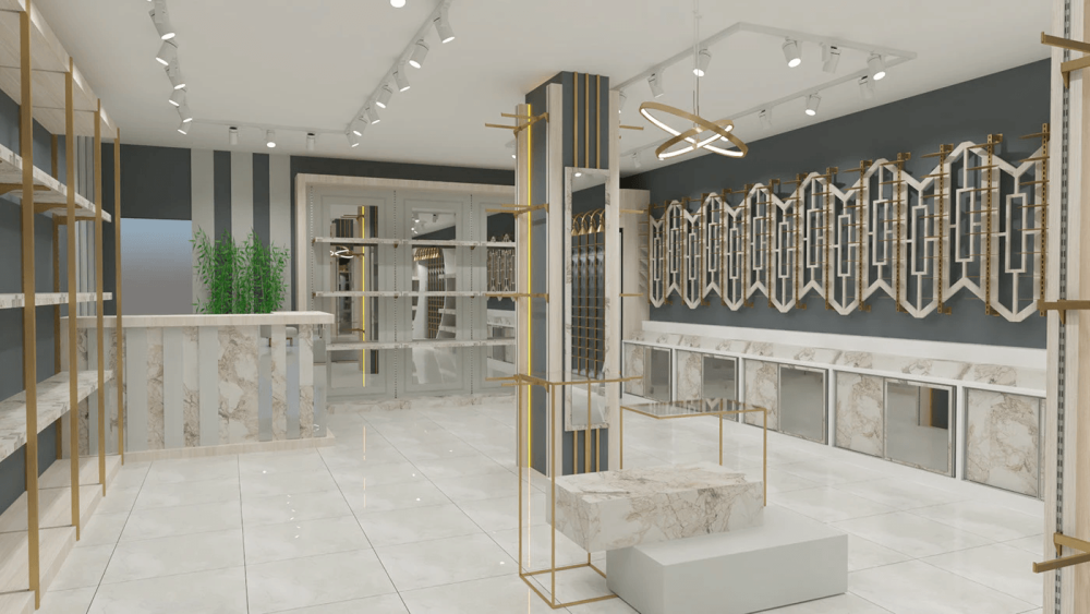
- 1. Main background wall
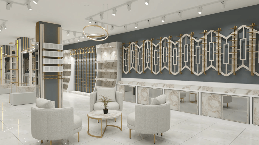
The background walls of many boutiques are either simply painted or decorated with a row of ordinary shelves, which makes them look monotonous and cheap. However, in this design, the main background wall directly turns the display stand into an entire wall of installation art. Look, on the dark grey wall, there are continuous white frames similar to the deformation of Chinese meandering patterns, with golden horizontal bars interspersed in the middle. The entire shape flows seamlessly without any breaks. The benefits of this design are too obvious:
- First, it is not like ordinary shelves, which are lined up in rows and cut the wall into pieces. The integrity of the entire space is immediately highlighted. Even if no goods are placed on it, this wall itself is a visual focus.
- Secondly, practicality is not compromised at all. The golden crossbars can be used to hang accessories, bags or clothes, and the white frame can also be combined with shelves to place ornaments or boxed goods, offering a very flexible display method.
- Thirdly, it has a built-in check-in attribute. Many customers will notice this wall at first sight when they come in and can't help but take pictures and post them on social media. In this way, the store is promoted for free without being noticed.
Moreover, the low cabinet below is also very ingenious: the cabinet door is a marble-textured panel with a mirror embedded in the middle. It can not only reflect the goods, making the display look more rich, but also the extension effect of the mirror makes the entire space appear larger than it actually is. The cabinet door can still hold inventory, solving the problem of difficult storage in small stores. It really strikes a balance between appearance and practicality.
- 2. Transform the load-bearing columns into display columns
Many load-bearing columns in retail stores are a "nuisance". They block the view, take up space and look very out of place when wrapped up. However, in this design, the columns are directly made into multi-functional display nodes, without wasting any space at all. For instance, these several columns in the middle have an open display stand with white checkered shelves on one side, which is suitable for placing small items. On the other side is the hanging area with golden hanging rods and warm yellow light strips embedded in it. When the lights are turned on at night, it creates a particularly atmospheric atmosphere. A full-length mirror is also embedded in the pillar. After trying on clothes, customers can directly look in the mirror here without having to go to a dedicated fitting room, which is particularly convenient.
- 3.Creative display stand in the window
For a boutique, the display window is the first business card. Whether it can attract passers-by to come in depends entirely on whether the display window can touch people's hearts. The window display in this design completely breaks away from the traditional pattern of glass window displays.
The frame of the display window is made of the same marble as that inside the store, and the texture immediately sets it apart from ordinary shops. The display stands inside are also very creative. On one side, there is a round golden hanging rack, and on the other side, there is a decorative wall with light wood-colored round pieces. The shape is both dynamic and high-end. Even if not too many goods are placed on it, it can still be remembered at a glance. Moreover, these display stands are also very practical. The round hanging racks can be used to hang bags or accessories, and the round shelves can hold small ornaments. The display methods are very flexible and can be adjusted at any time according to new products.
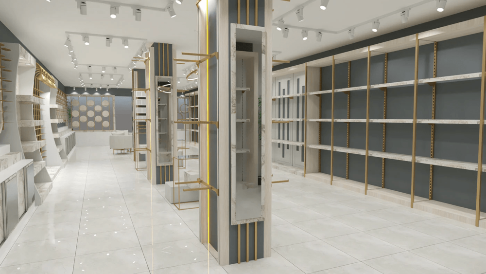
- 4. Side wall open shelves
Many people make such long shelves either too densely packed, making them look very crowded. Either it is done too sparsely and wastes space. However, in this design, the height of the shelves is adjustable, and there are holes on the brackets. If you want to place stacked clothes, just lower the shelves. If you want to place a higher box, just raise the shelves. It can be adjusted completely according to the size of the goods, which is very flexible. Moreover, light-colored shelves do not steal the spotlight from the goods. Even if they are filled with items, they do not appear messy but instead give off a sense of neatness and sophistication.
- 5. Central Island Marble exhibition stand
In the middle of the store, there are several two-story island display stands. The bases are white, the countertops are made of marble with natural textures, and they are covered with golden frames. The design is simple yet grand. The height of this kind of exhibition stand is just right. Customers can clearly see the products without bending over. It is particularly suitable for displaying the main promotion items or new products. As soon as they enter the store, they can see them, which can easily catch the customers' attention. Moreover, the marble countertop is very durable, not afraid of scratches, and not easy to get dirty. It is very convenient to maintain. For retail stores, it is really both beautiful and worry-free.
Atmosphere and circulation
First of all, for the floor, large-sized glossy white tiles are used, which have a very good reflective effect. They can not only reflect the ceiling lights, making the entire space brighter, but also reflect the display stands and goods, making the display look more rich. Moreover, the glossy tiles also make the space appear larger. Even for a small store, it won't feel oppressive.
Then there is the lighting. Track lights are used, with a warm white light color temperature. The focus is on the products and display stands. There are no dazzling main lights or dim blind spots. Every product can be illuminated, allowing customers to clearly see the details of the products without feeling dazzled. The circular chandelier on the ceiling, with its golden lines echoing the golden color of the display stands, does not make the ceiling seem empty. When the lights are turned on at night, the atmosphere of the entire store immediately becomes lively.
There is also a rest area in the middle, with a cream-colored sofa and a small marble coffee table, and golden stands, which are completely in harmony with the overall style. Many people think that boutiques don't need rest areas, but that's not the case. When customers get tired from shopping and have a place to sit down and rest, they are willing to stay a little longer. The longer they stay, the higher the transaction rate will naturally be. Moreover, this rest area has also become a social space. Customers can chat with friends here and take a look at the products at the same time. The experience is immediately enhanced.