Many people's impression of optical stores still remains on "functionality first" : they first plan the optometry room, the eyewear fitting area, and the inventory room, and then just place the white cabinets purchased uniformly in the remaining space, and that's it. When a customer goes in and wants to find a certain brand of glasses, they have to flip through the labels one by one. They get tired after just 10 minutes of browsing, let alone remembering the features of this store.
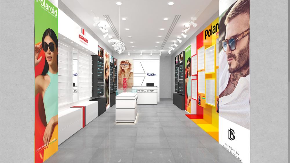
- It doesn't use large areas of light colors to "pretend to be professional", but instead uses the brand's signature high-saturation color blocks for zoning: on the right is Polaroid's red, yellow and orange gradient wall, and on the left is Carrera's red, white and black contrasting color area. Even the air exudes a lively and neat contrast.
- It doesn't mix all the glasses together either. Instead, it has created a dedicated display space for each brand. You don't need to look at the logo; just by the color and the style of the cabinet, you can tell which area belongs to which brand.
- Even better, it doesn't sacrifice the sense of design for the sake of "professionalism". The spherical decorative lights on the ceiling, the staggered wall cabinets, and the floor lines with a gradient - every detail is saying, "I'm different from others."
Color blocking is not a random play
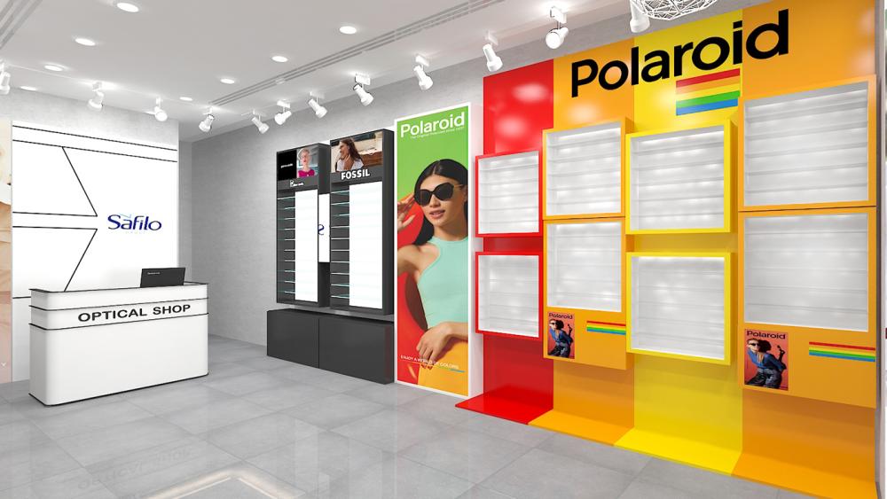
- The Polaroid area on the right
What is the brand tone of Polaroid? It is retro, lively and full of color, just like its rainbow logo. So the design of this area has directly maximized the brand's color genes:
The wall features a gradient from red to yellow and then to orange, transitioning from dark to light, like the color of a sunset, naturally creating a warm and lively atmosphere. The frame of the wall cabinet is also in red, yellow and orange, echoing the gradient of the wall. Even the small decorative paintings inside the cabinet are Polaroid's signature rainbow elements. The advantages of this design are too obvious: as soon as customers see the red and yellow color scheme, they know this is Polaroid's area. There's no need to look for the logo; the brand's memory points are directly maximized. Moreover, highly saturated colors are inherently attractive, and passers-by can't help but take a second look. This is something that traditional white-wall stores can't compare with.
- The Carrera district on the left
In stark contrast to Polaroid's lively style, Carrera's brand tone is neat, cool and sporty. Therefore, the color scheme of this area also follows a minimalist color-blocking approach
The large area of white and black as the base, combined with the brand's signature red lines and logo, is clean yet powerful. The black high cabinet on the inside contrasts with the white open cabinet on the outside. The red brand logo is dotted in the middle, catching the eye at a glance. This color combination also goes well with Carrera's brand history. After all, the words "EYEWEAR SINCES 1956" paired with the neat black, white and red color perfectly echo the brand's classic and tough style.

It turns out that optical stores can do this
Polaroid wall cabinet
The Polaroid wall cabinet on the right is truly the epitome of the store's overall appearance. It is not the kind of neatly arranged grid cabinet, but uses square frames of different sizes. The borders are in three different colors: red, yellow and orange, and are arranged in a staggered manner on the wall, like a colorful jigsaw puzzle.
- The shelves inside the cabinet are white with embedded soft light strips. The light comes out from the side of the shelves and does not directly reflect on the glasses. Whether it is to look at the details of the frame or to check the effect when trying them on, it is very clear.
- Some frames contain glasses, some have brand posters and decorative paintings, and some have blank Spaces left in the frames to prevent the entire wall from being too full and instead give it a sense of breathing.
- The color of the cabinet's frame perfectly echoes the gradient of the wall, and it also matches the Polaroid model poster and brand logo beside it very well. The entire area is like a dedicated brand pop-up store, with the atmosphere immediately at its peak. It looks great for customers to take photos inside, and it has its own promotional attribute.
Carrera series cabinets
The black high cabinet at the back, with a transparent glass door, has light blue shelves. It is used to display the main products or limited editions, which not only protects the products but also allows you to see the styles inside through the glass. The black cabinet body contrasts strongly with the white brand logo, giving it a very cool look.
Outside is a whole row of white open cabinets. The shelves are tilted and divided into small slots, which can just fit a pair of sunglasses. Customers can reach out and get them without bending over or standing on tiptoe, which is very convenient.
The logo and brand slogan of Carrera are printed on the cabinet body, which perfectly echoes the red, white and black color scheme of the cabinet. Even the lines of the cabinet feet are aligned with the track lights on the ceiling, and the details are done very well. This design not only solves the problems of display and storage but also does not sacrifice the brand's style. It is much more sophisticated than those uniform white cabinets.
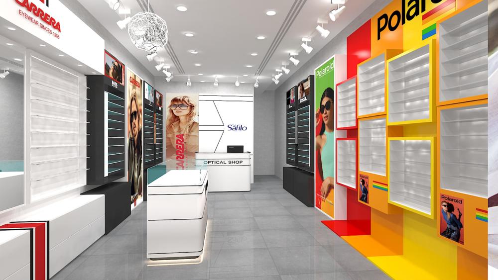
Central island cabinet and reception desk
The central island cabinet is decorated with black lines, echoing the color of the brand cabinets on both sides. The glass countertop is illuminated to display the main or new products. Customers can see them as soon as they enter the door, and it is also convenient for the staff to introduce them.
The reception desk is also white with black lines, inscribed with "OPTICAL SHOP". The Safilo logo wall in the background is designed with simple lines, which is in harmony with the style of the reception desk. It not only highlights the brand but also does not steal the spotlight from the wall cabinets on both sides.
The position of the central island cabinet is precisely in the middle of the two brand areas, serving as a transitional role and also becoming one of the visual centers of the entire space. When customers are browsing the store, their eyes will naturally be drawn to it, which is very ingenious.