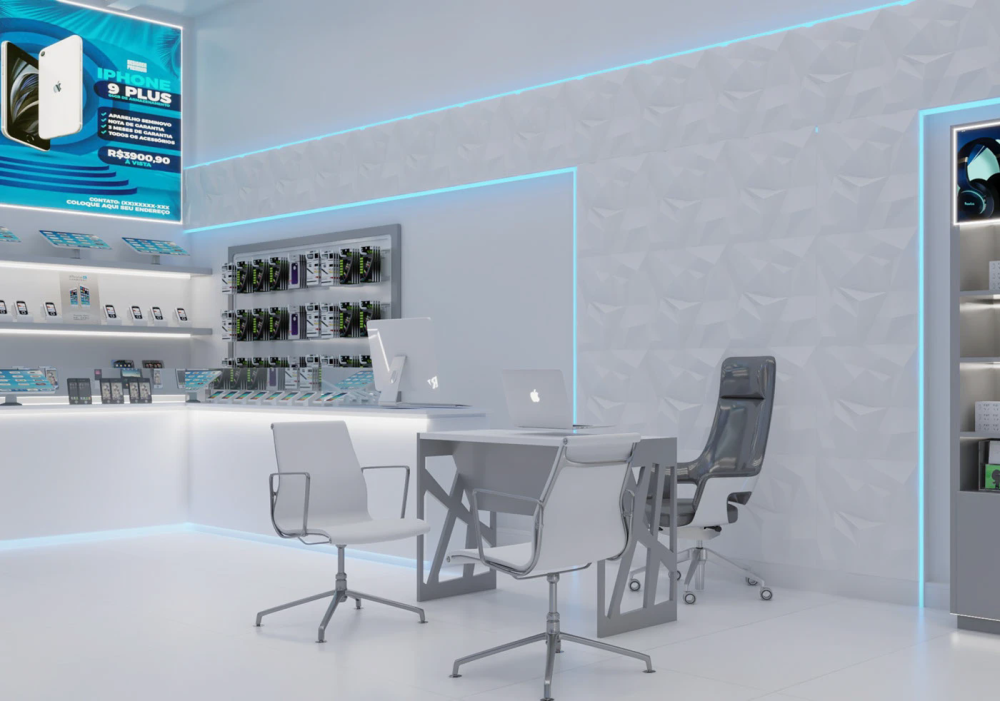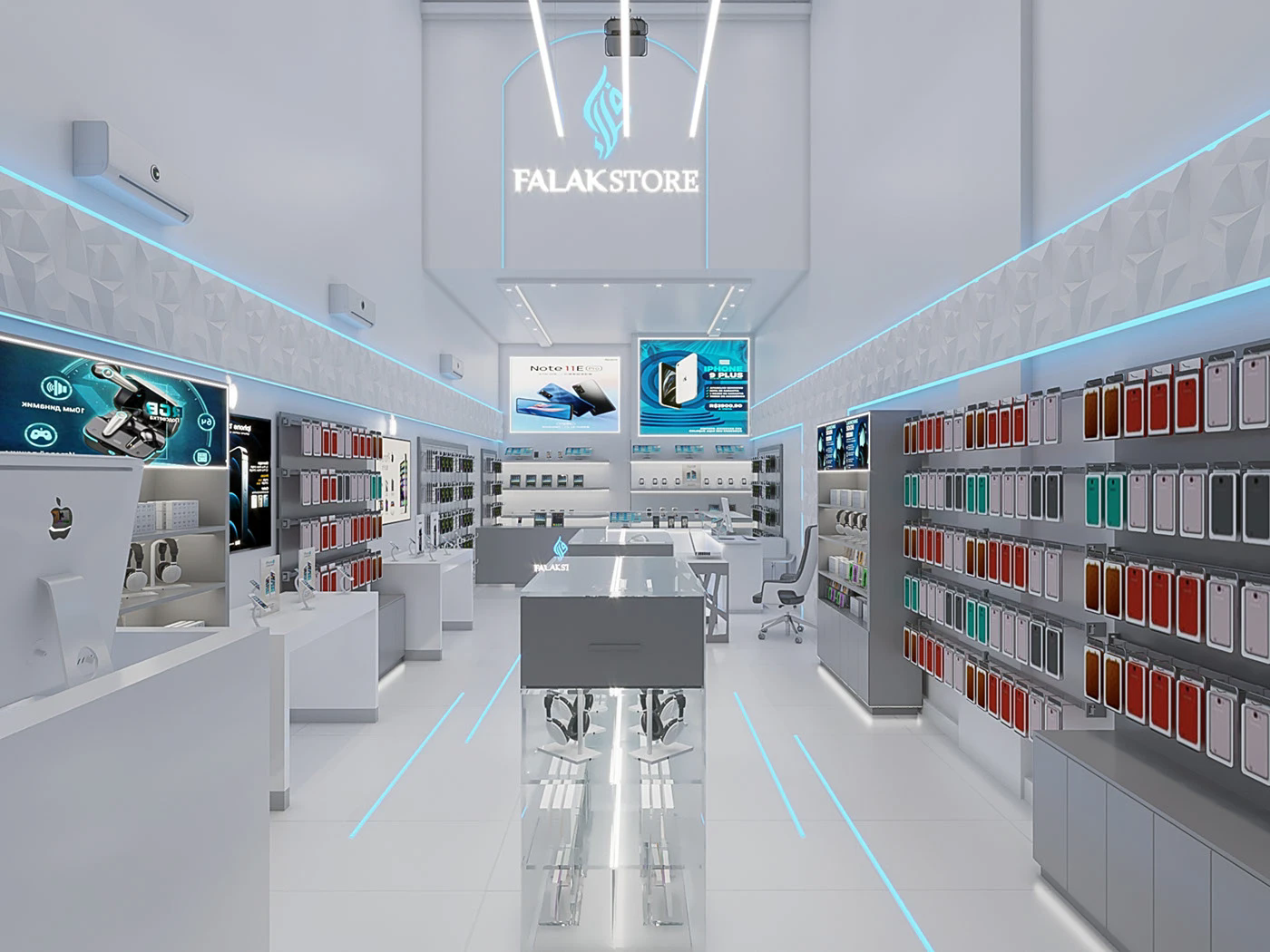
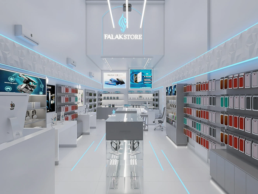
The overall main color of this mobile phone store is pure white, almost covering the walls, floors, ceilings and most of the cabinets. This large area of white first gives people a clean and refreshing feeling, which is perfectly in line with the "simplicity and purity" tone pursued by digital products. The wall is not a monotonous plain white but features a three-dimensional diamond-shaped relief design. From a distance, it appears as a clean white wall, but up close, it has a fine texture and feel. This not only avoids the dullness of large areas of white walls but also does not steal the spotlight from the product. The floor is paved with smooth white tiles, which can reflect the lights from the top and the neon blue lines, making the entire space look brighter and more extended.
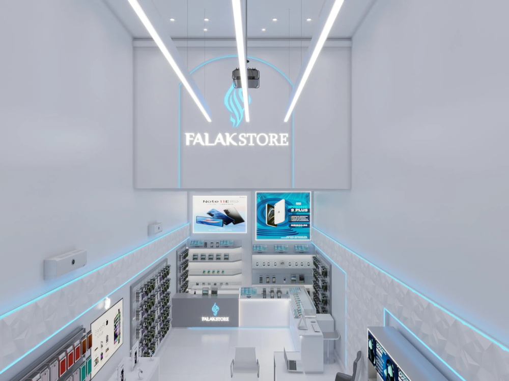
Modern transparent space
Judging from the layout, the circulation design of the entire store is very reasonable. The entrance is a large glass door, which not only allows natural light to come in but also enables passers-by to see the entire interior of the store at a glance. The unobstructed sense of transparency easily attracts customers to come in. After entering the store, the view will not be blocked by the messy shelves. In the middle is a transparent glass display cabinet, and on both sides are wall-hung display areas.
The cash register and the brand logo wall are located in the middle and back positions, while the negotiation area is in the corner on the side. The entire circulation line is a smooth "square shape", allowing customers to walk through all areas without taking a detour and without feeling crowded. Moreover, the store has a very high ceiling, with downlights and long strip lights embedded in the ceiling. Coupled with the natural light from the glass doors, the entire space is not at all oppressive; instead, it gives a sense of openness and comfort. Even after strolling around for a long time, one won't feel tired.
Neon blue light
The most obvious feature is the circle of blue neon lights at the top of the wall, which runs along the edge of the relief on the wall. It is not that highly saturated and dazzling blue, but a light ice blue with a cool tone, like a gentle contour line, instantly elevating the layers of the entire white space. This circle of light strips is not only for decoration but also serves to divide the space, creating a gentle transition between the wall and the ceiling, and giving the originally monotonous white wall a sense of breathing.
In addition to the wall light strips, several blue linear lights are also embedded on the floor, extending from the entrance all the way to the depth of the store. They are like futuristic guiding lines, not only guiding the customers' movement but also adding layers to the floor. Especially when the light dims, these linear lights echo the wall light strips, and the entire space is filled with a strong sense of technology. There are also hidden light strips at the bottom of the counter and display cabinet, which are the same ice blue color. They form a top-down response with the light strips at the top, making the cabinet body not appear bulky but rather giving a sense of lightness as if it were floating.
Moreover, the lighting combination is also very meticulous. The main light uses soft cold white light to evenly illuminate the entire space, ensuring the true color of the product and preventing the phone screen from reflecting light or having color distortion. The neon blue light strips are merely auxiliary light sources, used to create an atmosphere. They neither steal the spotlight from the main lights nor make customers feel dazzled. When shopping in the store, the eyes feel very comfortable. This kind of lighting design with a clear distinction between primary and secondary lights is really much more sophisticated than randomly piling up a bunch of colorful lights.
Display cabinets and displays
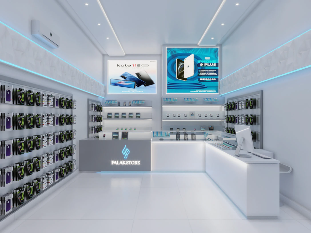
The first is the wall-mounted display area, mainly used to showcase mobile phone cases and small accessories. On the grey back panel, phone cases of different colors such as red, green, white and black are neatly arranged. Each case is fixed with a uniform hook, like a color palette with regular colors. This not only makes it convenient for customers to compare and select, but also creates a sense of visual order due to the arrangement of colors. The back panel is also embedded with soft light strips, ensuring that each phone case is evenly illuminated. The details and texture can be clearly seen, and the light from the light strips is very soft, preventing the color of the case from being distorted.
- Glass display cabinet
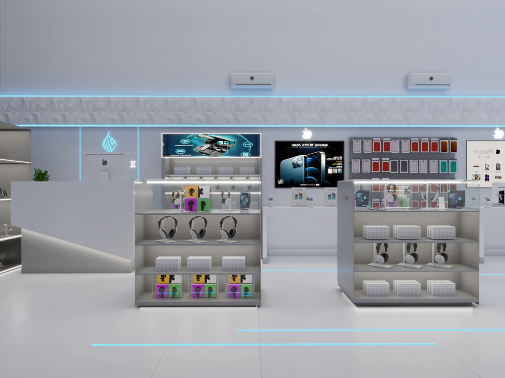
The middle area is a transparent glass display cabinet, which is used to store high-end accessories such as headphones and smartwatches. The fully transparent glass cabinet body, combined with the luminous white shelves, makes the products placed inside look just like exhibits in a museum, exuding an inherent sense of refinement and sophistication. Moreover, the glass cabinet is transparent. Customers can see the products inside from any Angle of the store without being blocked. The lights on the shelves only shine on the products, highlighting the displayed items without looking messy.
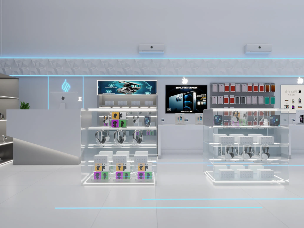
- Middle shelf
The open shelves against the wall are used to store packaging boxes, chargers and other accessories. The white shelves are paired with grey cabinets, which are in harmony with the overall white and grey tone. The products in each compartment are classified and placed neatly and clearly, making it very convenient to find them. There is also the cash register area. The grey countertop is embedded with the illuminated Falak Store brand logo, using ice blue lighting that is consistent with the overall style. It echoes the background light strips, which not only strengthens the brand identity but also does not look out of place. Beside the cash register, there are also computers and sample machines. Customers can experience the products here, and it is also convenient for the staff to handle orders. Both functionality and appearance have been taken into account.
- Negotiation counter
There is also a negotiation area on the side. The white tables and chairs are in harmony with the overall minimalist style. The tabletop is clean and refreshing, without any unnecessary decorations, making it convenient for customers to sit down to consult or experience the products. The metal legs of the chairs also echo the overall cold tone, without looking out of place. Even the seats in the rest area are simple metal chairs, which are in line with the overall style of the store. The sense of unity in the details is really a plus.
Without spoiling the style
Many mobile phone stores' advertising light boxes are made to be large and bright, directly ruining the overall style of the store. However, the design of the light box in this store is also very restrained. The large light box on the wall uses a background in the same color series as neon blue, displaying the model and price of the new mobile phone. It not only serves a promotional purpose but also blends perfectly with the overall color tone without looking out of place. The light from the light box is also soft and not dazzling. Instead, it becomes a visual focus in the space, guiding the customers' gaze.
There are also sample machines in the experience area, neatly placed on the white experience table. Each sample machine has its own independent position, making it convenient for customers to get hands-on experience. The lighting at the experience desk is also very soft and does not affect the viewing effect of the mobile phone screen. There is also a display of accessories beside it, allowing customers to directly match and choose. Even on the glass door at the entrance of the store, there are no messy posters pasted. Only clean glass is retained, allowing natural light to fully shine in and enabling passers-by to immediately see the overall style of the store. This "less is more" design concept is really suitable for digital stores.