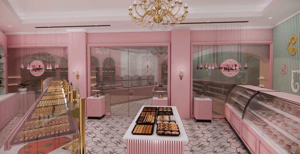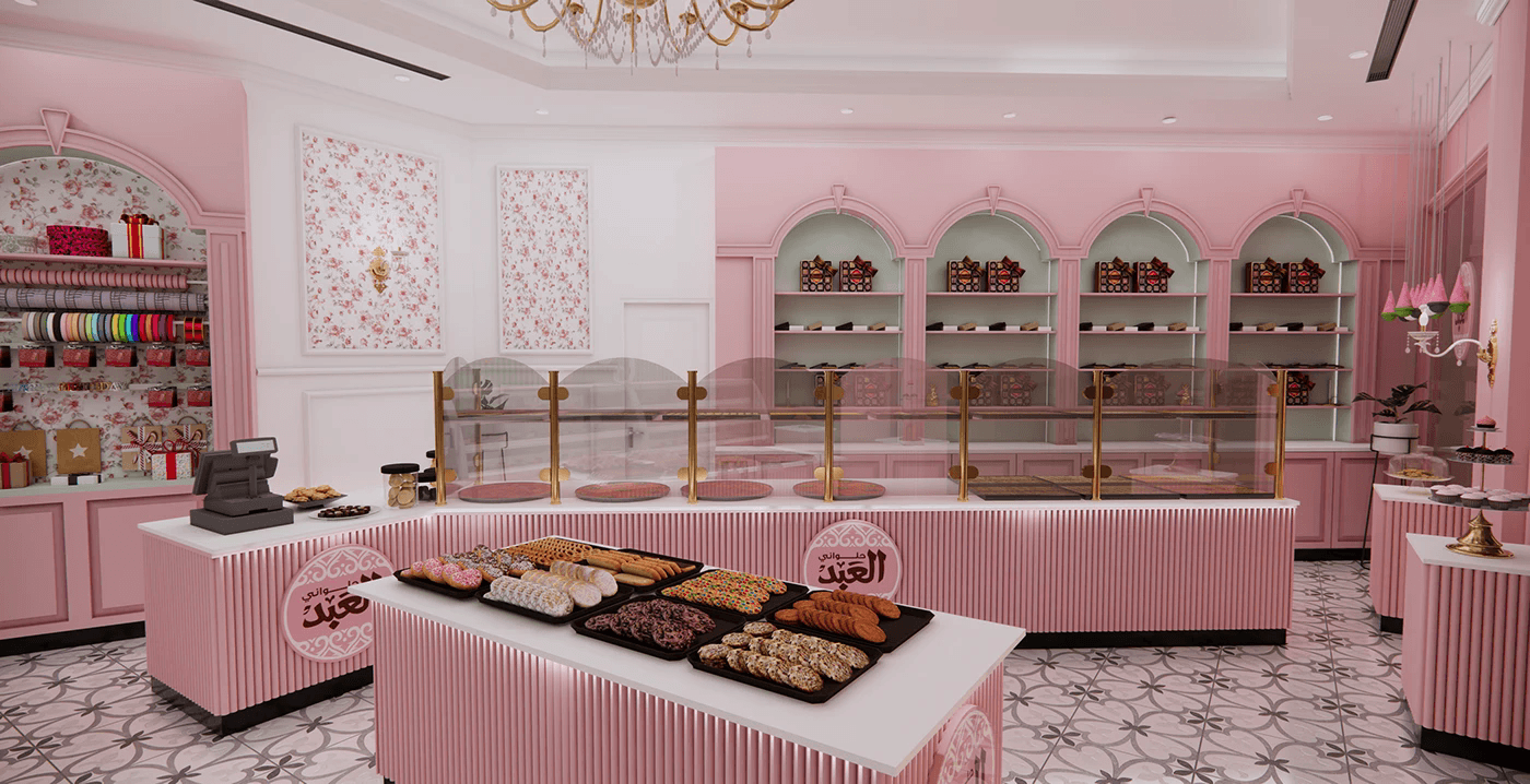
The moment I clicked on the picture, I was immediately caught by this gentle red bean paste powder. Unlike the common "Death Barbie pink" on the market, the main color of this store is a nude pink with a hint of gray. Its low-saturation texture is like melted strawberry milk, sweet yet restrained and gentle. The large area of pink covers the display cabinets, bar counter and walls, yet it is not at all greasy. The secret lies in the designer's use of mint green and white to balance it out. The mint green vertical striped wall on the left is like a soda with a spoonful of lime added. The refreshing green immediately breaks the sweetness of the pink and adds a few more layers to the space. Paired with the white ceiling and the vintage floral tiles on the floor, the color combination of the entire space is like a carefully matched macaron, gentle and harmonious.
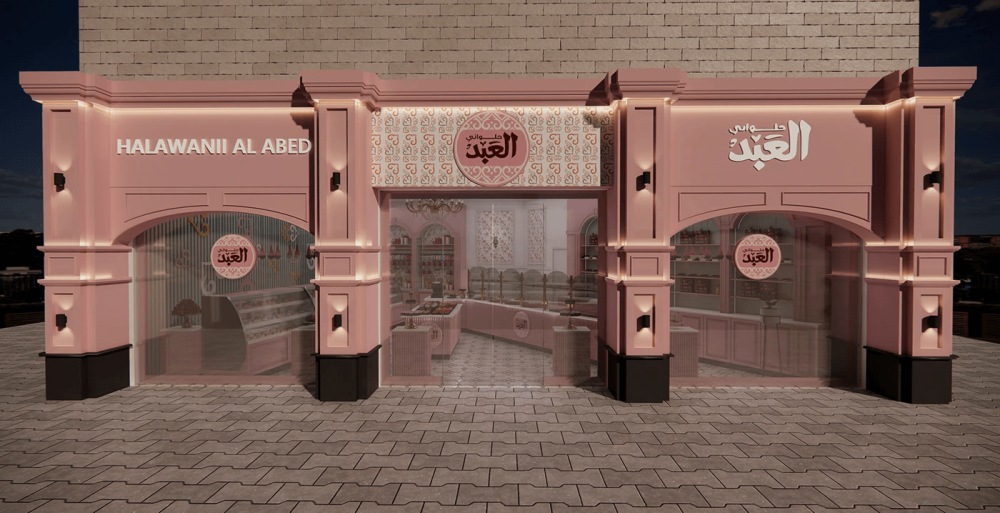
How can I use pink without looking out of place?
Main color: Low-saturation red bean paste pink: It is widely used on the cabinet body, bar counter and exterior facade. This pink with a hint of gray tone naturally exudes a sense of luxury and does not appear cheap. Instead, it is as gentle as cream. Whether it is day or night, the light it casts is very soft.
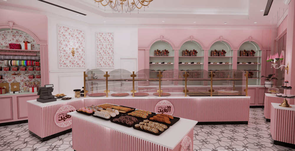
Contrasting color: Mint green vertical striped wall: As the main color of the background wall, the refreshing feeling of mint green just balances the sweetness of pink. The vertical striped design can also visually elongate the space, making the entire store look more spacious. The heart-shaped decorations on the wall also use pink, white and gold that echo the overall color scheme. The lines are smooth and have a touch of the delicacy of Arab patterns. They are not childish cartoon hearts but instead add a touch of vitality to the wall.
Accent colors: Champagne gold + White: Gold is used on chandeliers, the stands of display cabinets and the borders of logos. It is not the dazzling bright gold but a warm champagne gold that exudes a retro and luxurious charm. When paired with pink, it's like giving the dessert shop a gentle glow. White is used as the base color for the ceiling, walls and some countertops, making the entire space brighter and more transparent, and also neutralizing the heaviness of large areas of color.
Neutral color: Retro patterned tiles: The black, white and grey patterned tiles on the floor are truly the finishing touch! The pattern is symmetrical and in a retro European style, with a touch of Moroccan charm. It is both retro and timeless, instantly suppressing the sweetness of pink and adding a touch of steady texture to the entire space, preventing it from appearing light and airy.
Dessert shop layout design
- Island counter Station
As soon as I pushed open the door, the first thing I saw was the central island counter in the middle. On the white countertop were black trays, and cookies and pastries of various colors were neatly lined up. The warm light shone down, and each pastry was saying, "Come and eat me," immediately stimulating my appetite. This central island is the visual center of the entire space. No matter from which Angle you enter, you will be attracted by it first and naturally want to go in.
Then the flow of traffic became very smooth: On the left side of the central island, there was a whole row of curved glass cold storage cabinets. The pink cabinets were paired with transparent glass, and inside, various exquisite small cakes were placed layer by layer. The light shone from the top of the cabinets, and the cream and fruits on the cakes were all glittering. It was impossible to move on the road when passing by. On the right side of the central island, there is an L-shaped glass display cabinet with a golden arc-shaped stand and a transparent glass cover. Inside, there are large pieces of Middle Eastern desserts like nut honey cakes. It not only prevents dust but also allows you to clearly see the texture of each dessert. The golden stand perfectly echoes the overall sense of luxury.
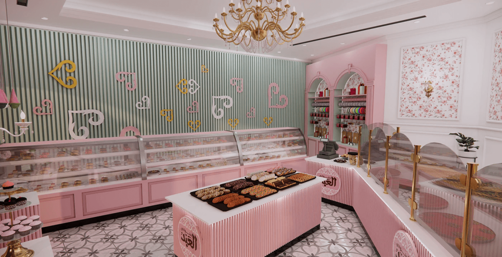
Further inside, in the arched niches of the background wall, there are various packaged gift boxes, red, striped, and gold. The colors are rich yet not messy, making them suitable for both personal consumption and as gifts. The cashier counter is right next to the central island counter, which is convenient for checking out and does not block the way to the store. The entire layout does not waste any space. Each area has its own appeal, making you unable to resist strolling around slowly. Before you know it, you have taken a look at all the desserts.
Display cabinet to bar counter
Curved glass freezer: The entire row of freezers on the left really hit the mark for me! The pink cabinet features delicate lines. The curved glass has no sharp edges, being gentle and safe. The transparent glass allows you to see every dessert inside without any hindrance. The layered design is also very reasonable. The cake is placed on the lower layer and small pastries on the upper layer. The light is warm white, which won't discolor the desserts. Instead, it makes the cream on the cake look fluffier and the fruits brighter.
L-shaped glass display cabinet: The display cabinet on the right has a golden arc-shaped bracket that is really amazing! The matte champagne gold, with smooth and exquisite lines, is paired with a transparent curved glass cover, making the dessert inside look like a work of art. This semi-open design not only prevents dust but also makes it convenient for staff to access, and does not make customers feel distant. The pink color of the cabinet is also in harmony with the overall look. The vertical stripe texture makes the cabinet look more textured and not monotonous.
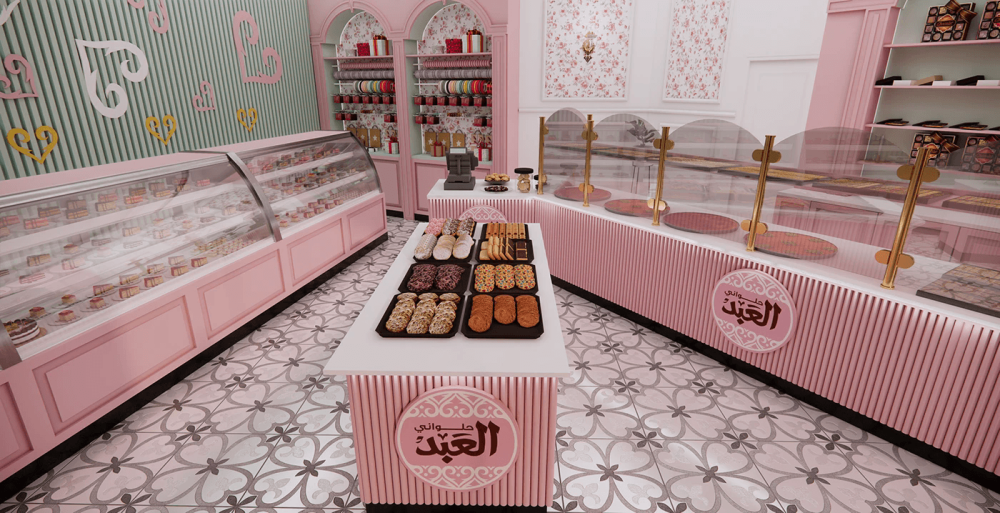
Island: The island in the middle is my favorite part! The white countertop is clean and refreshing. When a black tray is placed on it, the color of the dessert immediately stands out and is particularly eye-catching. The cabinet body features a pink vertical grille design with a touch of texture. There is also the brand's circular logo on the front, with exquisite patterns and an exotic charm, perfectly echoing the overall style. Whether it's for displaying samples or new products, this central island counter can become the focus of the store. Customers will be attracted by it as soon as they come in.
Arched niche wall cabinet: The arched niche on the background wall is really so French! The pink arched border, the mint green background, and the packaged gift boxes placed inside, the color combination is lively yet not messy. The arched design echoes the arches on the facade and is in harmony with the overall retro style, like a dessert treasure hidden in the wall, making people unable to resist taking a second look. The open shelves on the right are also very considerate. The uneven shelves hold various gift boxes, making it convenient for customers to choose and keeping the entire wall from looking empty.