If you pay attention to beauty retail design lately, you’ve probably noticed that store interiors are changing faster than ever. Few years ago, it was common to see heavy cabinetry, bold color combinations, layered decorative panels, and elaborate statement displays in makeup stores and mall counters. The idea was simple: the more eye-catching the space, the better it would perform. But today, that approach feels dated. Bulky fixtures can make a store feel cramped, push costs higher, and distract customers from the products themselves. What’s replacing it is quieter, more practical, and easier to live with: lightweight, minimalist beauty counters.
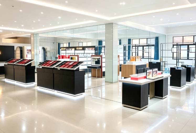
Why Minimalism Is Winning in Beauty Retail
All these showcase and counter in beauty store toward lighter, simpler counters isn’t just about looking more attractive. It’s about how people actually shop now. Modern customers tend to respond better to calm, uncluttered spaces. When a store is covered in bright branding, flashy graphics, and heavy displays, it can feel overwhelming—especially in smaller retail space. Minimalist fixtures solve that by clearing the visual noise and letting the makeup, skincare, and testers take center stage.
That matters because beauty retail is still a hands-on experience. People want to swatch shades, compare textures, test lighting, and move through the store without feeling boxed in. A lighter, more open layout supports that behavior naturally. It also makes the store more suitable for social sharing, since the background stays simple while the products remain the main focus.
For store owners, the appeal is practical too. Simpler fixtures are often faster to install, easier to reconfigure, and less expensive to maintain than highly customized statement builds. That combination of shopper experience and operational flexibility is why minimalism has moved from “nice style” to “default retail logic.”
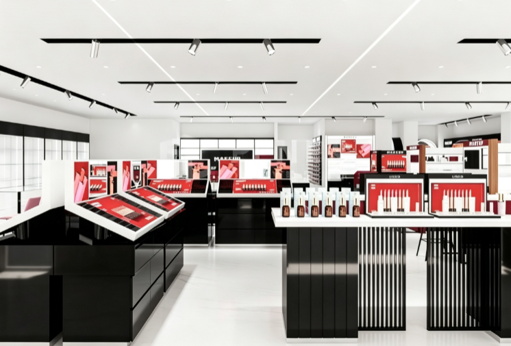
What the Most Popular 2026 Counter Designs Actually Look Like
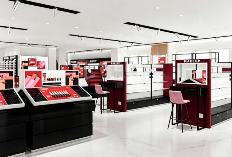
From what we’ve seen at recent trade shows and newly finished store projects, the minimalist trend in beauty counters isn’t about being cold or empty. It’s about removing what doesn’t need to be there. The strongest designs stick to a tight palette: cream white, soft oat, matte gray, and subtle warm neutrals. Instead of piling on colors and shapes, they rely on material differences to create hierarchy—matte metal frames, smooth laminated surfaces, fine wood-grain panels, and clean glass details. The result feels intentional without being loud.
Lightweight construction is another defining feature. Many of the newer counters use thinner profiles, open shelving, suspended elements, and modular components instead of solid heavy backs and oversized end panels. The goal is the same: reduce visual weight while keeping the display functional. This is one reason the style works across different retail formats. It can be scaled up for a larger flagship counter, adjusted for a smaller boutique, or reconfigured for a temporary pop-up.
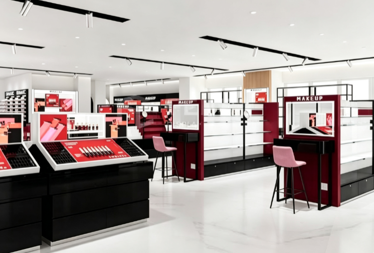
Practical Sturctural
A common misunderstanding is that minimalist means flimsy or oversimplified. In reality, the best lightweight counters are engineered to handle daily retail use. The key difference from older designs is smarter construction. Heavy fixed panels are being replaced with lighter framing, adjustable shelves, slim glass inserts, and modular sections that can be rearranged as the product mix changes. That’s a real advantage in beauty, where launches, seasonal promotions, and category resets happen frequently.
For example, a store might use one section for lipstick bestsellers, another for skincare serums, and a separate area for testers. If demand shifts, the fixtures can adapt without a full remodel. That kind of flexibility matters more today because retail spaces need to respond faster to customer behavior.
There’s also a logistics benefit, especially for cross-border purchasing. Lighter modular fixtures take up less shipping volume, are easier to handle on site, and are often simpler to install. For suppliers and store owners, that can translate into lower transport costs, faster turnaround times, and fewer delivery issues.
Lighting and Details Are Doing More of the Work
In a minimalist space, details can’t be an afterthought. They have to carry the design. Lighting is one of the clearest examples. Instead of adding decorative light fixtures as a separate feature, many new counters integrate lighting directly into the structure. Hidden LED strips under shelves, slim edge lighting around glass panels, and soft illumination above tester areas create a cleaner look while still making products visible.
For beauty products, that’s important. Customers need to see color accurately, especially for lipsticks, foundations, and eyeshadows. Poor lighting can distort shades and create doubt, while even, well-placed light builds confidence during testing.
Other details are getting simpler too. Handleless cabinet doors, clean countertops, flush joints, and minimal brand signage reduce clutter. Rather than large overhead graphics or bulky backlit panels, many stores are using small metal logos, narrow light strips, and restrained graphic accents to communicate the brand without overpowering the space. This approach also makes maintenance easier. Flat surfaces and fewer decorative crevices mean faster cleaning and less time fixing worn details.
The Business Case for Lightweight Minimalist Counters
Beauty retail design is increasingly judged by how well it supports sales, not just how good it looks in photos. That’s where minimalist lightweight counters have a real edge. When the environment is calmer, customers tend to browse longer. They’re also more likely to engage with testers and compare products without feeling rushed or distracted. If the layout is logical and the fixtures are adjustable, staff can keep displays organized more easily, which makes the whole store feel more professional.
For store owners, the business case often comes down to four points:
1. Better use of space: Lighter fixtures take less visual room, which helps smaller stores feel more open.
2. Lower long-term costs: Simpler structures and modular parts can reduce renovation and reconfiguration expenses.
3. Stronger product focus: With less competition from the interior itself, products get more attention.
4. Easier logistics: Lighter, split-component fixtures are often a better fit for international shipping and on-site assembly.
These advantages don’t disappear after installation. They continue to matter whenever the store needs to refresh its display, move categories, or expand into new product lines.
Is This Just a Trend, or Something More Permanent?
It’s hard to deny that minimalism has become more than a style—it’s become a baseline expectation for many modern retail spaces. Customers now expect stores to feel organized, calm, and easy to navigate. Heavy, ornate fixtures used to signal luxury, but today they can feel outdated and even wasteful. Minimalism, by contrast, reads as current, rational, and customer-focused.
That said, the version of minimalism succeeding in 2026 isn’t the cold, empty kind. It’s practical minimalism: restrained design, lighter construction, better lighting, and more flexible layouts. It works because it solves real problems for both shoppers and operators. If the industry continues moving toward faster turnover, smaller retail footprints, and more omnichannel selling, lightweight fixtures will probably stay relevant. They fit the way retail is actually evolving.
Final Thoughts for Store Owners and Buyers
If you’re planning a new beauty store, updating an existing counter, or sourcing fixtures for export, lightweight minimalist designs deserve serious consideration. That’s the difference between a trend and a practical upgrade. Minimalism works when it’s more than skin deep.
They aren’t right for every brand—some concepts still need stronger statement visuals. But for most beauty retailers, the real question isn’t whether to go minimalist, but how to do it without sacrificing function. A good counter should look clean, but it should also hold products efficiently, support testing, handle daily use, and adapt when the assortment changes.