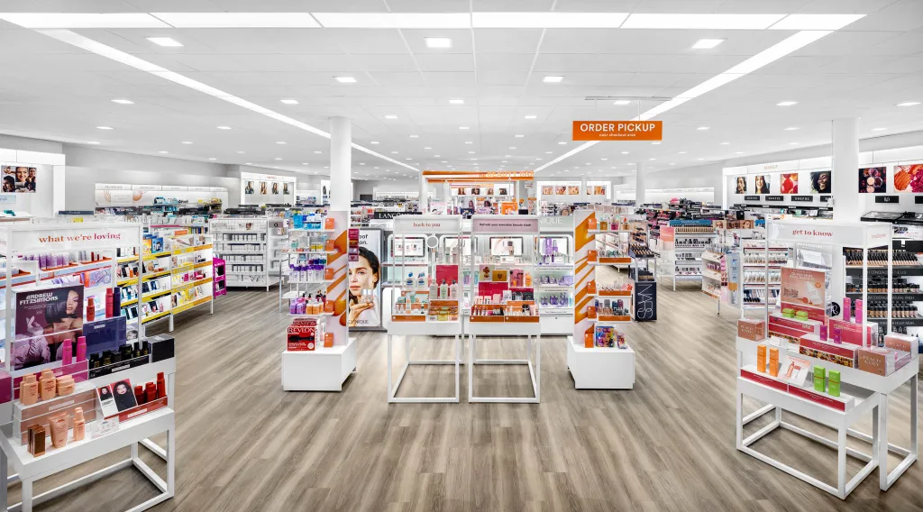
This is a large‑size hybrid beauty store. It’s not just somewhere you buy cosmetics. There is an on‑site hair salon called “The Salon”, plus a dedicated Beauty Bar for makeup trials and services. Most of the in‑store fixtures are white, with bright orange as the brand accent colour. Light wood‑look flooring runs through the whole shop, and plenty of ceiling panel lights keep the space nice and bright. This is a very common and proven store format for beauty businesses across North America. These photos are taken from Ulta Beauty’s latest store concept. This location mixes regular beauty retail with on‑site salon services. I’ve jotted down all the hands‑on build‑out details from this real project. Whether you’re working on a beauty shop renovation or sourcing retail displays for overseas orders, this case is super useful for your reference.
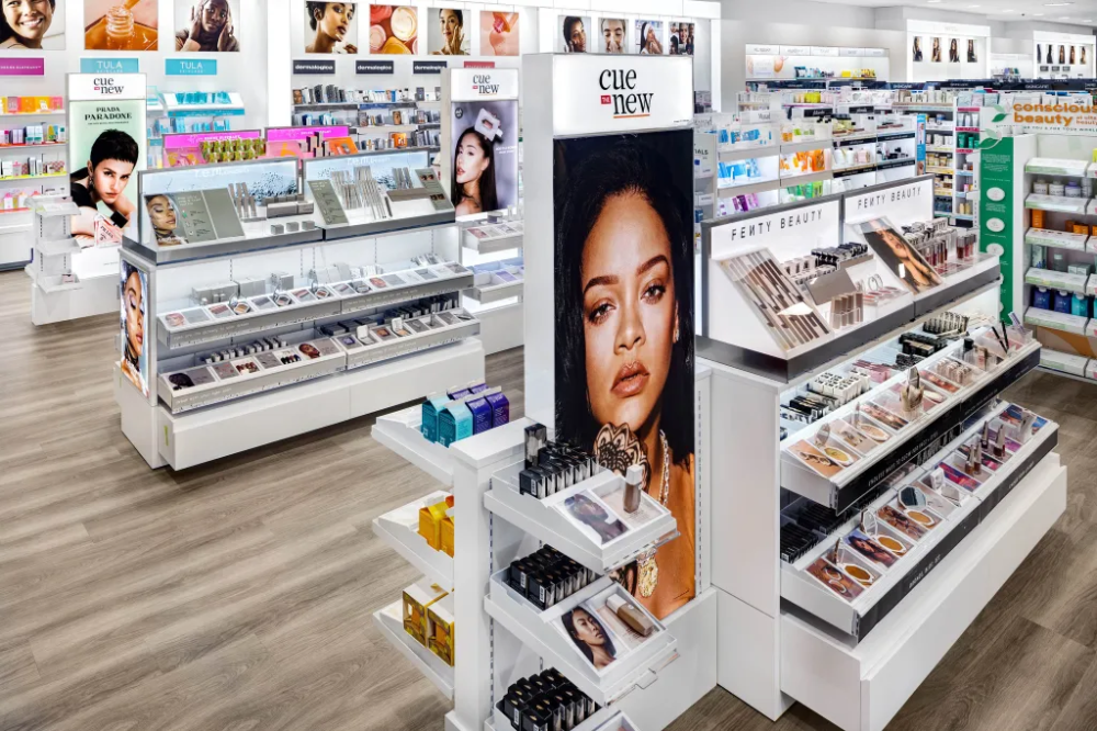
The Salon: On‑Site Hair Service Area
They didn’t put up solid walls here. Instead, vertical white slat panels act as semi‑open dividers. It marks out the salon area, yet keeps the sightlines open. People shopping the retail side can easily see what’s going on inside the service zone.
Up top, you’ll spot large 3D illuminated “THE SALON” signs, layered with orange and magenta trim that really catches eyes. Inside the zone are standard salon styling chairs, rolling tool carts, and wall‑mount lightboxes showing different hairstyle looks. A simple bench is added for customers waiting for their appointments.
This setup links retail and salon experience really well. Shoppers picking up haircare goods can book haircuts or colour treatments right then and there. It helps boost order value and keeps customers staying longer inside the store.
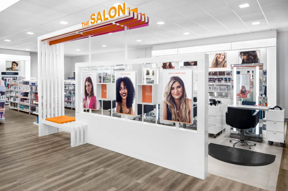
Central Island Displays & Online Order Pick‑Up Point
The middle of the store is filled with modular island shelving, and this is where most customer foot traffic flows.
There is a dedicated “ORDER PICKUP” spot for customers to collect goods bought online. It connects online shopping and in‑store experience smoothly. Rows of white metal‑framed islands run theme‑based displays, such as “what we’re loving” and “get to know”, showcasing new arrivals and best‑selling items.
All shelves are height‑adjustable. When you need to swap products or rearrange layouts, you don’t have to do heavy rework. This works great for chain brands rolling out multiple store locations.
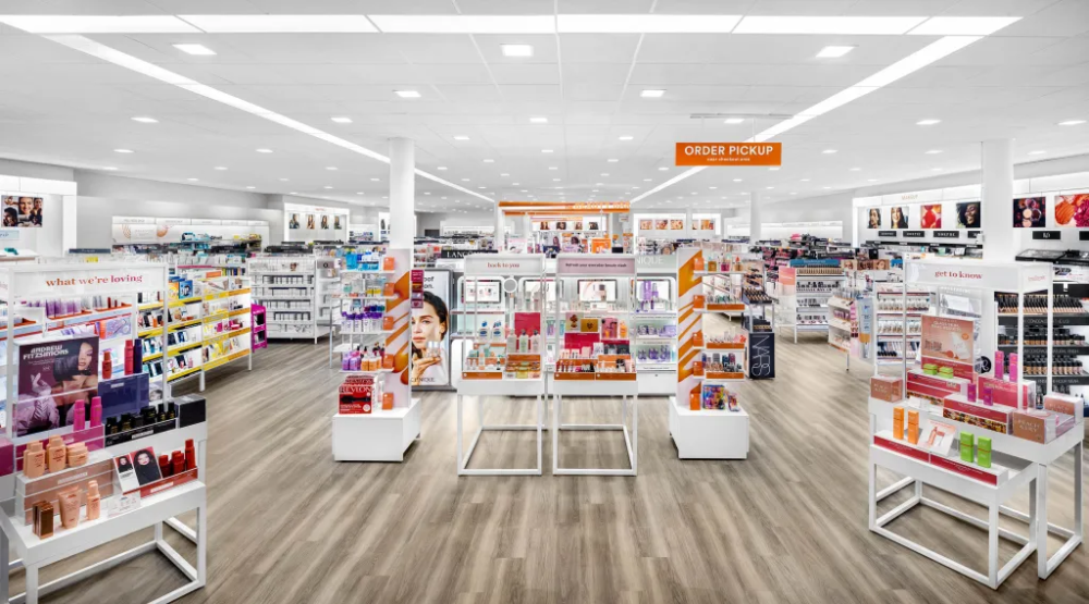
Hair Tools & Haircare Section
Curling irons, combs, scissors and other styling tools hang on display panels, so shoppers can check them out directly. Haircare products sit on glass shelves, grouped by brand. Popular brands like Ouai get their own display spots paired with brand posters. Closed storage sits underneath the shelves to hold bulk stock. You won’t need a huge separate back‑room warehouse, which is really practical for large‑footprint stores.
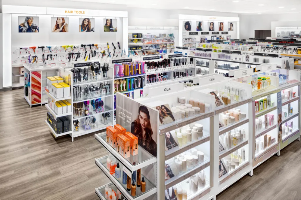
Individual Brand Makeup Counters
Major cosmetic brands have their own custom display units. The Fenty Beauty counter is a good example here.
Tall back cabinets pair with extended side display decks. Large lightboxes show brand campaign visuals. Built‑in drawers store stock while keeping tester products easy to grab for swatching.
Every fixture shares the same clean white base. Each brand brings in its own graphics and accent colours. The whole store keeps a unified look, meanwhile each brand still stands out.
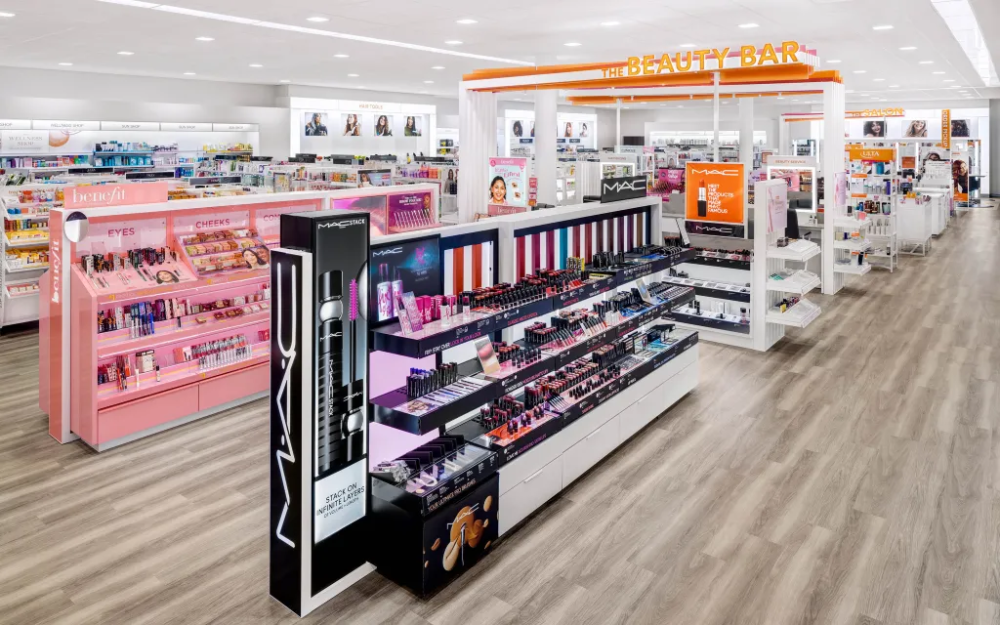
The Beauty Bar & Brand Counter Cluster
“The Beauty Bar” is the go‑to spot for makeup testing, surrounded by counters for MAC, Benefit and other well‑known labels.
Benefit’s counter uses its signature pink tone, with split‑up shelving for eye products and cheek‑focused goods. MAC goes with its classic black styling, completed by tall illuminated logo totems. Long island racks hold lipsticks, mascaras and compacts, with plenty of counter space for customers to try on makeup. Standing here you can see straight through to the hair salon area; all customer movement paths connect naturally.
Practical Layout Lessons
1. Don’t fully seal off your service zones. For salons or makeup bars, semi‑open dividers beat solid walls. Shoppers walking around the retail area can see services happening, and are more likely to book a session.
2. Go for modular, standard‑style fixtures. Stick to universal white base units. Use lightboxes and posters to show brand personality. It cuts costs for chain store roll‑outs and makes future layout updates much easier.
3. Simple colour logic: white base plus brand accent colour. Build your space on neutral white, add your brand accent colour (orange in this case), then let individual brand counters add their own colours. Balance overall unity and brand uniqueness.
4. Make space for omnichannel business early on. Most North American beauty stores set aside an in‑store pick‑up area for online orders. You need to plan for this when you start designing your fixtures.
Who Will Benefit From This Case Study
- Shop owners building hybrid beauty stores combining product sales and in‑salon hair / makeup services
- Chain‑store operators looking for replicable SI store design solutions
- Overseas buyers and importers sourcing custom retail fixtures: If you want to build similar beauty retail spaces, our team handles full custom design and manufacturing for beauty store displays. We study real overseas store references like this one closely. We can adjust layouts, material options, lighting and modular structures to fit your target market, and deliver finished fixtures ready for your projects. Feel free to reach out so we can bring your store idea to life.