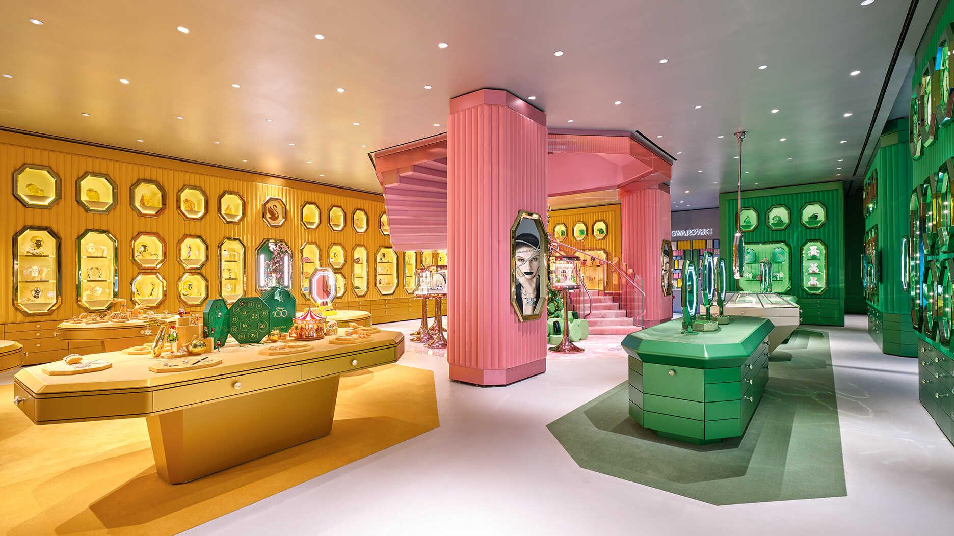
If you’ve browsed high‑end jewelry store flagships lately, you’ve probably noticed how much custom fixtures shape the whole shopping experience. Today I’m breaking down our completed Swarovski boutique build — talking through real‑world challenges, material picks and practical retail considerations, not just pretty renderings. This store went all‑in on bold color blocking: deep emerald green, mustard gold and magenta pink for different product zones. Our job was turning the interior design concept into durable, shop‑ready furniture that retail staff could actually work with day‑to‑day.
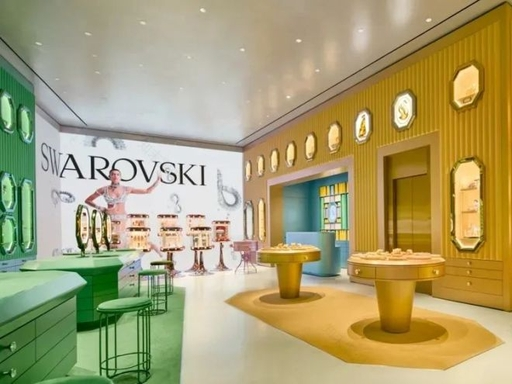
Octagon wall recess display niches
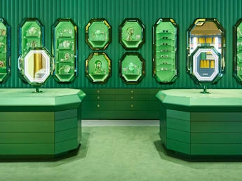
That octagonal frame runs all along the wall and sets the whole store vibe. These are not simple off‑the‑shelf showcases. Each niche sits flush within fluted wall panels, fitted with soft built‑in LED lights to make jewelry pop.We split zones by color: emerald green section for core jewelry collections, golden niches for best‑sellers, magenta pink area dedicated to sunglasses. One practical point most new store owners overlook: Behind those pretty wall showcases, we fitted rows of soft‑close drawers. Sales teams need fast access to backup stock, you cannot rely only on front display space.
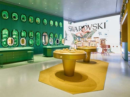
Large octagon freestanding display islands. These big multi‑sided islands sit right on the sales floor. Tops are velvet‑upholstered for laying out rings, bracelets and small accessories. Underneath are stacked pull‑out drawers for inventory storage.
We matched finishes to each zone: green islands for the emerald‑themed area, gold islands in the main high‑traffic selling zone. Mall stores take heavy daily knocks. We used solid plywood substrate rather than thin particle board, because cheap substrates warp quickly under constant retail use.
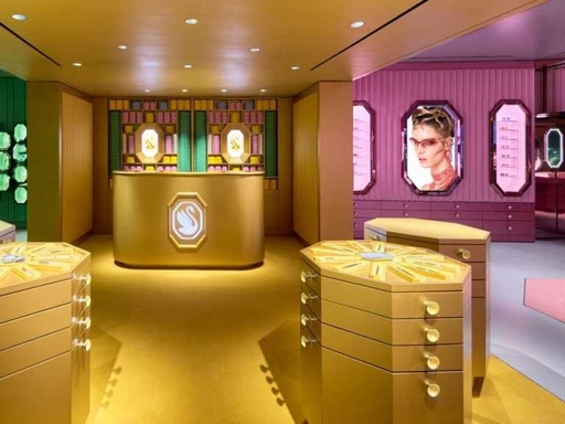
Curved cashier wrap counter with illuminated logo. The curved cashier station acts both as checkout point and brand focal spot. We embedded the lit‑up Swarovski logo on front fascia. Inside there is plenty of room for gift boxes, packing supplies and office items. Many boutique locations have bulky structural pillars you cannot remove. Instead of trying to hide them, we added matching octagon display frames directly onto pillar surfaces. This trick leverages wasted vertical real estate, keeps visual styling consistent across the whole shop and saves floor space you would otherwise spend on extra cabinets.
Material & Lighting Practical Choices
-Surface: High‑quality automotive‑grade matte paint finish, scratch resistant for heavy foot‑traffic retail environment
-Countertop: Velvet fabric upholstery, gentle against polished metal and crystal pieces
-Hardware: Full soft‑close drawer slides for all storage compartments
-Lighting: Warm‑toned LED strips fitted inside every wall niche; add‑on spotlights for high‑value jewelry items
-Quick real‑world tip: Avoid overly cool white lights for crystal and jewelry. Warm lighting brings out sparkle far better for shoppers.
Practical Takeaways for Jewelry Shop
From working through this build, here are actionable lessons for anyone planning their own jewelry retail fit‑out:
-Pick one signature geometric motif and repeat it. The octagon shape in this case creates instant brand recall for visitors walking in.
-Color‑code your zones. Clear color grouping naturally guides customer flow without extra signage cluttering up your space.
-Never skimp on hidden storage. Jewelry shops hold tons of backup stock. Pretty front displays mean nothing if your staff struggles to retrieve items fast.
-Build lighting directly into each showcase. External stand‑alone spotlights look messy and collect dust fast.
How to Get Started
If you are sourcing custom fixtures for your jewelry boutique, in‑mall kiosk or pop‑up store, send over your floor plan. We can walk through layout ideas and work within your actual site dimensions and budget.