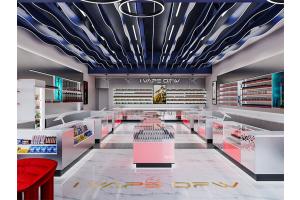
Walk into a sunglasses store and you will often see the same thing: rows and rows of frames covering every available wall.
It looks like the store has a great selection.
But there is a problem.
Customers don't shop by counting how many sunglasses you have. They shop by noticing the right ones.
If 100 pairs are fighting for attention, your best products can easily disappear.
That is why a good sunglasses display is not about putting more products on the wall. It is about making the right products easier to notice, compare and try.
1. Stop Treating Every Sunglasses as Equal
Your newest collection, best seller and slow-moving stock should not necessarily get the same amount of display space.
Give your strongest products a clear position.
A simple wall display can be divided into several zones:
New Arrivals — somewhere customers naturally look first.
Best Sellers — easy to reach and easy to compare.
Premium Collection — fewer products, more breathing room.
Everyday Styles — higher-density shelving where product quantity matters more.
This creates a hierarchy instead of a wall of identical products.
Well-planned visual merchandising uses layout and focal points to guide customers through a store rather than leaving them to process everything at once.
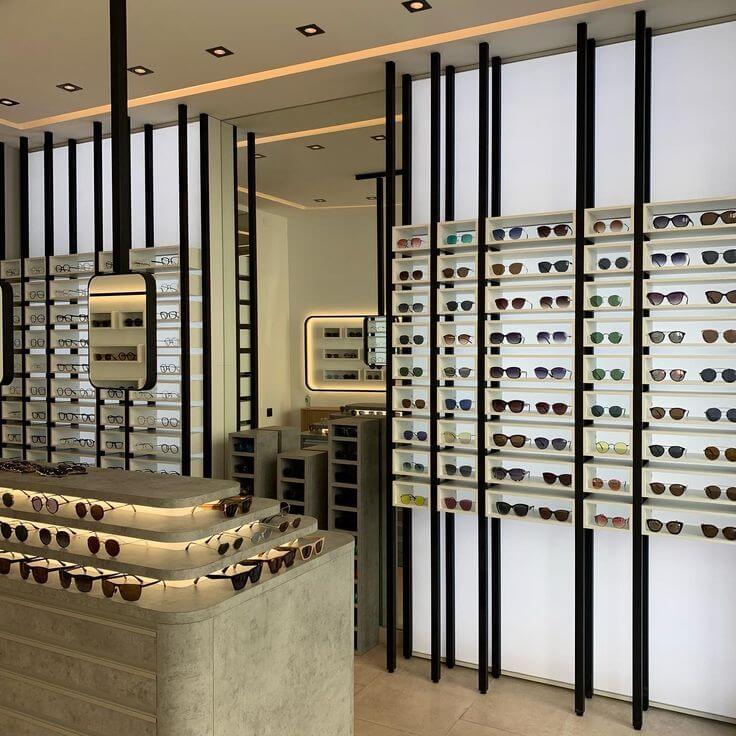
2. Give Expensive Frames Some Space
One of the easiest mistakes to make is overcrowding.
A $300 pair of sunglasses surrounded by twenty other frames doesn't necessarily look more valuable.
Sometimes, the opposite happens.
Premium eyewear benefits from space around it. A single frame placed under focused lighting can attract more attention than several tightly packed rows.
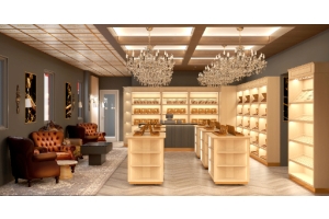
Recent eyewear store projects have used exactly this principle: fewer visual distractions, more deliberate spacing, and individual frames treated as focal products.
Not every shelf needs to be full.
Some empty space is doing a job.
3. Design the Display Around Eye Level
Customers don't scan a display with equal attention from top to bottom.
The products placed at comfortable viewing height are naturally easier to notice and handle.
That makes the middle section of your display valuable real estate.
Use it for the products you most want customers to see.
Higher and lower shelves can then carry supporting collections without competing with your main products.
This sounds obvious, but it is often ignored when a store is designed around maximum capacity instead of customer behavior.
4. Lighting Should Help the Frames, Not the Wall
Sunglasses are reflective products.
Too much direct light can create glare on lenses and make the frames harder to see.
Instead of simply making the whole cabinet brighter, consider where the light actually lands.
Integrated LED strips under shelves can create a clean line of light and separate each display level. Adjustable spotlights can be used for feature displays.
The goal isn't to make the cabinet shine.
The goal is to make the sunglasses stand out.
Luxury eyewear stores often combine shelving, display counters and carefully integrated lighting rather than relying on one large overhead light source.
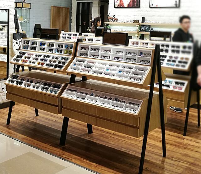
5. Don't Forget the Try-On Experience
A customer may notice a pair on the wall, but the sale often happens after they put it on.
So your display should work with mirrors, seating and consultation areas.
Avoid placing a large display cabinet where customers cannot step back and look at themselves.
Also think about staff.
Can they quickly reach different frames? Can they put returned products back in the correct position? Is there somewhere to keep cleaning cloths, cases and packaging?
A beautiful display that slows down the sales process is still a bad display.
6. Storage Is Part of the Display
This is especially important for smaller stores.
You need somewhere for:
- Extra frames
- Sunglasses cases
- Cleaning cloths
- Packaging
- Shopping bags
- Promotional materials
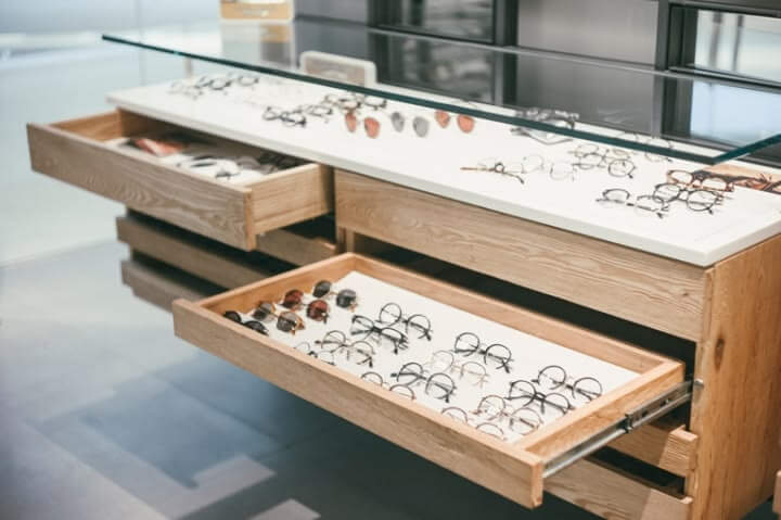
Adding a small drawer or closed cabinet below a wall display can solve a surprisingly large number of problems.
It keeps the customer-facing area clean while giving staff quick access to everyday supplies.
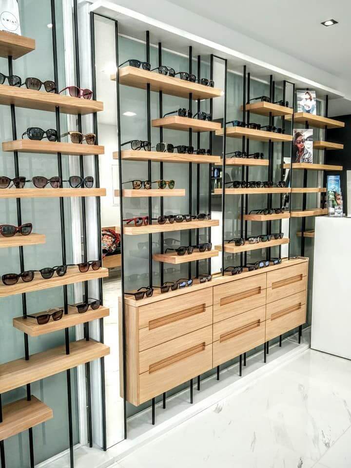
7. Don't Buy the Cabinet Before Measuring the Store
Before choosing a standard sunglasses display, measure more than the wall.
Check:
Wall width.
Ceiling height.
Electrical outlets.
Door clearance.
Customer circulation.
Mirror location.
Checkout position.
A display cabinet may fit the wall perfectly and still make the store uncomfortable to walk through.
Retail layout is ultimately about creating an easy shopping journey, not filling every available square foot.
So, What Does a Good Sunglasses Display Look Like?
It doesn't necessarily have to be expensive.
It doesn't need complicated shapes.
And it certainly doesn't need to cover every inch of the wall with products.
A good sunglasses display cabinet should do a few things extremely well:
Make the right products visible.
Make comparison easy.
Make trying on comfortable.
Keep stock organized.
And fit naturally into the store.
For a small boutique, that might mean a simple wall-mounted display with integrated lighting and drawers.
For a larger eyewear store, it could mean a combination of wall displays, freestanding cabinets, glass showcases and consultation counters.
For a brand or shopfitting contractor, the priorities may be different again — consistent dimensions, custom finishes, modular construction and repeatable production.
There is no universal “best” sunglasses display.
The best one is the one designed around how your customers actually shop.
And sometimes, the biggest improvement isn't adding another shelf.
It's taking one away.