2017 is the 20th anniversary of the establishment of KING TAI FOOK, and it is also a year for the brand to develop across the ages. Facing the stagnant development of many traditional jewelry industries, KING TAI FOOK exceeded one thousand direct sales and franchise stores this year.
In the final analysis, KING TAI FOOK follows the times and implements a brand rejuvenation upgrade strategy to face the market and the times. Changes in the promotion. From the brand VI images to the SI space terminal image, to the brand promotion strategy, all revolve around how to transform KING TAI FOOK’s “traditional blessing cultural image” into a consumption style and cognitive tendency that caters to the current young people.
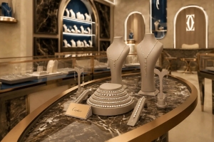
Check Below Modern Theme KING TAI FOOK Jewelry Shop Interior Design!
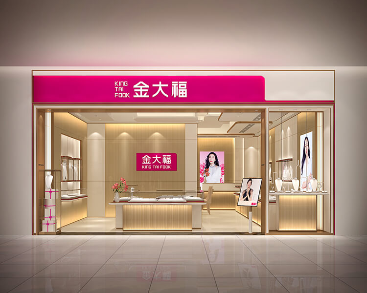
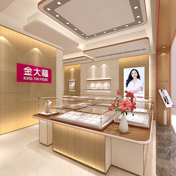
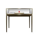
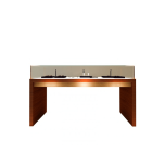
Ultra slim edge Display showcase design for jewelry retail store, chanpange gold combined with snow white to create a high-end retail space.
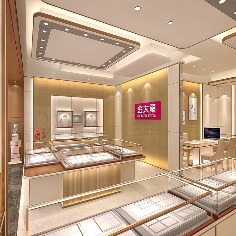
KING TAI FOOK: A jewelry brand that closely follows the trend of the times.
The KING TAI FOOK brand changed to a youthful and vibrant rose red hue for VI identification. This time, the Jiuyue team combined with the brand VI image upgrade to use champagne gold as the primary color in the space design, whichever is light, luxurious, and elegant; the shape is elegant and straightforward, Emphasize the beauty of simple lines. As shown in the picture: the brand texture of light luxury, simplicity, and fashion is ready to come out.