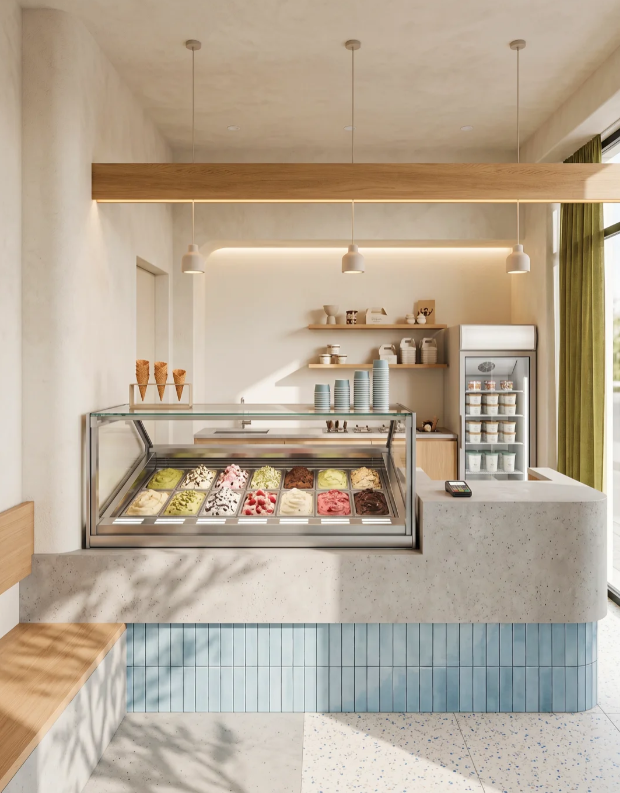
I wrapped up this tiny handmade gelato spot in a residential area not long back. The owner’s main ask was straightforward: a space people love popping into for photos, but never at the cost of smooth daily shop work. Since the premises were really compact, every single design call had to pull double duty – nice to look at, but fully functional for staff and customers alike.
I’ll walk you through the whole space step by step, starting out front and moving inside, referencing the actual finished site photos we took. We’ll go over the street-facing frontage, main order-and-scoop counter, back prep zone, window seating nook and the big combined storage-display wall. For every section, I’ll break down exactly what it’s used for, the thinking behind how we built it, and the real tangible perks it brings to running the gelato shop day in, day out.
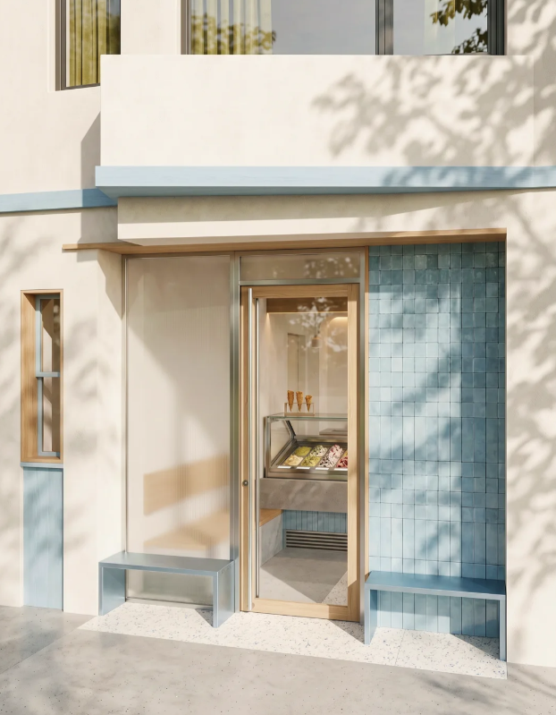
Front Street Facade
Nearly every other shop along this road relied on loud, cluttered neon signs and busy branding, so we opted for a much softer, calmer look to stand out gently. The off-white micro-cement exterior walls and pale blue trim match the vertical tiles fitted inside the whole shop. This ties the indoor and outdoor visuals together tight, making the shop stick in locals’ heads without over-the-top branding that feels cheap after a few months.
We went for full unobstructed glass sliding doors instead of thick solid partition walls for one key reason: anyone wandering the sidewalk can spot the full range of gelato flavours laid out inside straight away. Loads of casual strollers pop in on a whim just from catching sight of the bright scooping display, which directly pushes up how many new walk-in customers we get each day. The light natural wood framing softens the cold, harsh feel of big glass panels, fitting the warm, relaxed vibe a dessert shop needs.
We fitted two simple pale blue metal benches either side of the entrance purely because there wasn’t spare indoor floor space for waiting areas. On warm sunny days, people grabbing waffle cones or waiting for takeaway packs can sit outside without blocking new customers from stepping through the door. The benches tie straight into the shop’s core colour scheme, and plenty of visitors snap quick photos of their gelato sat out here, sharing shots on social media that act as free word-of-mouth promotion for the shop.
That slim timber-framed accent window on the side wall was a low-budget tweak to stop the plain blank white facade looking flat and boring. It adds subtle architectural detail without a huge renovation spend, making our storefront far more eye-catching than the generic basic shop fronts lining the street, so passersby slow down and take a second glance.
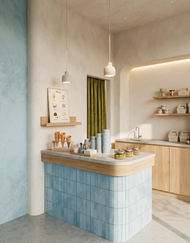
Main Till & Scooping Counter
We slotted the gelato display cabinet dead centre, right in line with the front door, instead of shoving it into a forgotten back corner. Customers lay eyes on all the flavour tubs the second they step inside, instantly triggering that urge to buy. The clear glass front also lets guests watch staff scoop gelato by hand, hammering home that handmade artisanal feel – this small detail lets us price single scoops a little higher than generic pre-packaged ice cream and boost profit margins per sale. A fixed waffle cone holder sits right on top of the cabinet to pre-stack cones ahead of rushes, cutting down order prep time massively and stopping customers leaving the queue out of frustration from long waits.
Stretching the full length of the counter is one solid timber beam, holding three matching matte white pendant lamps. Warm 3000K soft white bulbs were non-negotiable here; harsh cool white lighting washes out the natural fruit, chocolate and cream tones of each gelato flavour, making the product look dull and unappealing. Warm soft light also tones down that sterile commercial retail feel, encouraging guests to linger a little longer browsing flavours, which almost always leads to upsells – extra nut toppings, two-person sharing sets and so on, lifting average customer spend.
That split dual counter setup is the most practical design choice we made for daily operations. The main counter stays clear just for taking orders, processing payments and scooping gelato, while all cup storage, topping prep and takeaway bag packing shifts to the side counter. Two team members can work alongside each other without crowding one another, speeding up order turnaround drastically and cutting waiting times for every customer. Simple floating timber shelves fixed to the back wall hold small tasting bowls and disposable cutlery within arm’s reach, so staff don’t waste constant trips back to far-off storage cupboards mid-rush.
Rear Prep Back Area
All cabinetry uses pale natural timber with zero harsh chemical odours, a must for any venue handling food. Floating open timber shelves stack takeaway boxes, tasting bowls and sealed topping jars where every supply is visible at a glance – staff don’t lose precious rush time rummaging through closed cabinet doors hunting for gear. Lower closed cupboards hide bulk gelato tubs and backup stock to keep the front prep surfaces tidy and visually polished for customers walking past.
We built a full sink straight into the prep counter rather than walling off a separate closed kitchen, a huge win for small shop footprints. Most tiny gelato shops can’t afford to carve out whole separate kitchen space without chopping into revenue-generating dine-in seating room. This integrated sink lets staff rinse scoops and serving tools straight after every use, fully complying with local food hygiene rules while fitting complete prep functionality into a tight footprint.
We ran subtle warm LED strip lighting underneath each floating shelf. Once dusk rolls in, these strips light up all stored supplies without harsh overhead glare making jars and tubs hard to tell apart. That soft ambient glow also warms up the shop’s whole atmosphere after sunset, drawing evening foot traffic who spot the inviting glow from the street outside.
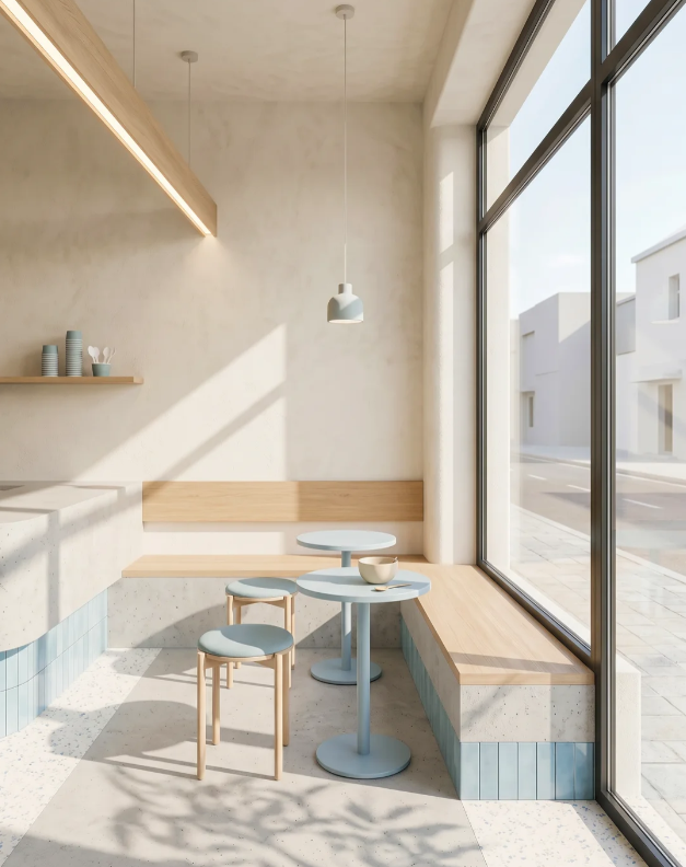
Window-Side Seating Nook
We fitted a full-length custom wooden banquette running parallel to the floor-to-ceiling windows. This setup makes the absolute most of natural sunlight without wasting valuable central aisle floor space. Paired with lightweight pale blue stools and tiny round tabletops, the seating works comfortably for single visitors or pairs. The base of the banquette is wrapped in the shop’s signature pale blue tiles to keep the whole venue’s visual flow smooth and unbroken, no disjointed mismatched sections.
Expansive full-height glass windows cut daily artificial lighting overhead costs massively, flooding the space with natural daylight all through opening hours. Sunlight filters through nearby tree foliage to cast soft, organic shadow patterns across floors and walls – no expensive decorative props or backdrops needed at all. Every casual photo guests snap here has that naturally soft, filtered look that pushes organic social media shares, bringing free online exposure to the shop week in week out. Visible street views through the glass also counteract that cramped, boxed-infeeling small retail spaces often have, so the shop never feels overstuffed even when every seat’s occupied.
All stools and tabletops use that same signature pale blue finish, paired with light timber bench tops and off-white micro-cement walls to lock in a consistently clean, airy colour palette. Those muted cool tones feel refreshing year-round, matching gelato’s summery, cooling product vibe perfectly. We kept the decor colour range tight and soft instead of busy, bright hues, so the space never feels tiring or dated even after months and years of trading.
Only slim floating timber shelves line the window wall, holding a small handful of serving cups as gentle subtle decor. They don’t block any incoming sunlight, and elevate blank empty wall space with minimal decor spending – no need for cluttered artwork or piles of ornamental trinkets that make the spot feel cramped.
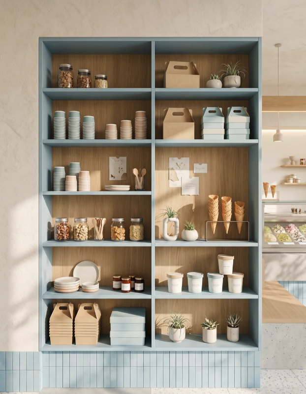
Full-Wall Multi-Use Storage & Display Cabinet
We wanted this big cabinet to feel like a natural part of the shop’s design, not an afterthought bulky storage unit dumped in a corner. The outer frame uses the venue’s signature pale blue, with natural timber backing panels inside that mirror all the tiles and woodwork fitted elsewhere in the store. This ties the whole shop’s brand visuals closed tight, with no disjointed, mismatched decor across different zones.
Every shelf has a clear assigned job to avoid clutter:
- Top tiers hold small potted plants and sample gift boxes as soft decor, lifting the shop’s premium feel while showing visitors exactly what takeaway gift sets we stock for birthdays and small gifting occasions.
- Middle tiers stack paper cups, sealed nut topping jars and small serving bowls. Guests can clearly see the whole range of whole nuts, fruit preserves and raw ingredients we use, building trust around product quality and pushing upsells for premium extra topping add-ons.
- Lower tiers store bulky backup takeaway boxes and large storage containers, hiding all messy bulk inventory out of sight to keep front counters neat and presentable.
We skipped fitting cabinet doors entirely, as open shelving speeds up service during busy rushes – staff grab cups and toppings without constantly opening and closing hardware mid-order rush. The styled open shelves also work as a statement feature wall on their own, decked out with small plants and waffle cone display stands, cutting costs by removing the need to buy separate artwork or standalone decor pieces. The cabinet’s base wraps all the way to the floor in the same pale blue vertical tiles used on the counter and street facade, creating a seamless visual link between furniture, flooring and walls with no jarring material breaks for a polished, unified finish.
Small Cohesive Decor Touches That Shape The Shop’s Long-Term Vibe
A handful of simple, restrained design choices keep the whole space visually consistent without overcomplicating the look. All main walls use off-white matte micro-cement with a soft subtle texture that feels refined but approachable. Milk smudges and stains can be lightly sanded and touched up easily, slashing long-term repair and refresh costs. Accent walls finished in soft pale blue paint add gentle visual layers without overloading the space with dozens of competing materials.
Every light fixture, from pendant lamps to under-shelf LED strips, uses identical warm soft white colour temperature – no random clashing harsh cool white bulbs mixed in anywhere. Whether it’s bright afternoon sunlight or dim evening indoor lighting, the shop holds that calm, welcoming atmosphere that sets it apart from rival dessert shops relying on stark, clinical overhead lighting.
We limited the whole venue to just four core neutral tones: off-white walls, natural timber, pale blue tiles and furniture, plus muted olive green window drapes. Sticking to a narrow range of soft, low-vibrancy hues means the space never feels tacky or overstimulating, fitting the gelato shop brand through every season, summer heat and winter cold alike.
Core Practical Business Perks Of This Gelato Shop Layout
1.Steadier walk-in foot traffic: The fully transparent glass storefront and warm street-facing presence draw in casual passersby who’d normally walk straight past competing generic ice cream shops.
2.Faster service during peak hours: Split working counters and neatly tiered storage cabinetry completely streamline staff movement around the shop. Team members rarely get in each other’s way, queues move far quicker, and we cut down on customers leaving mid-line out of boredom from long waits.
3.Cheaper long-term cleaning and maintenance: All materials we picked resist spills and wipe clean easily, a non-negotiable for any dessert shop constantly dealing with melted dairy and sticky messes. They also stand up to years of daily heavy use without fading or looking worn out early, cutting renovation refresh spend down the line. The unified colour and material scheme also avoids visual mismatches whenever we restock decor or retail add-on products further down the line.
4.Higher perceived product value: The warm, handmade-focused space backs up a slightly higher price point than basic counter-only scoop shops can pull off. We easily sell pricier single scoops, premium topping combos, seasonal gift packs and couple dessert sets that push up every customer’s average spend.
If you’re gearing up to launch your own small neighbourhood gelato shop, or looking to revamp an existing ice cream store, balance between good visuals and practical daily operation should always be your top priority. A space that photographs beautifully won’t move extra gelato if the counter workflow is clunky, storage is messy, or visitors can’t spot your best flavours the second they walk in. Drop me a rough measurement of your shop’s total floor area, and I can walk you through tailored layout ideas built around this fully finished real-life case study.