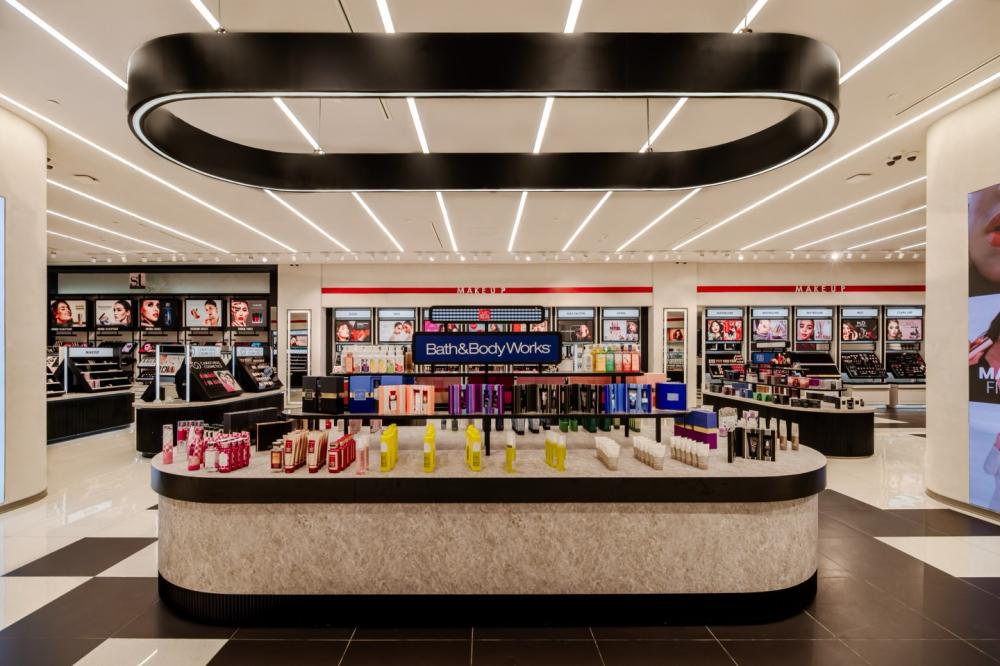
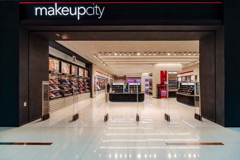
A good beauty store never attracts customers with its luxurious decoration, but rather with a comfortable experience and a clear layout, making customers willing to stop and connect with the products. Makeup City beauty store has taken "less is more" to such an advanced level. There is no excessive decoration and no dazzling neon lights. Instead, with clean lines and restrained colors, it places the products and user experience at the core.
"Simplify and eliminate complexity
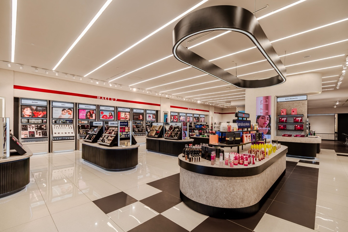
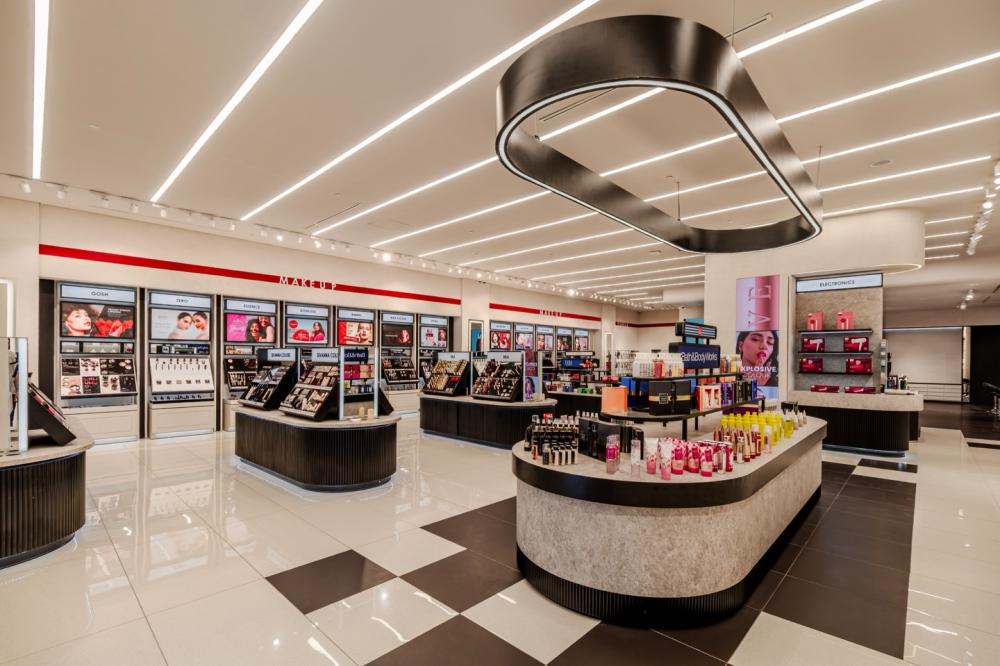
The moment I pushed open the beauty store door, I was immediately caught by the overall atmosphere. The entire space is based on off-white walls and black cabinets. The floor is paved with black and white checkerboard tiles, extending from the entrance all the way to the depth of the store, like an invisible guiding line for circulation. The wall has no superfluous decoration. Only a thin red line is used as an accent at a key position, marked with the zoning words "TOOLS", "MAKEUP" and "SKINCARE", which are clear yet not jarring.
Unlike the crowded atmosphere of traditional beauty stores filled with posters and hanging light boxes, most of the walls here are left blank, with all the "hustle and bustle" reserved for the products themselves. This "subtractive" design concept actually makes people who enter the store relax instantly - there is no sense of being pressured by sales promotion, nor is there a visual clutter. All your attention will naturally be drawn to the displayed makeup and skin care items.
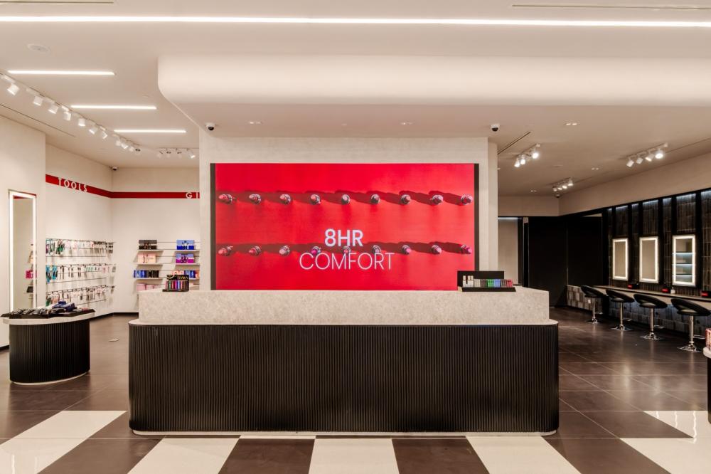
Arc-shaped reception desk
As soon as I pushed open the door, the first thing that caught my eye was the arc-shaped reception desk that spanned more than half of the space. It is like the heart of the store, standing firmly at the center and becoming the visual focus of the entire space. The countertop is made of light grey marble with natural textures, feeling warm and textured to the touch. The cabinet below is black and features a vertical texture design, not a smooth flat surface. When light hits it, it creates fragmented shadows, instantly making the "minimalist" look less monotonous.
I just stood there in a daze for two seconds. I never expected that the reception desk in a beauty store could be so well-designed. The curved design is particularly ingenious, with no sharp corners. No matter from which direction you walk in, you can approach it smoothly without blocking the routes to the makeup and skincare areas. The counter is not piled high with messy brochures. Only small black display stands are placed on both sides, with a few lipsticks and beauty eggs on display. This simple yet precise message conveys the beauty attribute of the store.
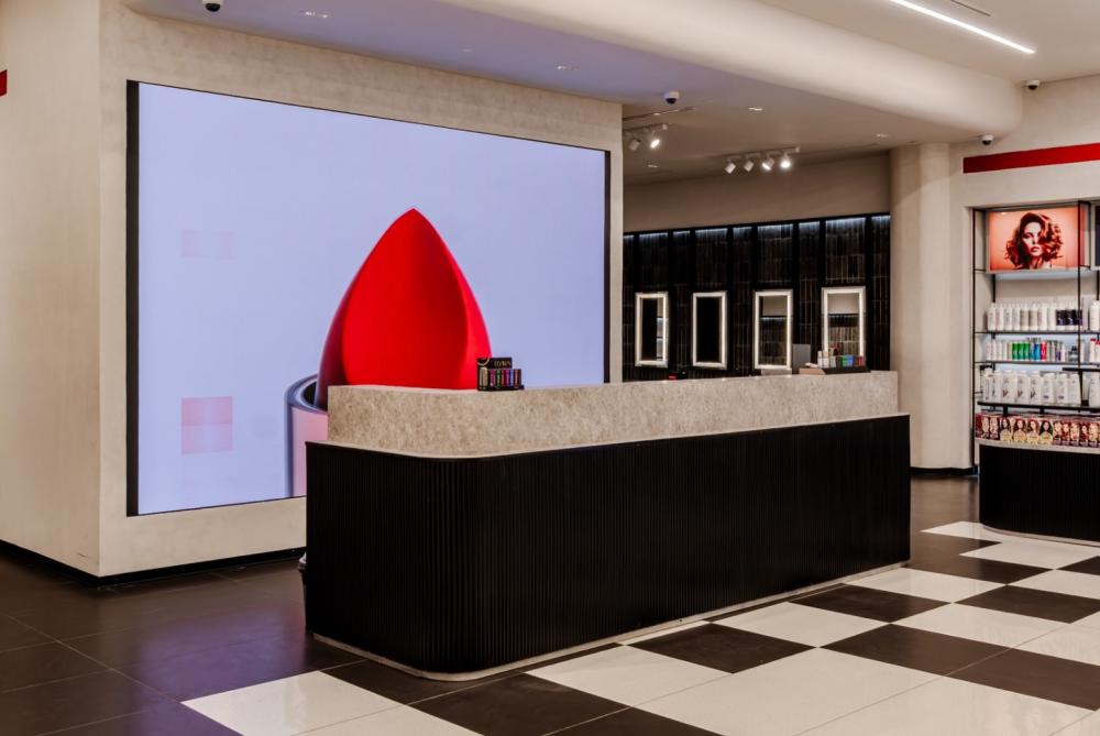
The huge LED screen behind the stage is also very interesting. It continuously plays advertisements for lipsticks and beauty eggs. The words "8HR COMFORT" are printed in light pink on a red background. There are no exaggerated special effects, but the core selling points of the products are directly conveyed, which echoes the simple countertop in front and is not at all out of place. This reception desk is not merely a "cash register", but more like a window for brand display. It clearly conveys the tone of Makeup City in a restrained way.
Partition Layout
- Makeup area
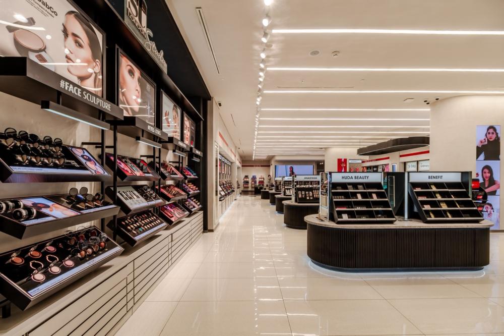
The makeup section is located on the right and deep side of the store. It is the liveliest area in the entire store, yet it is also well-organized. A large number of double-sided island counters are used here. For example, popular brands such as Huda Beauty and Benefit are placed on the oval-shaped black island counters. The countertop of the island counter is the same style of marble as the reception counter, and the edges are rounded. Customers can approach simultaneously from both sides without having to crowd together.
Double-sided island station
The display stand on the island is designed diagonally. The makeup items are spread out in a fan shape. Whether it's lipstick, eyeshadow or powder compact, they can all be clearly seen and are very convenient to take. At the bottom of the island counter, there is also a circle of ambient lights. The faint white light shines on the ground, making the black cabinet not look dull but rather giving it a sense of lightness and suspension.
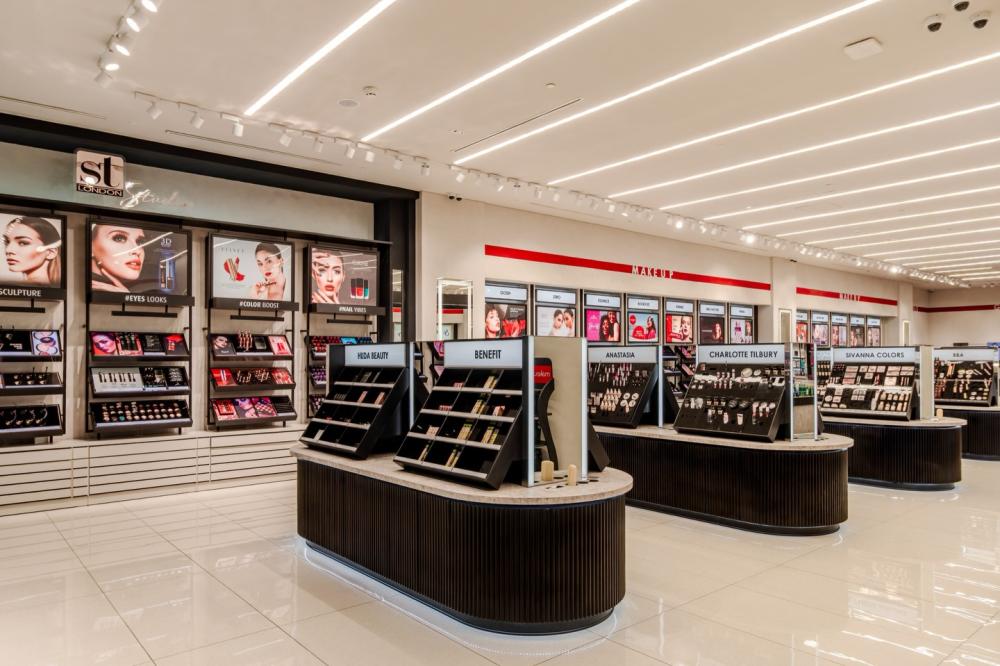
Corresponding to the island counter is the wall cabinet on the wall. In the "ST London" area on the left, the entire wall is filled with open shelves. The black frames are paired with white cabinets. Track spotlights are installed on each floor, illuminating the cosmetic products clearly. The electronic screen above the wall cabinet was playing the beauty tutorial in a loop. The words "#FACE SCULPTURE" and "#EYES LOOKS" were printed in white on the black background, in harmony with the overall style and not messy at all. The most ingenious part is the design of the makeup trial area. In front of the black brick wall background, a row of makeup mirrors with circular light strips are installed. The products displayed on the opposite side are reflected in the mirrors, which not only makes it convenient for customers to try on makeup but also makes the entire space look more transparent, without appearing messy due to too many mirrors.
- Skin Care area
The skincare section is located in the middle of the store and is naturally separated from the makeup section by black and white bricks on the ground. The island here is a larger oval shape, with a huge black circular pendant lamp installed on top. The white light from the inside of the lamp frame falls down, just covering the entire island, like an independent small space.
The red logo of "SKINCARE" is pasted on the wall. The products of brands such as St Ives and The Ordinary are neatly placed on the shelves below. The open display design, without the barrier of glass cabinets, enables customers to pick them up and try them directly.
There are no closed cabinets around the island counter; it is all open. Hair care, skin care and fragrance products are divided into different sections. Even first-time customers can find the category they want at a glance. The special area of Bath & Body Works is located in the middle. The colorful bottle bodies are neatly arranged on the white countertop, contrasting with the black and white cabinets. This not only highlights the products but also does not disrupt the overall minimalist feel.
Makeup lighting
The linear LED lights on the ceiling are the main light source running through the entire space. The off-white light grooves are embedded in the ceiling, emitting soft white light that evenly spreads on the floor, making the entire space bright but not at all dazzling. Above the wall cabinets in the makeup section, there are track spotlights installed. The light precisely shines on the products, restoring the true color of the makeup. When trying on makeup, you no longer have to worry about being deceived by "death lights".
The makeup mirrors in the makeup try-on area are equipped with circular light strips. The light comes from all sides and shines evenly on the face. There will be no situation of "fair face and dark neck" at all. The colors of lipstick and foundation tested are very accurate. The ambient lighting at the bottom of the island counter is the finishing touch. The faint white light shines on the ground, making the black cabinet not look heavy but rather giving it a light and airy feeling. The LED screen behind the reception desk also serves as a light source. The advertisements with red background and white characters reflect a faint light on the off-white wall, making the light and shadow layers of the entire space more rich.