Many people are worried that "blue will steal the spotlight from jewelry", but quite the contrary, the cool-toned blue is the best "backdrop" for jewelry store. Among the jewelry stores lined with "gold + white" on the streets, a bold shade of blue itself is the most powerful visual symbol. Passing by on the street, you will immediately notice this blue store instead of being lost in the stereotyped shops. This differentiation not only attracts customers into the store but also leaves a deep impression of the brand in their minds: when it comes to blue jewelry stores, CAST comes to mind.
CAST spatial circulation design
Large areas of blue can easily make a space seem dull, but CAST has perfectly balanced this with details: the warm glow of brass, velvet soft chairs, vibrant floral decorations, and yellow sofas as bright color accents, giving the entire space both the high-end feel of blue and a strong sense of life. You won't feel like you are "buying jewelry", but rather in a space full of design sense, appreciating and experiencing beauty. This immersive experience is something that traditional jewelry stores cannot offer.
At the entrance: A blue glass door paired with a golden brand logo catches the eye at a glance from the street. The golden logo on the glass door echoes the logo wall inside the store, and the brand sense runs through from the moment you enter the store.
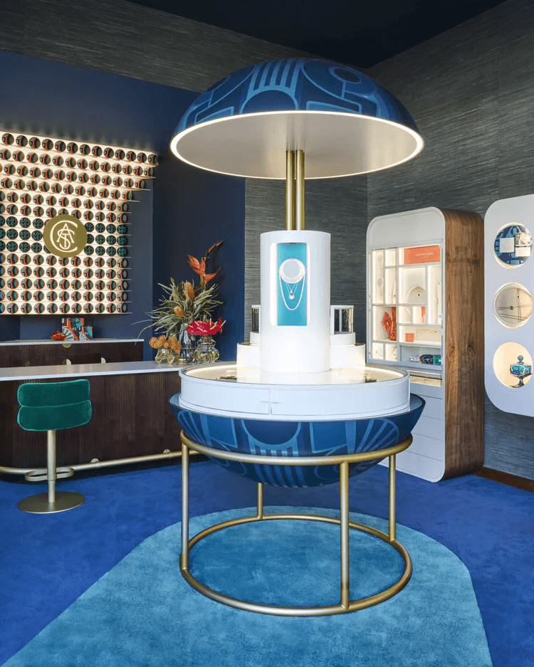
After entering the store: The central circular display stand becomes the natural visual focus, guiding customers to tour around it. It naturally divides the space into different functional areas: one side is the wall cabinet display area, and the other side is the rest and negotiation area. The movement lines are clear, preventing customers from getting lost.
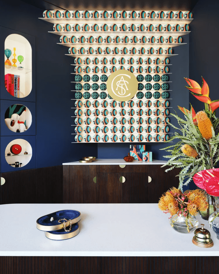
Deep area: A service bar counter is set up, equipped with velvet bar stools and brass bar legs. Customers can sit down here to try on jewelry and consult details, transforming the "cold shopping" into a "relaxing experience like chatting in a cafe".
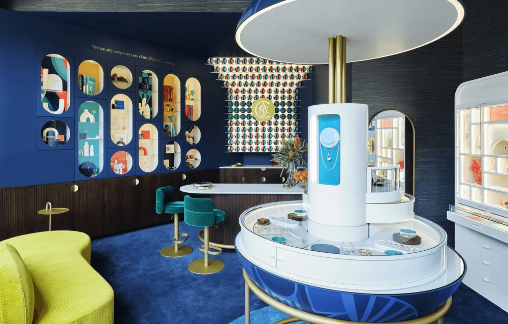
Central circular display stand
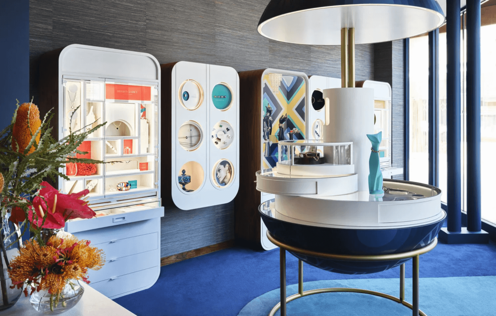
Design: The bottom is a deep blue hemispherical base with geometric patterns printed on it, paired with a brass metal bracket, making the entire display stand seem to be "suspended" on the ground. In the middle is a white cylindrical display area, surrounded by circular glass display cabinets. Jewelry is displayed in 360° without any blind spots. Customers can clearly see the exhibits from any Angle, making it very suitable for showcasing necklaces, bracelets and other accessories that need to be presented in all directions.
Lighting design: The top is a huge circular warm white ceiling light. The light shines on the jewelry in the display case, creating a warm and cool contrast with the blue base, instantly enhancing the luster of the jewelry. Moreover, this ceiling light itself is also a decoration of the space. Its huge circular shape instantly enhances the sense of layering of the entire space.
Function and Circulation: This display stand is not only a display area but also the "circulation anchor point" of the space. After customers enter the store, they will naturally tour around it, guiding the flow of movement. At the same time, the space is divided into different functional areas to make the layout more reasonable.
Details echo: The blue geometric pattern on the base perfectly echoes the blue theme of the entire space. The metallic texture of brass, in harmony with the brass elements such as door handles, bars and chair legs in the space, is filled with a sense of detail, making the design of the entire space blend seamlessly.
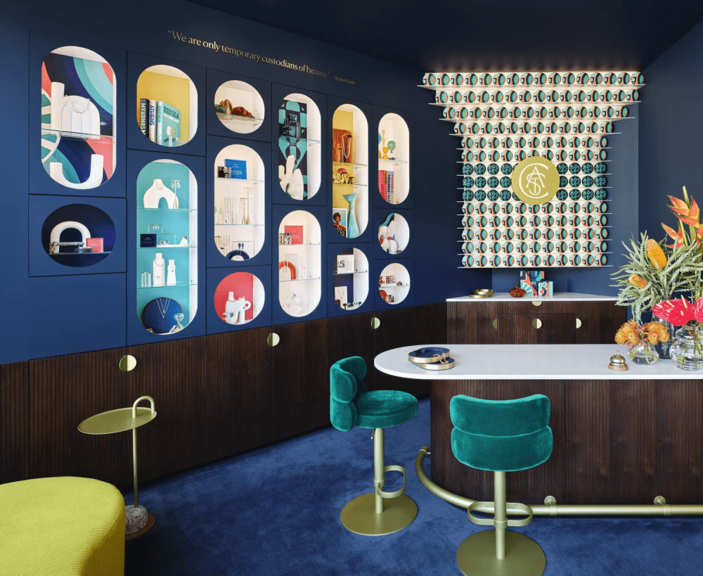
Wall cabinets and niches
A full-length floor-to-ceiling glass cabinet is used to display a series of jewelry. There are "circular window-style" display cabinets hung on the wall, resembling porthole Windows. Inside, different background colors (dark blue, off-white) are used in combination with lighting to display small accessories such as rings and bracelets. Each small display cabinet is an independent "miniature exhibition". There are also oval and circular niches embedded in the blue wall, with varying heights. Inside, there are backgrounds of different colors such as red, blue and yellow, displaying jewelry, ornaments and brand books, turning the wall into an art wall full of stories.
Details and ingenuity: The edges of all display cabinets are edged with brass, echoing the metallic elements of the space. The background colors of the niches are rich but not messy. Each one has its own theme. Some display necklaces, some display ornaments, and some place brand brochures. This makes the wall not only have a display function but also full of design sense, without feeling crowded at all.
The sense of interaction is at its height: These undulating niches and display cases allow customers to look up and turn sideways while strolling, making new discoveries at every step, rather than following the walls of traditional jewelry stores with no surprises at all. This "exploratory" shopping experience can make customers more willing to spend time in the store and increase the possibility of consumption.
Wall decoration
The iconic three-dimensional logo wall: At the core of the space, there is a three-dimensional decorative wall composed of countless colorful circular modules, with the golden logo of CAST in the middle. This wall is not only the visual symbol of the brand but also the "visual anchor point" of the space. It can be seen from the entrance and strengthens the brand's memory. The three-dimensional shape makes the wall more layered. When the light is shone on it, the light and shadow effect is very beautiful, making it an excellent background for customers to take photos and check in.
The wall color and material: The wall is in a deep navy blue, with a dark brown wood veneer on the lower part. It is paired with small round brass handles, which not only exudes the high-end feel of blue but also the warmth of wood. The slogan of the brand, "We are only temporary custodians of beauty", is also printed on the wall. The brand concept is integrated into the design to make the space warmer rather than a cold and lifeless sales place.
Soft furnishing coordination: In the niches on the wall, apart from jewelry, there are also floral arrangements, ornaments and books, making the entire space more lively and conveying the brand concept of "beauty integrated into life", rather than an aloof luxury.