check out over 200+
Page 5 - Blog
-
- June 22, 2026 66
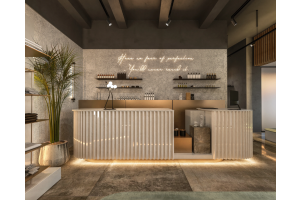
If you’re planning to open a comprehensive beauty salon or renovate an old store, this practical cream-style light luxury salon case is definitely worth referencing. I’m sharing the real on-site details, layout design and practical operational advantages of this local nail, lash and semi-permanent makeup salon, all shot and sorted out by ourselves. This salon is positioned as a mid-to-high-end local...
-
- June 17, 2026 59
When many people are choosing display cabinets for their stores, they often encounter this question:
Which one is more durable, the wooden display cabinet or the aluminum display cabinet, and which one is more suitable for long-term use in the store?
Nowadays, both of these materials are mainstream display cabinet materials for physical stores. After reading the following analysis, we believe you...
-
- June 17, 2026 100
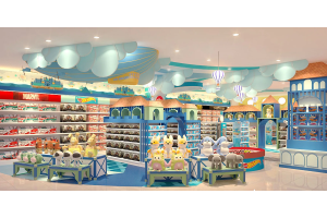
If you’re planning to open a squishy or kids’ toy shop, you’ve probably struggled with figuring out your store’s look. Most toy shops out there just use plain white shelves, which don’t grab the attention of families walking past. I just finished building this full toy store space and took real photos of every corner—from the street front to small photo spots inside. I’ve broken down all the easy-to-copy...
-
- June 16, 2026 42
If you’re planning a luxury women’s shoe kiosk fit-out inside a shopping mall, you’ve likely run into cheap display cabinet quotes that seem too good to be true — and they almost always are. I’ve worked with dozens of store owners who rushed into low-budget custom jobs, only to end up with displays that look cheap, fail to highlight their premium shoe inventory, and tank in-store conversion rates...
-
- June 15, 2026 157
If you’ve browsed local malls lately, you’ll notice sportswear and sneaker shops are getting major design overhauls. Old blocky, clunky shelves just don’t click with young shoppers anymore—they feel stale and fail to highlight shoe lines properly. Today we’re walking through a complete custom fixture build for a modern sneaker boutique, built around a muted gray-and-white futuristic layout that nails...
-
- June 15, 2026 192
Anyone running an optical shop knows the industry has changed drastically over the years. It’s no longer enough to just stock good-quality frames and lenses. Your store’s overall look, display setup and shopping atmosphere directly impacts how customers perceive your brand, and more importantly, whether they’ll stop to browse and buy. This is especially true for luxury multi-brand optical stores...
-
- June 15, 2026 53
Modern eyewear retail demands cohesive, function-driven store fit-outs far beyond basic frame shelving. As a seasoned commercial furniture factory delivering full turnkey optical fixture packages. Drawing from the showcased optical store project. Every design and production step prioritizes retail workflow efficiency, long-term durability, and unified brand visual identity for independent shops and...
-
- June 12, 2026 58
If you’re looking for great bubble tea shop design inspiration this year, check out this spot on Ponsonby Street in Auckland, New Zealand. It hits the sweet spot between good looks, daily practical use and real business needs. Let’s walk through the whole space and talk about its layout, decor and little details. The shop goes with a classic red and white colour scheme. Matte white walls make the whole...
-
- June 12, 2026 37
Most new beauty salon owners in Los Angeles, Irvine, and Santa Ana face the same problem: they spend a lot of budget on store renovation and custom cabinets, but end up with impractical layouts, poor material quality, or furniture that does not match their salon style. Many local custom factories only focus on appearance, ignoring the high-frequency use scenarios of beauty salons, resulting in easy...
-
- June 11, 2026 71
When a customer walks into your café, they don’t just notice the coffee smell first. They see the bar counter, how inviting the pastry display looks, and whether the whole space feels warm and welcoming enough to stay. We’ve worked with hundreds of café owners over the years, and we know what works. This soft cream-style café we designed isn’t just pretty—it’s built to help your business run smoother...
-
- June 09, 2026 71
In optical retail, store display effect and customer on-site experience directly determine walk-in rate, browsing duration and final transaction rate. Many optical shops invest heavily in store renovation but fail to boost sales, mainly due to mismatched interior styles, single and rigid standard shelves, and unreasonable spatial layout. As a professional manufacturer focusing on customized commercial...
-
- June 08, 2026 55
Want your store to be instantly recognizable on the street? This LABUBU theme pop-up store from Pop Mart takes a straightforward design approach, achieving the ultimate goal of "catching people's attention". Especially, the storefront is entirely made of fiberglass, which is durable and perfect for taking photos. Even ordinary people can easily learn and implement this design.
Contrasting Colors +...
-
- June 08, 2026 48
The four 3D design sets showcase a trending signature design: oversized luxury shopping bag forms as the gift kiosk’s main backdrop and framing structure. This is a high-concept design exclusive to gift retail, with strong thematic recognition far beyond standard box-style mall kiosk. This sculptural bag concept solves two critical mall kiosk pain points instantly: it stands out against generic cosmetic...
-
- June 08, 2026 43
Opening a fragrance shop is more than just putting products on shelves. The overall decor and display units speak volumes about your brand. From the moment customers walk in, the atmosphere, the feel of the cabinets and how your goods are presented will shape their shopping experience. Nicely built, solid custom display furniture is absolutely essential for any perfume retail space. Drawing on popular...
-
- May 14, 2026 84
The design of this clothing store is a combination of black, white and red. There are no unnecessary fancy colors, but it strikes a perfect balance between coolness and tenderness. The ceiling is decorated with a black grid. At first, I was worried that it might make the space feel oppressive. However, with the addition of a circle of adjustable track lights, the light shines down from the top, making...
-
- May 14, 2026 75
The interior design of a watch shop is not only about aesthetic presentation but also about integrating brand positioning, customer experience and functional needs. Unlike ordinary retail spaces, watch shops, especially those operating mid-to-high-end watches, need to highlight the sense of precision, luxury and professionalism, and at the same time ensure the rationality of the space layout and the...
-
- May 14, 2026 106
If you’ve ever stepped into a truly great men’s tailoring shop, you know it’s not just about the suits. It’s about how the space makes you feel—like someone who appreciates quality, who values the little things. This boutique we worked on? It’s exactly that kind of space. No flashy gimmicks, no over-the-top design—just thoughtful choices that make the clothes shine, and make customers want to stay...
-
- May 13, 2026 46
When it comes to luxury watch retail, the space itself is just as important as the timepieces it houses. As a custom commercial furniture factory with years of experience in outfitting high-end retail spaces, we know that every detail—from the layout to the smallest fixture—needs to align with a brand’s identity and serve the practical needs of both the retailer and their customers for watch shop... -
- May 13, 2026 66
Many small perfume stores have a common problem in their decoration: display cabinets are randomly matched, the styles of the front desk and display cabinets are disconnected, the lighting is chaotic, and the furniture shapes are all different. Shops pieced together haphazardly not only appear cheap and messy but also find it hard to retain customers to stop and choose. Adopting an integrated and unified...
-
- May 12, 2026 46
Right as I stepped in this store, those rows of chubby blue plushies by the door immediately won me over. Lined up perfectly on the shelves, they looked so soft and huggable. The store’s warm lighting and neatly arranged shelves felt cozy, not cramped like some cluttered variety shops. And the best part? No hovering salespeople breathing down your neck. You can take your time, browse at your own pace...

Recent Posts