I helped a buddy finish this cute little toy shop renovation recently. I stuck around to check every detail from the storefront all the way to the back interior, and snapped tons of real-life shots during the whole build. Today I’m chatting straight with anyone looking to open a blind box or figurine shop about how we put this soft pastel space together. Every tip I’m sharing here comes from actual on-site work, no generic, copy-pasted design fluff at all.
Walking Through The Eye-Catching Storefront
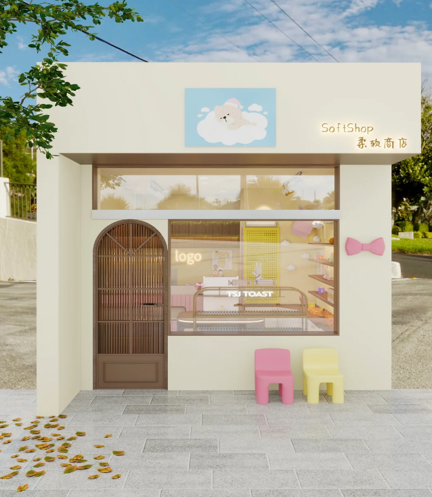
For any street-side small shop, the front facade makes or breaks random walk-in traffic, so we put a ton of thought into this part first. We coated all exterior walls with matte cream beige paint. It’s way less likely to show scuffs and ugly glare compared to plain stark white walls. We fitted one huge floor-to-ceiling glass window across the whole front, so people walking past can peek all the cute doll displays without even stepping inside. More often than not, that quick glimpse is enough to make strangers wander in out of curiosity.
Our front door is an arched dark brown wooden slat design. Curved lines soften the boxy, rigid shape of the whole building, and the natural wood grain adds a gentle retro touch to all the pale walls. Once the sun goes down, warm light from inside seeps through the wooden slats, and the whole front feels cozy after dark.We skipped bulky heavy sign letters and split the branding into two simple pieces. Up above the door hangs a light blue backlit poster with a sleepy little bear floating on clouds — the soft art style is easy to spot even from down the block. On the right wall, thin subtle lit letters spell out “SoftShop”, with the Chinese name “柔软商店” underneath. The glow is dim and gentle, never harsh on people’s eyes.
We added a simple 3D pink bow stuck to the right wall as a tiny decor accent, and honestly it’s one of the most photographed spots in the whole shop. Almost every customer stops to take a pic next to it right after they walk through the door.
Out front, we laid grey non-slip tiles on the pavement, scattered a handful of fake fallen leaves to add a seasonal touch, and set out one pink and one pale yellow tiny kid-sized chair. Girls walking by will naturally pause to sit and take photos, which means they post free content for the shop on social media. It cuts down so much money we’d otherwise drop on paid local ads.
Breaking Down Every Interior Functional Area
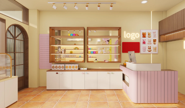
1. Cashier Station: Built for Checkout + Small Merch Display
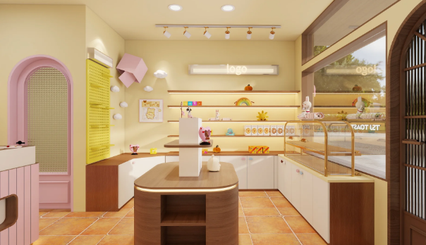
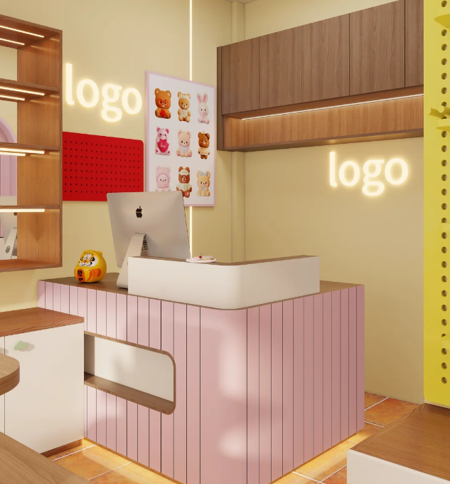
The register counter is the main focal point inside, and we debated the design for ages before locking it in. It’s covered in vertical blush pink slat panels with smooth rounded white trim. Every single edge is curved, so even little kids running around won’t bump and hurt themselves. The countertop uses solid natural wood — tough enough to stand constant blind box packing, receipt sorting and daily wear without easy scratches. We left an open hollow storage slot underneath the counter, perfect for stashing gift wrapping bags, ribbon, receipt rolls and spare packaging materials. All messy small supplies stay hidden away, so the countertop always looks neat and tidy.
We hung glowing logo light panels on both walls beside the register, and the soft glow never overpowers the actual toys on display. Right next to it hangs a wall poster covered in cute bear and bunny character art to lock in the shop’s sweet, gentle brand feel. We put up detachable red and yellow pegboards next to the poster too, with adjustable hooks to hang keychains, mini pendants and enamel pins. This lets us use blank wall space to stock dozens more tiny small goods, which naturally pushes up customers’ average spend.We set tiny lucky figurines and mini statues in empty little nooks on the counter. This one compact spot handles checkout, small product displays and brand presentation all at once — it works flawlessly for shops that only run 20 to 30 square meters big.
2. Main Wall Shelving: Our Core Blind Box Selling Zone
We fitted two full interior walls with double-layer solid wood display cabinets, all lined with soft warm LED light strips inside each shelf. The gentle lighting cuts harsh reflections that make blind box packaging art hard to see. The open top shelves hold full sets of blind boxes, larger figurines and fun little decor like mini pumpkins and rainbow cutouts. Closed storage cupboards sit underneath each unit, so we can tuck away all unopened bulk inventory and keep the whole space from looking cluttered.
We added a pink pegboard next to the shelving units, fitted with movable small trays and hooks to hang loose mini dolls and charms. This saves all valuable flat counter space for bigger products.
The floors are covered in warm terracotta vintage non-slip tiles. We tested six different pale tile options before landing on this one — its warm tone balances out the washed-out pale yellow walls and makes the whole room feel cozier. If anyone spills bubble tea or soda on the floor, it wipes clean in two seconds, which makes upkeep a breeze when we’ve got tons of photo-taking visitors every single day.
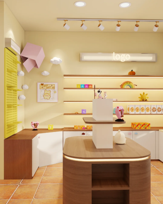
3. Central Display Island + Front Window Showcase
Right dead-center inside the shop sits a curved solid wood island stand, built with tiered stepped shelving. All our best-selling picks, limited-edition big plush dolls and brand-new blind box drops go straight here. Customers lock eyes on this unit the second they walk in, and it really helps push sales for our most popular stock. One full wall is covered in a huge bright yellow pegboard, decorated with 3D cloud cutouts and folded geometric decor to fill up blank empty wall space so it never looks bare or boring. The lit cloud decor gives off such a soft, dreamy vibe, and nearly every guest stops here to snap a full set of photos.
Along the street-facing windows, we installed gold curved glass dust-proof display cases, modeled after bakery pastry fridges. Clear glass lets passersby see our featured blind box sets clearly, while the glass keeps all stock dust-free and cuts down on how often we need to wipe every single toy. People walking outside spot our featured products instantly, which drastically bumps up how many new people walk through our doors.
How We Planned Out Lighting & Decor Style
1. Main Room Lighting: We fitted white adjustable track spotlights all along the ceiling. We can twist and turn each light to shine directly on every shelf and display stand, so every tiny detail on blind boxes and figurines stays visible without big dark shadow patches. We added hidden soft LED strip lights inside every cabinet and shelf too — once the sun sets, the whole room warms up and feels incredibly inviting.
2. Consistent Decor Theme: Every single piece in the shop, from the front window illustration, wall posters and small tabletop trinkets, sticks to the same soft bear, bunny, cloud and rainbow motif. Keeping the style uniform makes the shop stick in people’s heads, and they’re way more likely to come back and shop again.
3. Color Palette Plan: We used pale cream yellow for all base wall paint, then layered muted blush pink, soft butter yellow and natural wood brown as accent tones. We avoided every single super bright, oversaturated fluorescent shade we tested. Any photo taken inside the shop turns out clean and balanced without needing filters or editing, which makes it super easy for guests to share naturally on social media.
Real-World Business Perks
1. Built-in photo spots slash advertising costs hard
We dotted photo-friendly corners all over the shop: the front bow decor, outdoor small chairs, cloud accent wall and character poster by the register. Visitors automatically take photos and post them to Xiaohongshu, WeChat Moments and Douyin, bringing in steady local foot traffic without us spending cash on paid neighborhood ads.
2. Tiny shops can stock tons of products with smart display layout
We use every inch of space: pegboard walls, wall-mounted storage cabinets, central island counters and front window showcases all hold stock. Even a 20–30 sqm small shop can fit hundreds of blind boxes, figurines and tiny trinkets. Having such a wide product range covers every visitor’s taste and lifts overall daily revenue.
3. Unique gentle style builds steady repeat customers
Nearly every other toy shop around town goes for stark black-and-white industrial or dark edgy streetwear aesthetics. We leaned fully into soft, calming girly charm, which sets us apart from every competitor nearby. It’s super easy to build a regular crowd of students and young women who don’t have many similar shops to pick from.

Business Types This Design Fits
This layout works great for blind box collection stores, plush toy boutiques, girly stationery shops and cute cartoon dessert cafes. It fits street-front retail spots, small mall kiosks and cultural pedestrian block shops anywhere from 20 to 60 square meters.Renovation costs stay pretty manageable — most of the build only needs wall paint and custom solid wood cabinets. The construction process is straightforward, and the whole shop finishes fast. When new character toy lines come out, we only swap wall posters and small tabletop decor to refresh the space; no big expensive remodels needed, so it’s super flexible long-term.
Once we fully finished SoftShop, the daily walk-in crowd and organic social media attention we got blew all our original estimates out of the water. This layout skips all those over-the-top trendy internet-famous gimmicks, and focuses fully on three real, practical shop priorities: easy daily operation, smart merchandise display, and spots for customers to take nice photos. It’s simple to build, cheap to maintain long-term, and perfect for anyone planning to open their own pop toy boutique to use as a direct reference.
If you are going to open your own store, welcome to send inquiry to us, we are happy to provide help.