In store design, the choice of color is very important. It tells customers the store's style, atmosphere and brand concept in a unique way. The clever use of color can attract customers' attention, trigger their emotional resonance, and then influence their purchasing decisions and in-store experience.
The Influence of Warm Tones
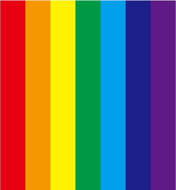
Red: Red is a color of energy and passion, symbolizing the sun. Using red elements in store design, such as red sofas or red decorative ornaments, can create a warm and vibrant atmosphere. At the same time, it can attract customers' attention, make your store more eye-catching and attractive, and stimulate customers' excitement.
When customers see red, their bodies will produce psychological changes such as faster heartbeats, making customers' minds feel more active. This emotion is very important for the store, allowing customers to better participate in the products you sell.
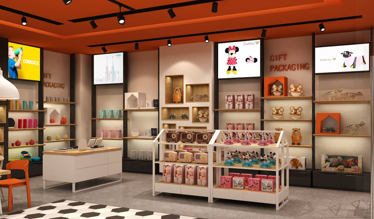
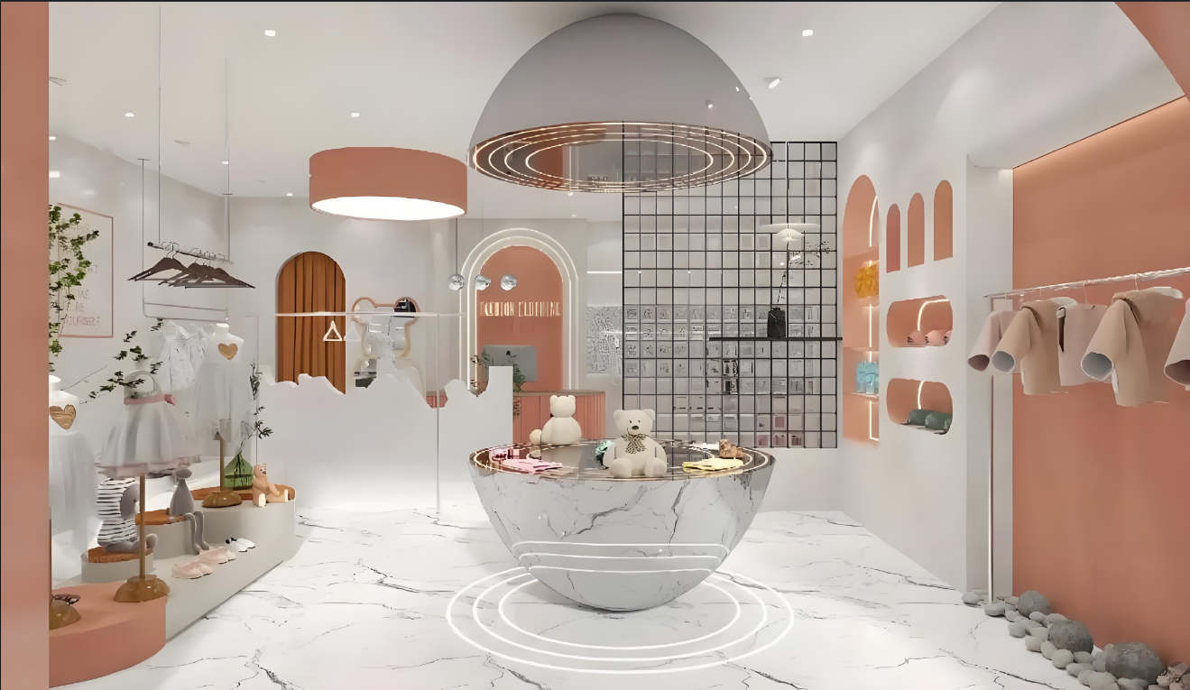
Orange: Orange has the characteristics of high brightness and can create a warm and bright atmosphere. In the store, Orange can attract people's attention, making customers more aware of this color and making your store stand out.
Orange can evoke positive and pleasant emotions in customers. For children's clothing stores, orange is a good choice. It can bring a warm feeling to children. At the same time, orange will also give people a friendly and kind feeling, making customers more willing to walk into the store.
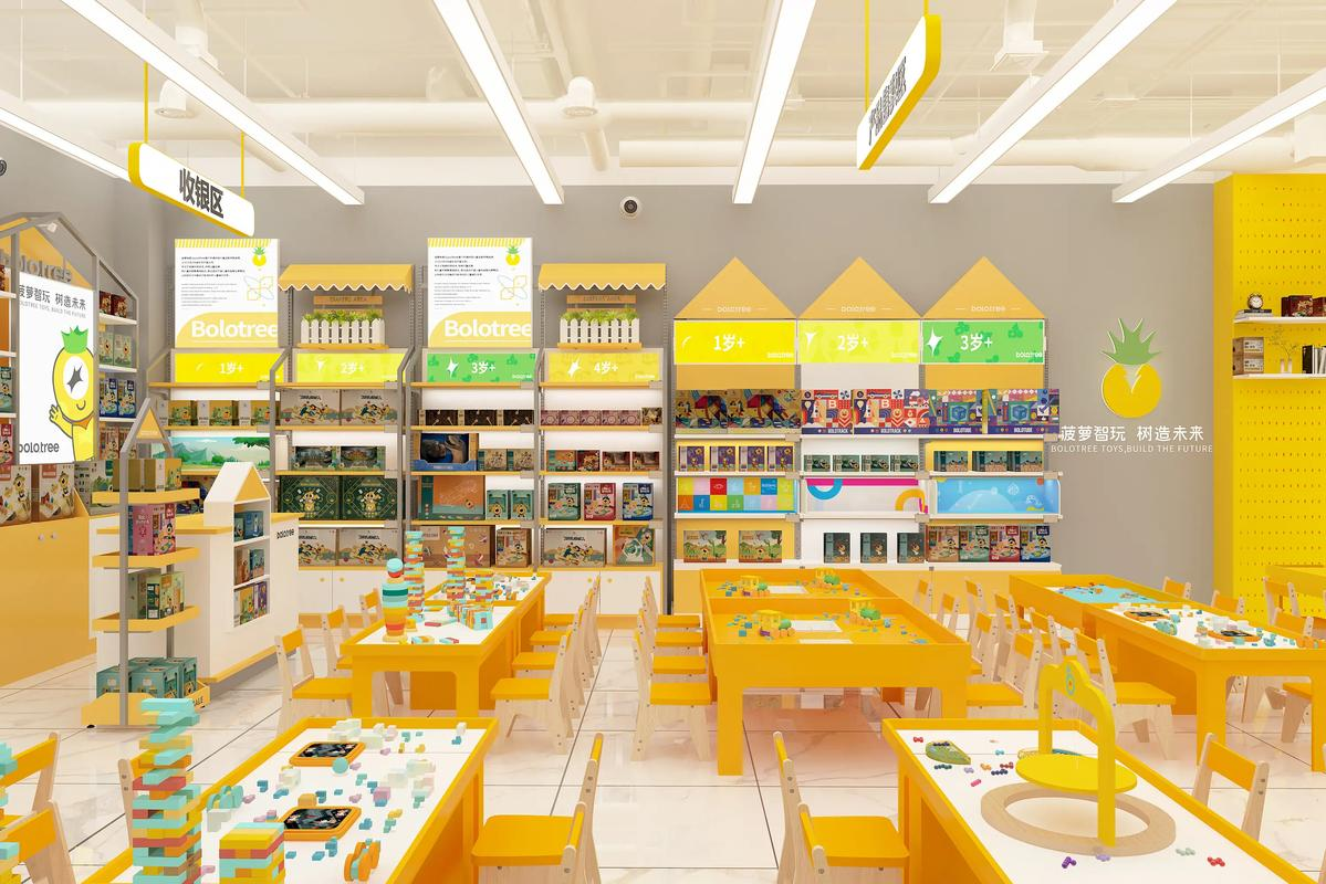
Yellow: Yellow is a bright color that can bring a sense of sunshine and hope. In store design, yellow decorative elements, yellow display racks, etc. can make the store appear more open and transparent. For example, a children's toy store uses yellow as one of the main colors, which will make the store full of childlike fun and vitality, giving people a cheerful atmosphere.
Yellow can enhance the mood of customers and make them feel optimistic and confident. This emotion helps customers stay in the store longer and are more willing to explore the goods or services in the store. In addition, yellow can stimulate the brain's thinking activities, so in some creative stores or bookstores, the appropriate use of yellow can stimulate customers' creativity.
The Influence of Cool Colors
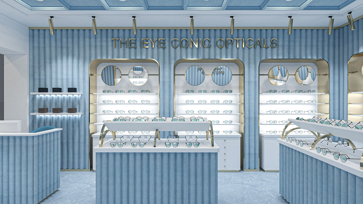
Blue: Blue gives people a calm and steady feeling. In store design, blue walls or blue decorative details can create a tranquil and professional atmosphere. For example, a technology product store using blue as the main color will make customers feel that the store is very technological and professional, and the products are more trustworthy.
Blue can relax customers and reduce tension. Using this color in an eyewear store can also make your glasses display more eye-catching. In addition, the use of blue in the store's door head will increase the probability of customers walking in.
Green: Green represents nature, vitality and health. In store design, a large number of green plants or green decorative elements, such as green walls, green display cabinets, etc., can create a fresh and natural atmosphere. For example, an organic food store uses green as the main color, which allows customers to intuitively feel the naturalness and health of the products in the store.
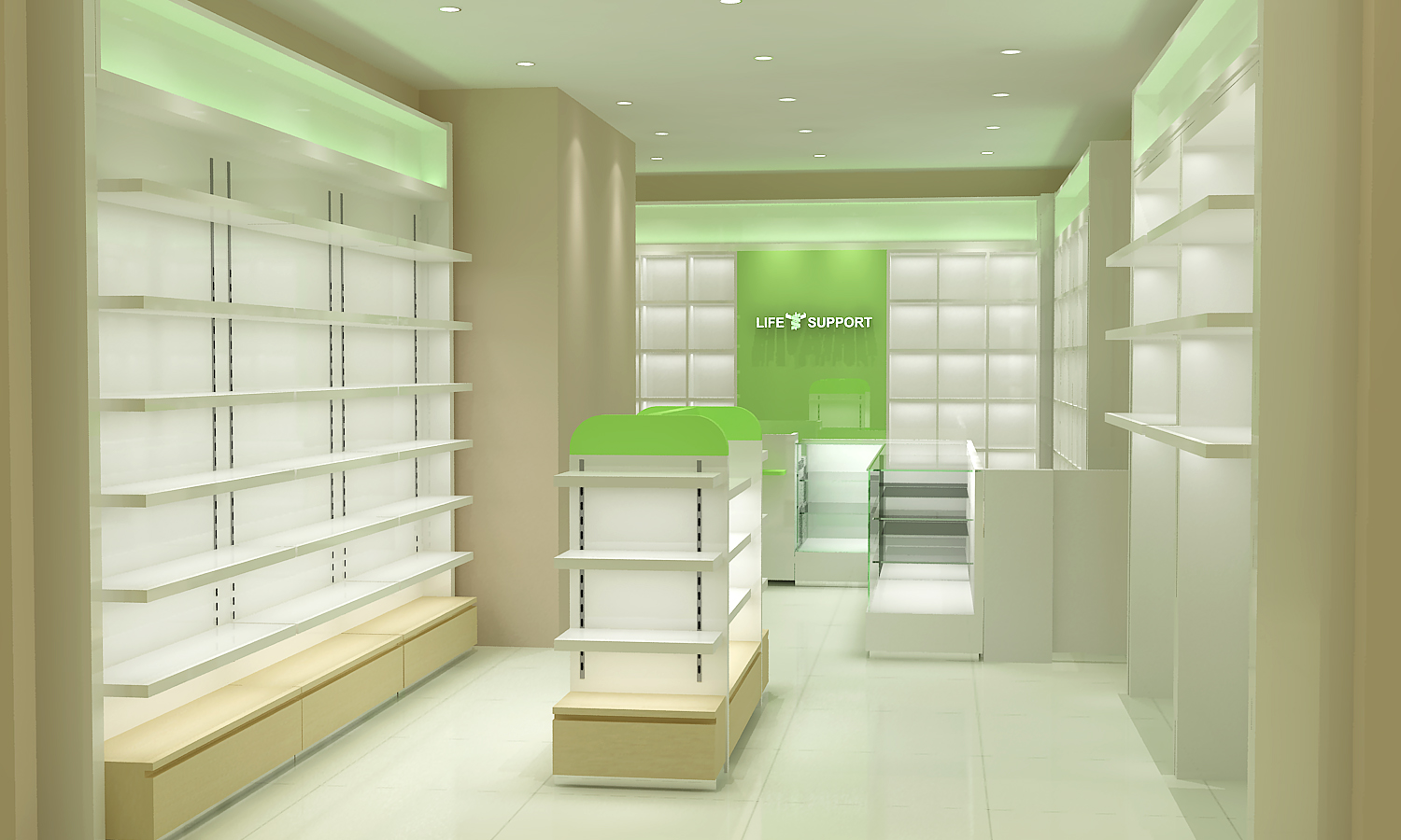
Green can make people feel calm and relaxed, and reduce visual fatigue. It can also convey an environmentally friendly and sustainable concept, attracting customers who pay attention to health and environmental protection. You can choose this color in your pharmacy to give customers the impression that your pharmacy sells green and healthy medicines. In this way, you can increase the advantages and competitiveness of your store.
The Influence of Neutral Tones
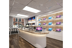
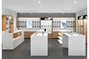
White: White is a pure and versatile color, giving people a clean and bright feeling. In store design, white walls, white ceilings or white tables and chairs can create a clean atmosphere and make the space appear more spacious and transparent.
White can make people's emotions calmer and more peaceful, and also give people a sense of elegance and purity. It is a versatile color that can be well matched with various other colors to make the overall style of the store more harmonious.
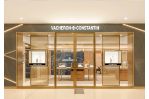
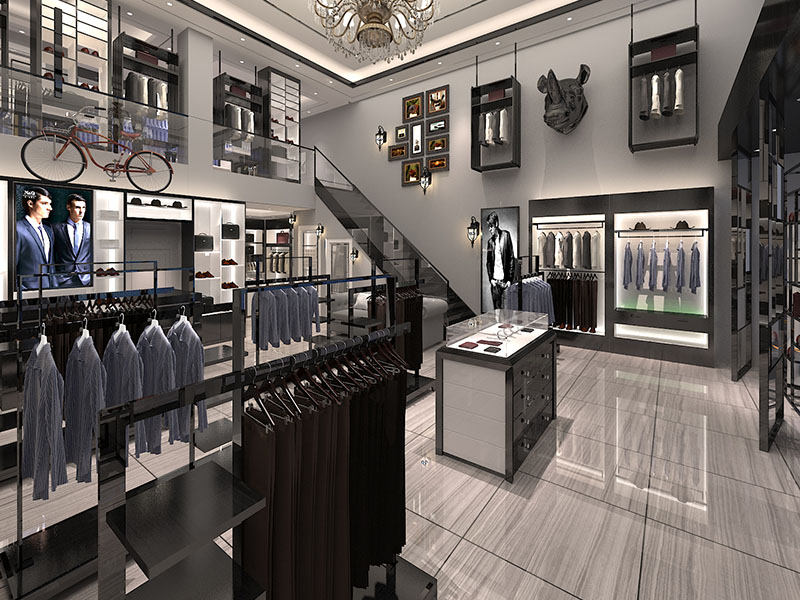
Black: Black is a mysterious and noble color. In store design, black elements can increase the elegance of the store and create a low-key and luxurious atmosphere. If used properly, black can also play a role in emphasizing and highlighting. For example, using black photo frames to display artworks can make the works more eye-catching.
Black can give people a sense of calmness and solemnity, and is more suitable for some formal occasions. For example, the large-scale use of black in men's suit stores can enhance the charm of clothes. Black display racks, hangers, and booths can increase the texture and charm of suits. Let customers be more assured of the quality of the clothes in your store.
Gray: Gray is a neutral and peaceful color between black and white. It is a fashionable color. Gray can bring you a dual feeling. Gray can create a soft and warm atmosphere, and at the same time, gray also has a steady and deep feeling.
If you pursue a fashionable style, you can consider using a gray sofa or gray carpet as the background color, and match it with other colors to make the color of the entire space more harmonious. Gray can keep people's emotions stable. It is not as depressing as black, nor as bright and dazzling as white. It gives people a quiet and restrained feeling, which is suitable for creating a low-key and quality store atmosphere.