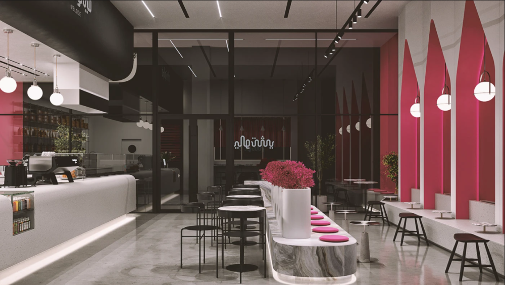
Upon entering the interior of the restaurant, the first impression is the seamless continuation of the storefront visual effect: a color scheme of rose red, pure black and off-white runs through the entire space, creating a coherent visual memory for customers from the storefront to the interior. The wall is based on a base color of off-white, with pure black panels used as accents in some areas. Rose red is used as an accent color in details such as the background wall, soft furnishings, and lighting. This not only avoids excessive color but also strengthens the brand's visual symbol, making the brand's memory points more profound for customers.

Color theme design
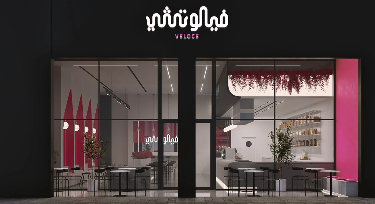
The entire restaurant's storefront features a core color scheme of rose red, pure black and off-white, breaking the dullness of traditional restaurant storefronts. Rose red is used as the main visual color, with a high saturation tone, which has a strong visual impact. It not only meets the aesthetic preferences of the young consumer group but also can quickly penetrate the visual distractions of the business district. Pure black serves as the base color and line color, playing a stabilizing role to prevent the rose red from being overly flamboyant, while highlighting the refinement of the brand logo. As a transitional color, off-white neutralizes the sharpness of the color, making the overall visual effect more layered.
Storefront design
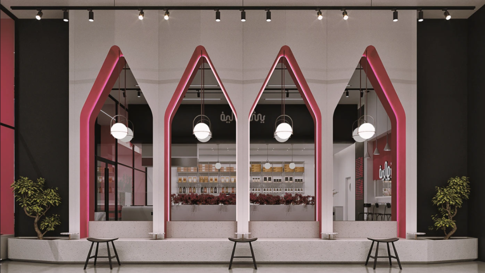
The core shape of the storefront abandons the traditional rectangular or arc-shaped design, adopting a pointed geometric shape combined with a modular splicing design. The brand logo area above the storefront is based on a pure black matte board, complemented by white three-dimensional illuminated characters and the rose-red "VELOCE" English logo below. The font is a simple sans-serif type, which is clear, easy to read and has a modern feel. It not only ensures recognition from 10 meters away but also enhances the brand's international tone.
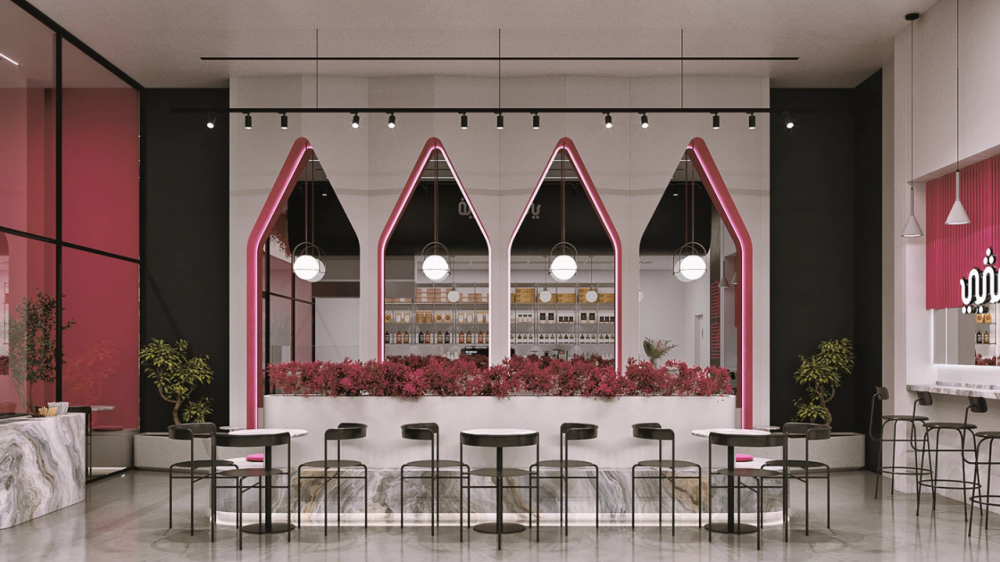
The core display area below the logo features four symmetrical pointed-top arched designs. The edges of the designs are outlined with rose red ribbons, and white spherical chandeliers are embedded inside. The design inspiration is drawn from the deconstructionist style of modern architecture, breaking the monotony of conventional storefronts. Each group of pointed roof designs is not solid and enclosed but made of transparent glass, which not only ensures the lighting of the storefront but also allows a faint glimpse of the interior decoration style, creating a visual progression of "having a shape from the outside and layers from the inside".
Material production
The selection of materials for the restaurant's storefront takes into account both aesthetics and practicality: the base is made of micro cement boards, which have a fine texture, are dirt-resistant and easy to clean, and are suitable for the high-frequency usage needs of commercial Spaces. The shape frame and logo frame are made of metal and treated with matte finish to avoid dazzling reflections and enhance the texture at the same time. The glass part is made of ultra-clear tempered glass, ensuring transparency while enhancing safety.
Lighting design is the "finishing touch" of the storefront. The brand logo adopts a backlit design with uniform and soft light, enhancing its recognizability at night. The rose red light band at the edge of the pointed top design is installed in an embedded manner, allowing light to seep through from the inner side of the design, creating a hazy atmosphere. The top track spotlights precisely illuminate the signs and shapes, enhancing the layers of light and shadow. The overall lighting layout follows the principle of "key lighting + ambient lighting", which not only ensures the clear identification of the storefront but also creates a high-end visual texture through light and shadow, making it an "eye-catching lighthouse" in the business district during night business hours.
Bar counter design
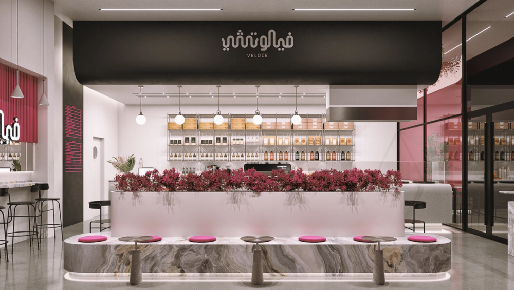
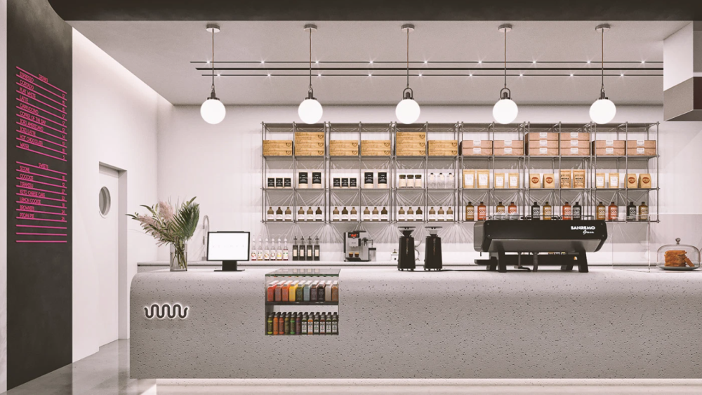
The countertop of the bar counter is made of terrazzo material, with a fine granular texture on the surface. It is wear-resistant, stain-resistant and heat-resistant, perfectly meeting the high-frequency usage requirements of the catering scene. The edge and bottom of the countertop are made of marble, with natural and smooth textures, enhancing the high-end feel of the bar counter. The interior of the bar counter adopts a steel structure frame, ensuring stability while reserving sufficient storage space for storing beverages, utensils, food ingredients, etc., achieving the maximization of space utilization.
The design of the bar counter continues the geometric language of the storefront, presenting an overall form that combines arcs and straight lines. This not only ensures the smoothness of the staff's operation routes but also adds a sense of visual layering. An open display compartment is reserved in the middle of the bar counter, displaying various seasoning bottles and jars as well as beverage ingredients. This not only makes it convenient for employees to take them but also serves as a visual decoration of the space, allowing customers to directly experience the quality of the ingredients in the store.
Background wall design
The core background wall behind the bar counter is the visual core of the entire space. The wall surface is made of off-white panels as the base, with pure black decorative panels hung above. The white three-dimensional brand logo is embedded on the panel surface, forming a unified visual system with the storefront logo. On both sides of the background wall, rose red vertical stripes are used for decoration, which echoes the rose red color scheme of the storefront. At the same time, the stretching effect of the vertical lines enhances the visual height of the space.
In the middle area of the background wall, an open metal shelving design is adopted. The shelving is made of silver metal with simple and clean lines, which is in line with the minimalist style of the space. On the shelves, various wine bottles, beverage ingredients and baked goods are neatly displayed. The combination of wooden storage boxes and glass jars not only ensures the neatness of the display but also enhances the visual texture through the contrast of materials. The lighting design of the shelves adopts recessed spotlights, precisely illuminating the displayed items, making the food and beverages become the "flowing decoration" of the space. This not only enhances the dining attribute of the space but also makes the background wall more life-like.
Dining chair design
The layout of the dining tables follows the principle of "smooth flow + diverse scenarios" : Tall dining tables are set up beside the bar counter, suitable for single-person dining and simple meal scenarios, and also facilitate interaction between customers and staff. The dining area is equipped with round and square dining tables. The round tables are suitable for group meals, while the square ones are ideal for double dining. The flexible layout caters to different customer groups.
The dining chairs in the dining area are mainly made of black metal frames, with simple and clean lines, in line with the modern minimalist style. The seats are made of black leather, which is soft in texture and easy to clean, balancing comfort and practicality. The design of the dining chairs is simple yet not monotonous. The backrest adopts an arc-shaped design, which conforms to ergonomics and enhances the comfort of dining. The edges of the cushions of some dining chairs are decorated with rose red accents, which echo the core color scheme of the space and make the details more design-oriented.