In the wave of fashion and beauty, cosmetics stores are no longer merely places for selling products; they have become aesthetic spaces that convey brand concepts and shape unique experiences. The design of an outstanding cosmetics store is like a meticulously crafted piece of art. From every aspect of space planning to the selection of materials, it contains the designer's ingenuity and craftsmanship. Today, we will step into this distinctive cosmetics store to explore the mysteries behind its design and appreciate how it finds the perfect balance between functionality and beauty.
Rational Space Layout
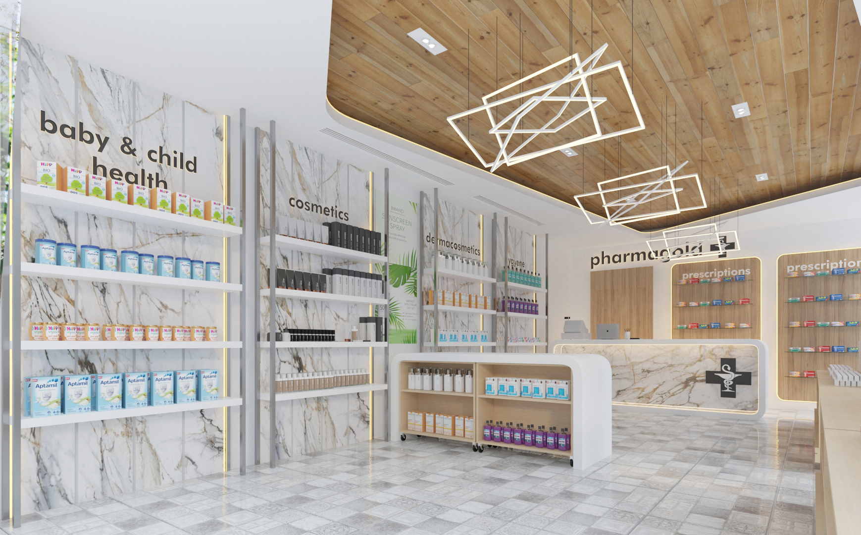
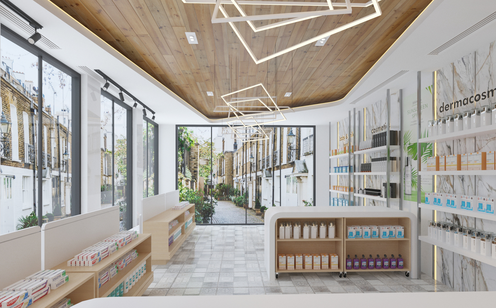
Upon entering this cosmetics store, the first thing you feel is its spacious and smooth open space design. The interior is centered around a central aisle, with display areas and service counters symmetrically distributed on both sides. This layout forms a clear customer flow path, allowing customers to naturally and effortlessly move through various areas without feeling cramped. Starting from the entrance, the open space design has no excessive partitions, giving a broad and transparent first impression and facilitating free entry and browsing for customers. In the display areas on both sides, the products are clearly categorized into multiple sections. Each section has clear and eye-catching signs above, enabling customers to quickly locate the product categories they need. This well-organized layout not only improves shopping efficiency but also helps with the management and display of goods. Additionally, there are movable display racks in the store, which add flexibility to the displays. The store can adjust the positions and contents of the display racks at any time according to promotional activities, new product launches, or seasonal changes, keeping the layout fresh and adaptable. The cashier and service area are set near the entrance with a wide view, making it convenient for staff to provide services such as checkout and consultation, and effectively manage the store, paying attention to all areas.
Harmonious Color and Material Combination
The combination of colors and materials is a major highlight in the design of this cosmetics store, creating a unique spatial atmosphere together. In terms of color use, pure white is the main color tone. The white walls, display shelves, and floor echo each other, establishing a simple, clean, and bright overall ambiance, which highly aligns with the cosmetics store's pursuit of a pure and professional brand image. Meanwhile, the wooden ceiling adds a warm and natural touch to the space, effectively neutralizing the possible coldness brought by the white color, making the entire space appear more friendly and pleasant. In addition, the marble-textured counters and some wall decorations, with their gray-white tones and unique textures, bring a high-end, elegant temperament to the space. The combination of these three colors creates a visual experience that is both comfortable and upscale, allowing customers to feel pleasure and relaxation during their shopping.
As for material selection, the walls use imitation marble panels with natural and realistic textures and delicate quality, greatly enhancing the grade and sense of quality of the space. The wooden ceiling not only brings a natural breath but also improves the acoustic effects of the space to some extent, reducing noise reflection and creating a relatively quiet and comfortable shopping environment for customers. The display shelves are mostly white metal frames paired with white shelves, featuring a simple and modern design style that is both sturdy and durable, and easy to showcase products, highlighting their features and beauty.
Unique and Ingenious Lighting Design
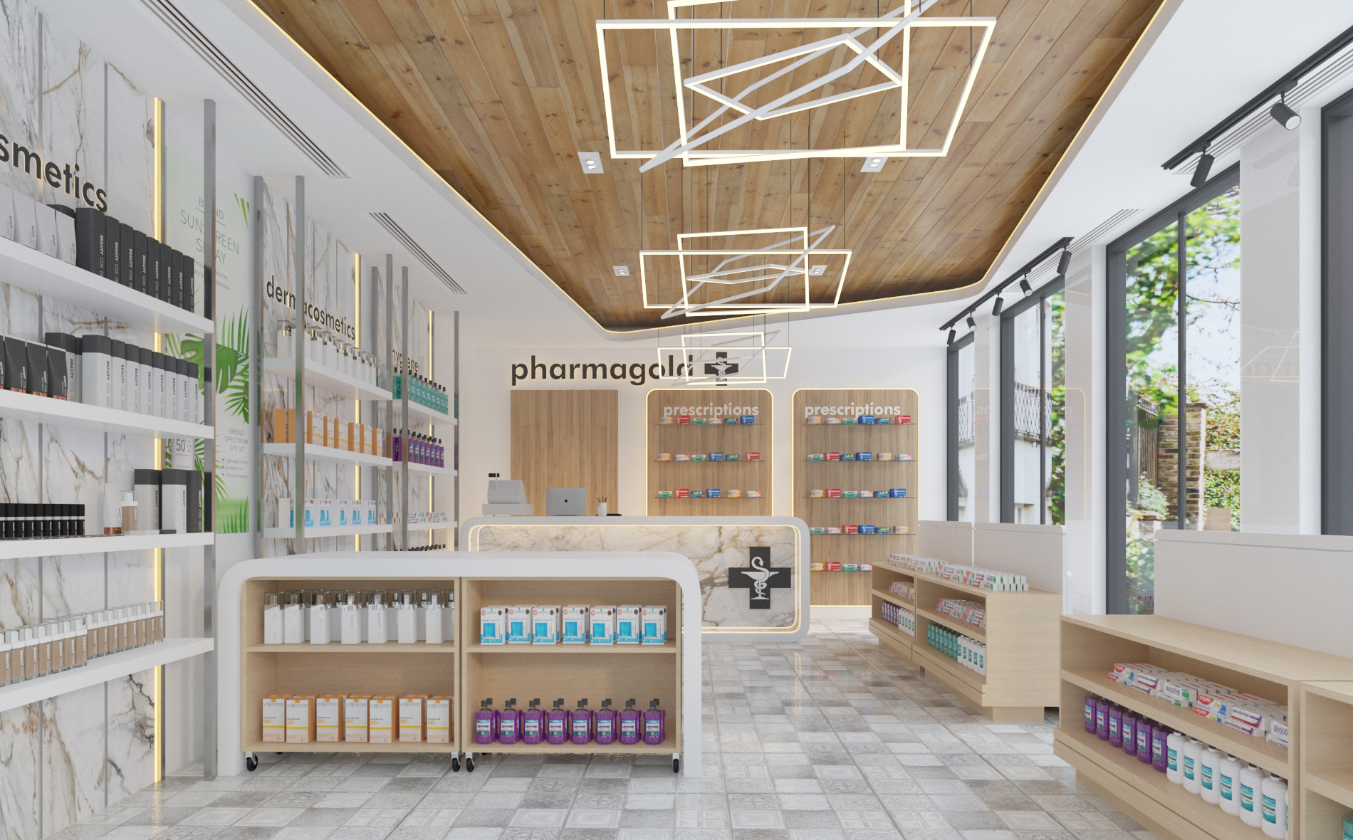
Lighting design plays a crucial role in this cosmetics store, adding rich layers of depth and ambiance to the space through multi-level lighting methods. Basic lighting is provided by evenly distributed recessed downlights on the ceiling, ensuring the brightness of the entire store space so that customers can clearly see the layout and products. Irregular geometric-shaped chandeliers become visual focal points in the space. They not only have unique shapes with strong decorative qualities that attract customers' attention but also provide focused light for key areas below, highlighting the product displays. In addition, hidden light strips carefully set along the edges of the display shelves are a clever detail. These light strips illuminate the products, fully showcasing their color and texture, making it easier for customers to observe and select products intuitively. Moreover, the brightness and color temperature of the lights in different areas may have been carefully designed and adjusted. For example, in the cosmetics display area, the lighting may be brighter and have better color rendering to highlight the color and texture of the cosmetics; while in rest areas or aisles, softer lighting is maintained to create a comfortable and relaxing atmosphere.
Rich and Orderly Display Exhibition
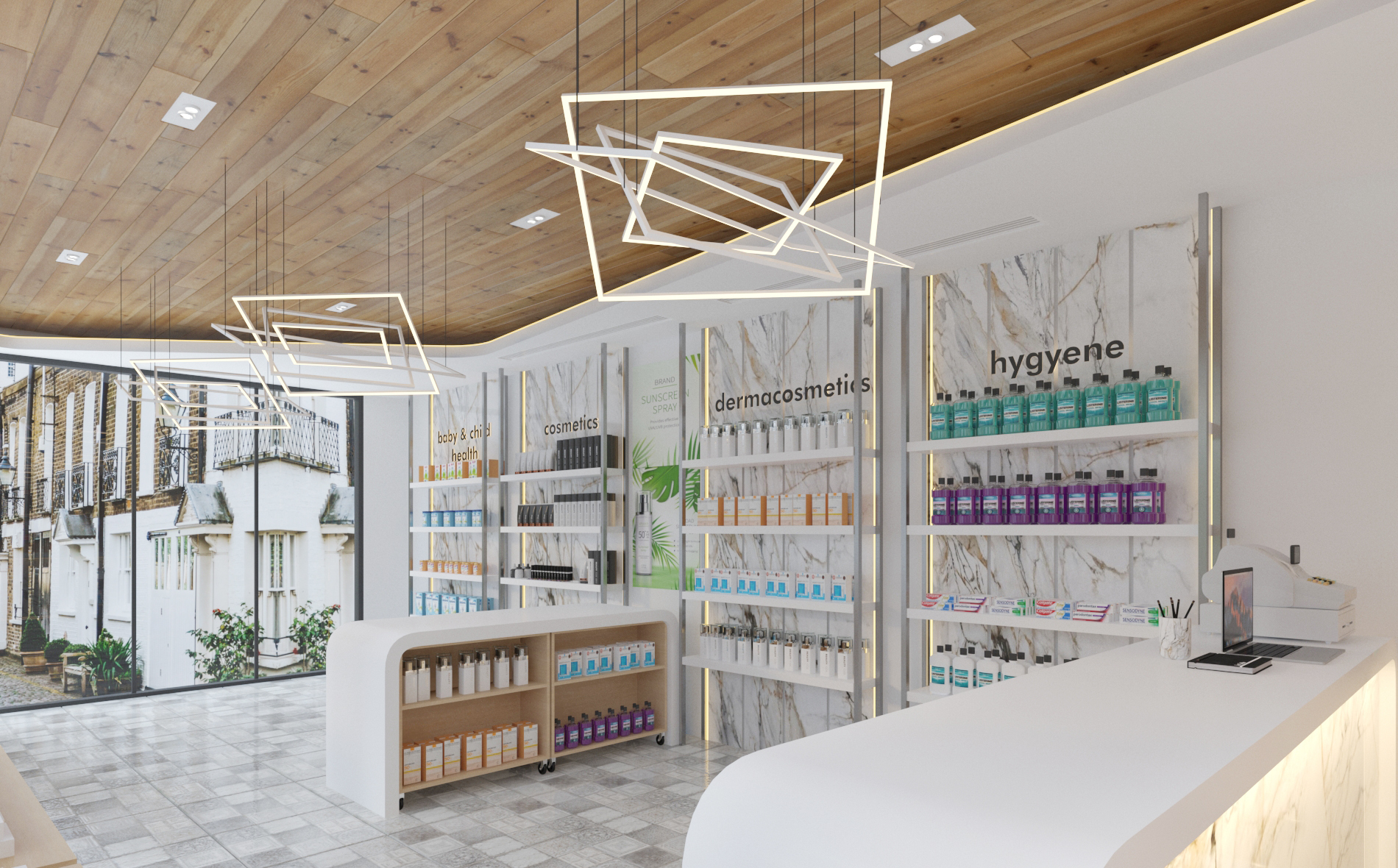
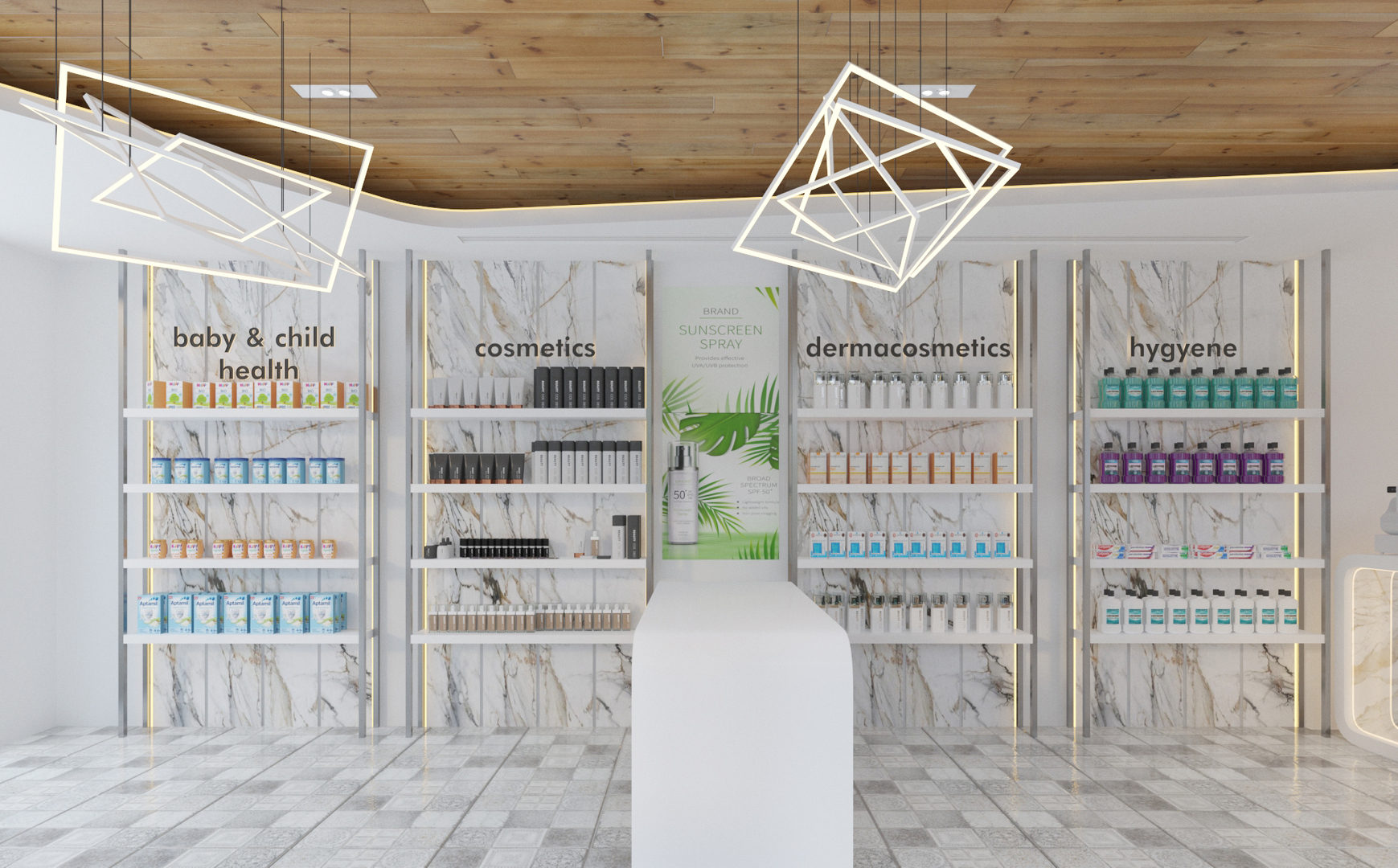
Display exhibition is an important part for cosmetics stores to showcase products to customers, and this store also excels in this regard. In terms of category display, products are strictly divided according to categories, with clear signs above each area, such as "baby & child health" "cosmetics", etc. This clear classification allows customers to quickly find the product categories they are interested in, saving shopping time. At the same time, products within each category are also orderly arranged. Taking the maternal and child health product area as an example, milk powder, complementary food, and care products are displayed in layers according to different functions and usage scenarios; in the cosmetics area, skincare products and makeup are arranged according to brands, efficacy, or usage order, facilitating comparison and selection by customers. In terms of display methods, diversified means are adopted. Wall-mounted fixed display shelves are one of the main display carriers, making full use of wall space to showcase a large number of regular products. Movable display racks set in the middle add flexibility and interest to the displays, allowing the store to adjust their positions and contents as needed. Some products are also displayed in layered and zoned arrangements, creating a sense of depth and richness. For example, when displaying lipstick and other makeup products, popular shades and new products may be placed in more prominent positions and displayed in layers, allowing customers to easily see the different options.
Meticulous Detail Design
Everywhere Besides the main aspects mentioned above, this cosmetics store does not neglect detail design either, reflecting concern for customer experience everywhere. In terms of signage and guidance, the sign system inside the store is designed simply and clearly, using fonts and colors that coordinate with the overall style. In addition to the large signs above each area, small directional signs are also set at corners, entrances of passageways, etc., further guiding customers to quickly find their target areas. These signs not only play a functional guiding role but also become part of the store's decoration due to their beautiful design, complementing the overall environment harmoniously.
In conclusion, this cosmetics store takes a smooth and rational space layout as its framework, harmonious and elegant color and material combination as its skin, unique and ingenious lighting design as its eyes, rich and orderly display exhibition as its language, meticulous detail design everywhere as its soul, trend-following technological elements as its wings, environmental sustainability concept as its foundation, and warm and natural soft furnishings as its gown. Every design element is not isolated; they blend and complement each other, jointly constructing a space that satisfies customers' shopping needs, brings pleasant experiences, and highlights brand characteristics.