
check out over 200+


$10,800.00
Availability:
In stock
SKU
HKFICK-1128
- New Custom Design
- High Quality
- Easy Installation
- Custom 3D Design
Built-To-Order
Ships in approximately 5 business days; excludes artwork approval processing time of 2 business days
Complimentary Artwork Review
For a worry-free purchase, one of our artwork specialists will review your submission prior to printing to ensure crisp text and sharp imagery on your final product.
In the field of commercial space design, a successful kiosk design must not only meet functional needs but also have a unique visual appeal to stand out in the fiercely competitive market. This pink ice cream kiosk design shows its uniqueness in terms of overall style positioning and the use of detailed elements.
Color application
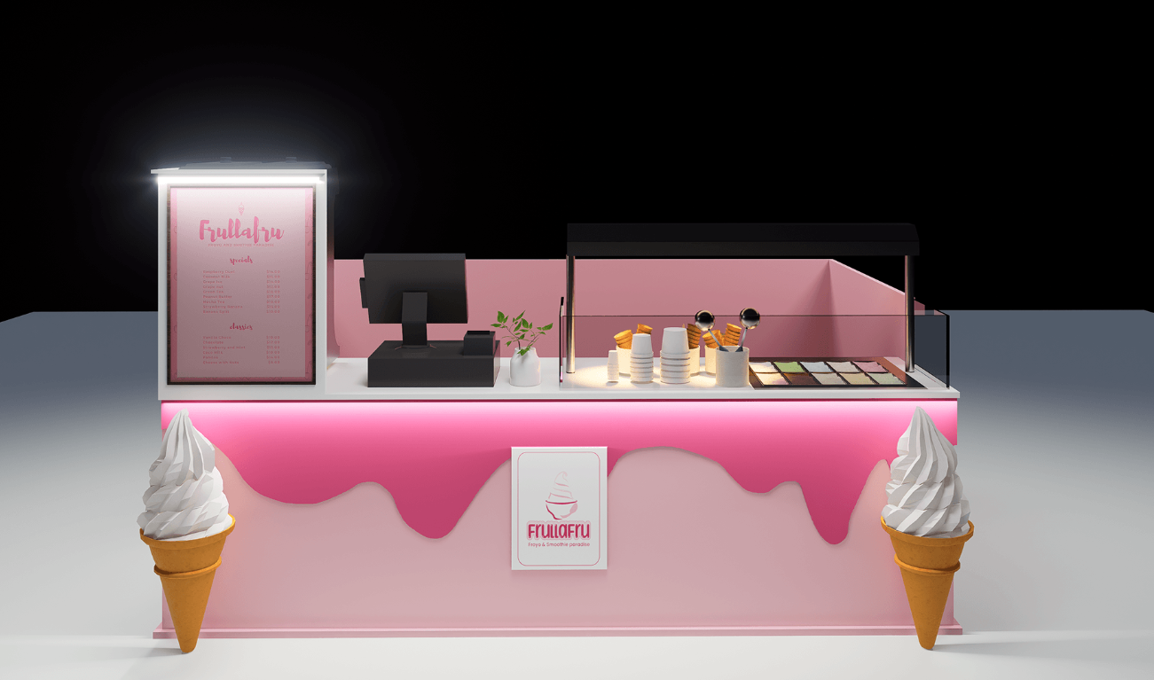
- The stall is dominated by pink, and this color choice is very strategic. Pink is usually associated with emotions such as sweetness, romance, and cuteness, which is highly consistent with ice cream, a product full of sweetness, and can quickly attract the attention of consumers, especially young women and children.
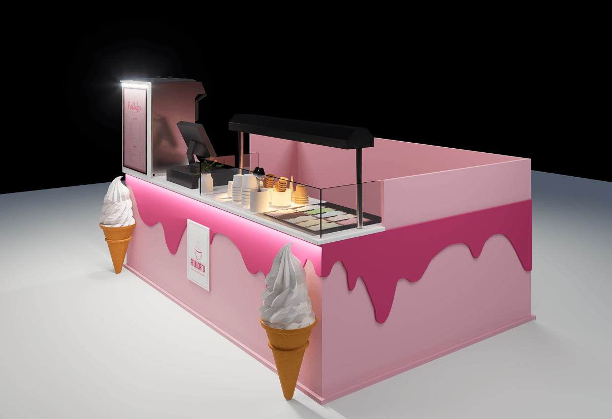
- The light pink main body is matched with the dark pink "melting" effect decoration to form a color layer, which increases the visual interest, as if the ice cream is slowly melting, vividly arousing people's appetite.
Modeling design
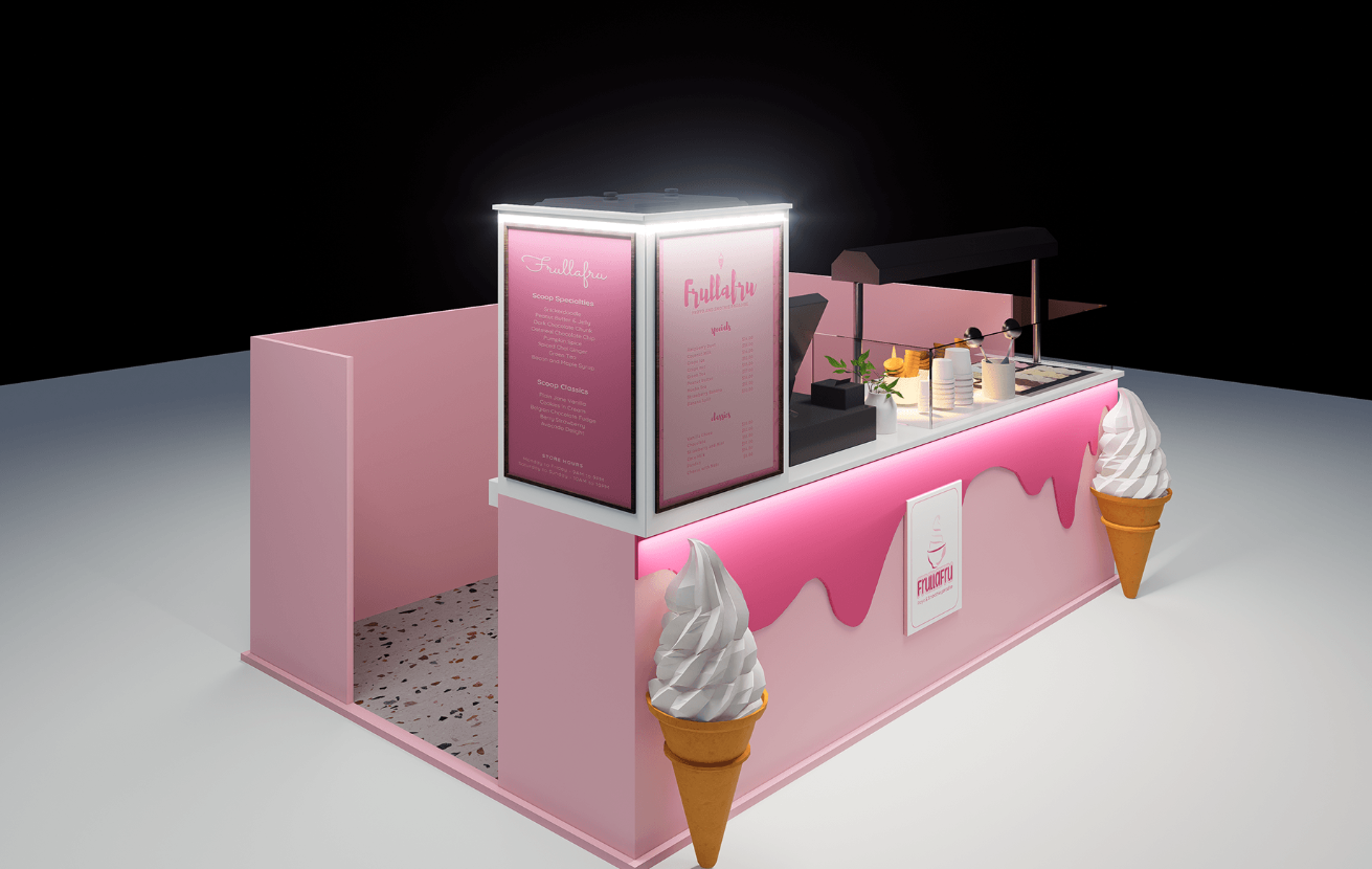
- The kiosk is simple and generous, with an open layout as a whole. The huge ice cream models on the left and right sides of the front are not only eye-catching brand logos but also intuitive displays of the products sold, which strengthen consumers' cognition of the stall's business categories.
- The menu display board above the stall adopts the form of a three-dimensional light box, which not only ensures that the product information can be displayed in different lighting environments but also adds a sense of fashion and modernity to the entire stall.
Functional zoning
- From a functional perspective, the design of the stall is very reasonable. The cashier area is on the left, which is convenient for customers to order and check out, and is close to the menu so that consumers can check their choices before placing an order.
- The operation area is in the middle, where various equipment and raw materials needed to make ice cream are placed. The open operation space allows customers to see the ice cream production process, which increases the transparency and trust of consumption.
- The display area on the right is protected by a glass cover and displays ice cream samples of different flavors, which is convenient for customers to choose intuitively.
Brand element integration
- The "Frullafru" brand logo appears many times on the stall, from the front logo to the brand name on the menu board, which strengthens the brand image and helps to improve brand recognition.
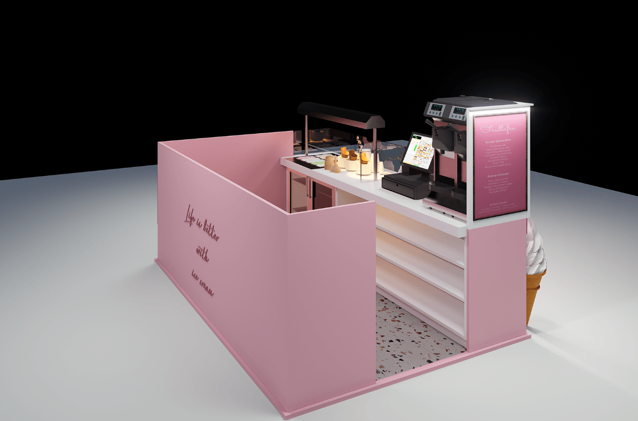
- The text slogan "Life is better with ice cream" on the internal wall not only conveys the brand concept but also creates a warm and pleasant atmosphere for the entire stall so that consumers can feel the attitude toward life conveyed by the brand while buying ice cream.
Conclusion
This pink ice cream stand design creates a beautiful and practical commercial space through clever color matching, reasonable functional division, distinctive brand element integration, and exquisite detail processing, which can effectively attract consumers and enhance brand influence and product sales.