check out over 200+


$7,800.00
Availability:
In stock
SKU
HKFICK-1127
- New Custom Design
- High Quality
- Easy Installation
- Custom 3D Design
Built-To-Order
Ships in approximately 5 business days; excludes artwork approval processing time of 2 business days
Complimentary Artwork Review
For a worry-free purchase, one of our artwork specialists will review your submission prior to printing to ensure crisp text and sharp imagery on your final product.
Design and Color Scheme
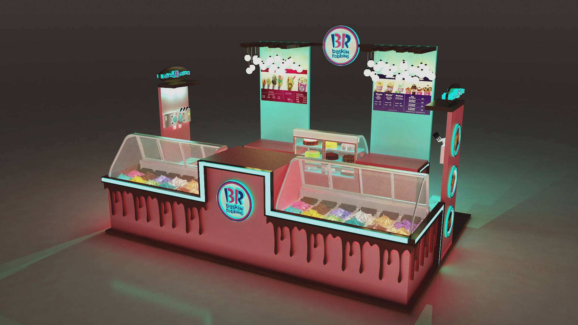
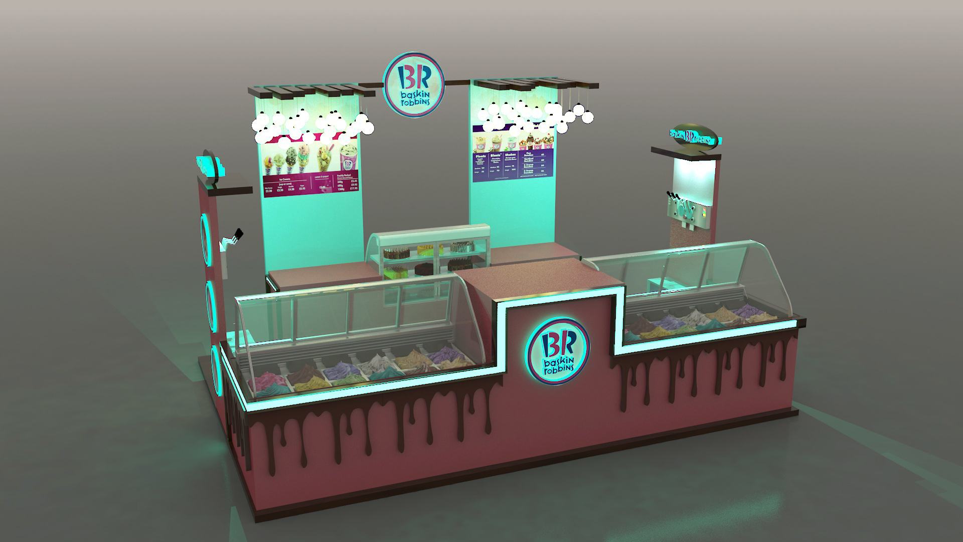
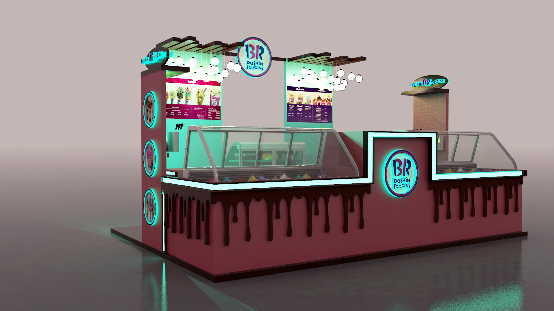
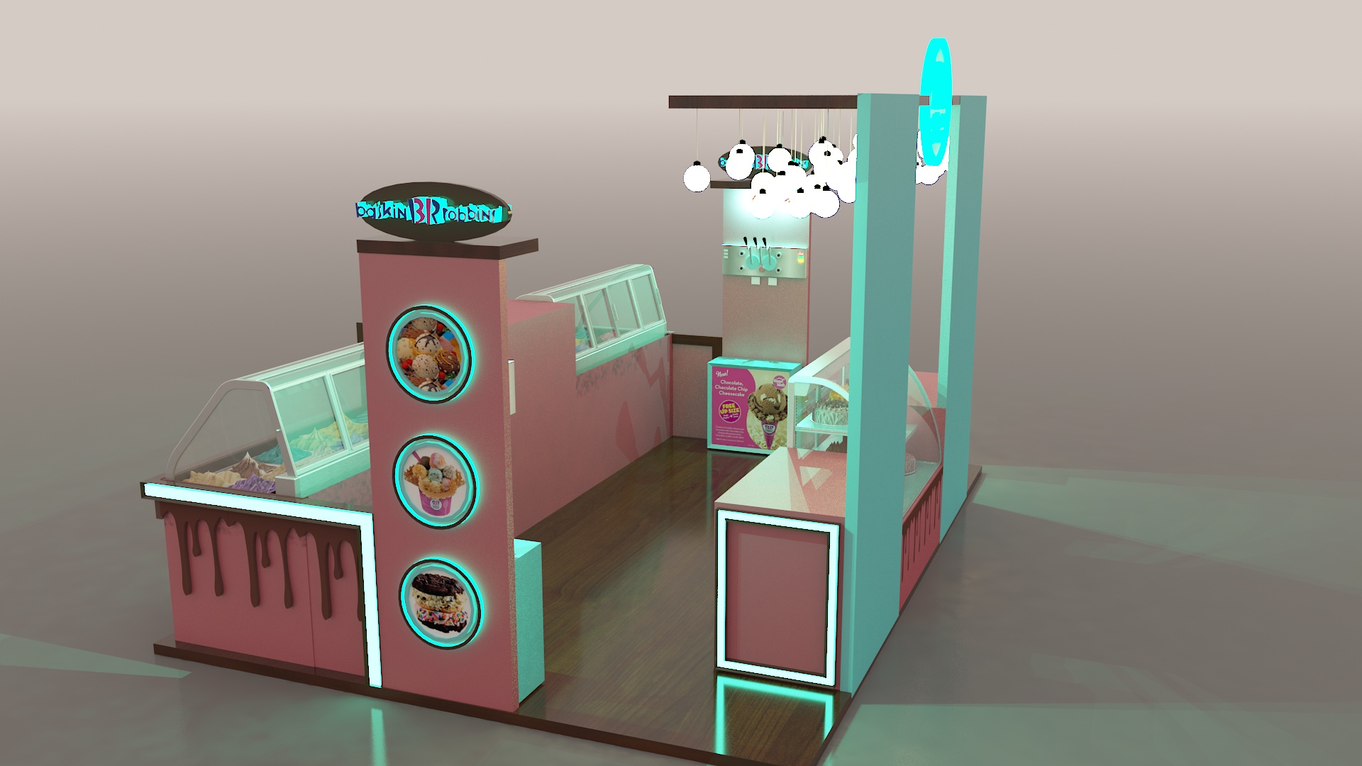
The ice cream kiosk, branded with "Baskin Robbins", features a visually appealing design. The dominant colors are a combination of pink and turquoise, creating a vibrant and inviting look. The pink sections, with an artistic chocolate-drip effect, add a touch of deliciousness and playfulness. The turquoise elements provide a fresh contrast, making the kiosk stand out.
Display and Layout
There are multiple glass-covered display cases, which are crucial for showcasing the wide variety of ice cream flavors. These cases are well-positioned at customer-facing sides, allowing easy viewing of the colorful ice cream selections. In addition to the ice cream displays, there are circular illuminated panels on the vertical structures, showing mouth-watering images of ice cream treats. Above the main counter, there are hanging spherical lights that not only provide adequate illumination but also add to the aesthetic appeal.
Branding Elements
The "Baskin Robbins" logo is prominently displayed at several key locations, such as the top of the kiosk and on the front panels. This repetition helps in reinforcing brand recognition. There are also menu boards within the kiosk, presenting the available products and their prices clearly. The overall branding is consistent throughout the kiosk, from the logo to the color scheme that is in line with the brand's identity.
Functionality
The layout of the kiosk seems to be designed for efficient service. The different sections for ice cream display, preparation, and customer interaction are clearly defined. The back area appears to have space for staff to move around and prepare the orders. With its well-thought-out design, the kiosk can attract customers, showcase the products effectively, and ensure a smooth service process.