
check out over 200+


$18,800.00
Availability:
In stock
SKU
KMRCK-1102
- Affordable price
- Custom service
- Direct factory
- High quality
Built-To-Order
Ships in approximately 5 business days; excludes artwork approval processing time of 2 business days
Complimentary Artwork Review
For a worry-free purchase, one of our artwork specialists will review your submission prior to printing to ensure crisp text and sharp imagery on your final product.
This cosmetics counter embraces an open concept, lacking obstructive walls and blending directlyinto the mall's public area. It seamlessly blends into the surroundings, lacking any harsh boundaries. The most eye-catching feature of the entire design is the sweeping curves. Look at the curved sign overhead; it harmonizes with the curves of the central island display counter, softening the harsh right angles and adding a gentle rhythm to the space.
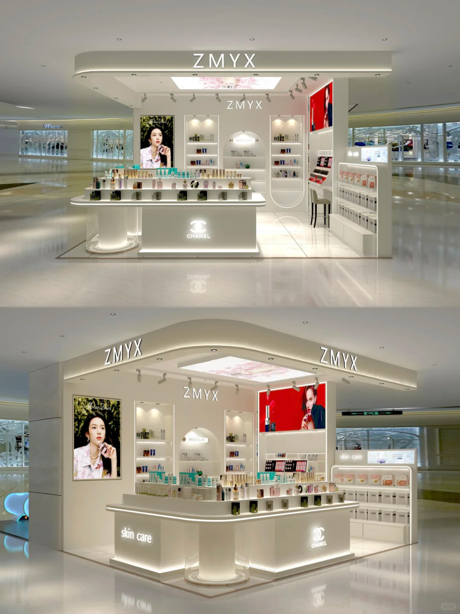
The center display counter (island counter)
The area labeled "Skincare" primarily displays basic skincare products like lotions and serums. The area with the Chanel logo, needless to say, houses Chanel collaborations or high-end products; the brand's presence immediately catches the eye. Thin light strips are hidden beneath and along the sides of the counters, giving the products a textured, premium feel. Another effect is that they make the counter appear to be floating, creating a sense of depth.
The shelves on the background wall
The shelves are layered, each at varying heights. Why? To accommodate everything from small samples to ordinary bottles and jars to beautifully packaged gift boxes—there's room for everything. Some shelves even have built-in light strips to highlight popular or newly released items, naturally drawing customers' attention. This open display makes it easy for customers to pick up items, try them out, and explore them, creating a strong sense of interaction. It perfectly aligns with the brand's message: "Great things are laid out openly, just waiting for you to try them!"
Wall Displays (Wall Panels) on Both Sides
On one side of the wall are oversized light boxes, while on the other are recessed display shelves. The images within the light boxes are exquisitely designed: the model on the left creates a refreshing and comfortable skincare atmosphere; the one on the right plays with the allure of makeup, embodying the brand's tone through the allure of the figure itself. The small compartments embedded in the wall are exceptionally intricately crafted, specifically designed to hold pricey limited editions or high-end items. This combination creates a clear logic for the wall display: it provides an eye-catching focal point while appearing to offer a rich and comprehensive selection.
If you plan to build a cosmetics kiosk, my suggestion is that you can build one like this. Because the kiosk with a roof design is a bit more popular than the traditional square-shaped one. So choosing such a design will also be beneficial to your business. One of the reasons is that we can also customize a dedicated space for you based on the products you need to display, so you don't have to worry about it not being suitable for your products.