
check out over 200+


$9,600.00
Availability:
In stock
SKU
KFDK-1027
high quality
affordable price
custom service
factory direct sell
Built-To-Order
Ships in approximately 5 business days; excludes artwork approval processing time of 2 business days
Complimentary Artwork Review
For a worry-free purchase, one of our artwork specialists will review your submission prior to printing to ensure crisp text and sharp imagery on your final product.
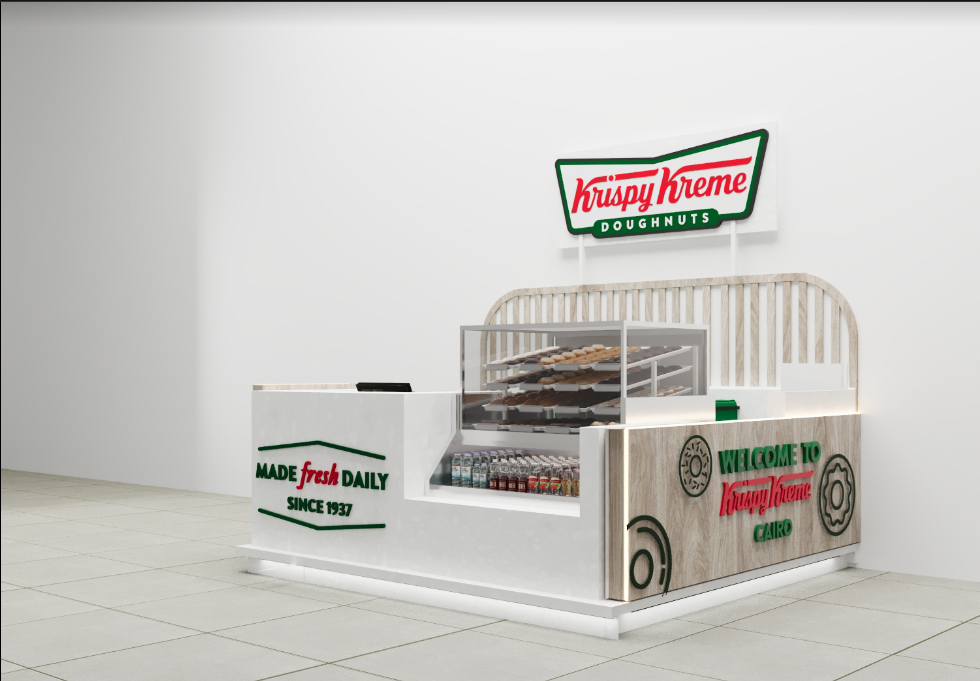
The Krispy Kreme Donuts Kiosk is a well-crafted retail space. It perfectly combines brand identity, functionality and aesthetic appeal. This design not only showcases the delicious donuts, but also creates an enticing and memorable experience for customers.
I. Brand-Logo Integration
The most striking feature of the kiosk is the prominent display of the Krispy Kreme logo. The logo is located above the kiosk with a distinctive green border and red letters, making it instantly recognizable.
This strategic placement ensures that the brand is immediately associated with the kiosk in the minds of passers-by. Below the logo, the word "Donuts" is clearly printed, leaving no doubt about the nature of the products sold here.
II. Aesthetic Appeal
- The color scheme of the kiosk is a harmonious blend of neutral and bright tones. The use of white as the main color makes the kiosk look clean, bright and hygienic, which is particularly important for a food-selling establishment.
- The wooden texture panels add a warm, natural element and create a contrast that softens the overall appearance. The combination of white and wood gives the kiosk a modern yet comfortable feel, making it suitable for a variety of shopping and public environments.
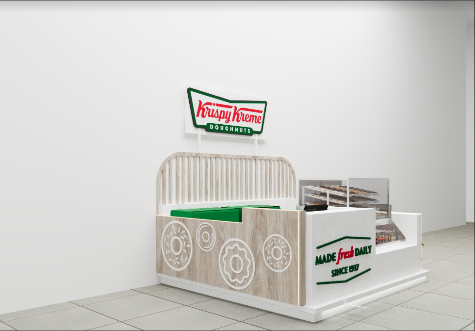
- The decorative donut-shaped patterns on the wood-textured panels are a clever design choice. Not only do they add visual interest, they also reinforce the brand’s identity as a seller of donuts. The patterns are simple yet effective, contributing to the overall aesthetic without overpowering other elements of the design.
III. Functional Layout
The layout of the kiosk was designed with functionality in mind. The central portion of the kiosk features a donut display case. This display case is made of transparent material, allowing customers to clearly see the freshly made donuts inside.
The multi-layered structure of the display case maximizes the visibility of the products, allowing customers to easily select their favorite donuts. Next to the donut display area is the beverage area. This area is stocked with a variety of beverages that go perfectly with donuts. The beverage area is located next to the donut display area, making it easy for customers to make combo purchases.
IV. Lighting Design
While not overly emphasized on the visual presentation, lighting plays a vital role in enhancing the appeal of the kiosk. Soft, warm lighting can be used to highlight the donuts in the display case, making them look more enticing. Lighting can also be used to create a warm atmosphere, attracting customers and making them feel comfortable. Additionally, well-placed lighting helps showcase the kiosk’s branding elements and decorative features, further enhancing its overall aesthetic.
V. Material Selection
The choice of materials for the kiosk’s construction is both practical and aesthetically pleasing. The use of MDF (Medium Density Fiberboard) for the primary structure provides a sturdy and durable foundation.
The white finish on the MDF gives it a clean and modern look, while the wood texture panels add a touch of elegance. The transparent material of the display case is not only practical in terms of product visibility, but also adds a sleek and modern feel to the design.