
check out over 200+


$11,000.00
Availability:
In stock
SKU
HKMNK-1073
- High Quality
- Easy Installation
- Factory Direct Sale Price
- Custom Design
Built-To-Order
Ships in approximately 5 business days; excludes artwork approval processing time of 2 business days
Complimentary Artwork Review
For a worry-free purchase, one of our artwork specialists will review your submission prior to printing to ensure crisp text and sharp imagery on your final product.
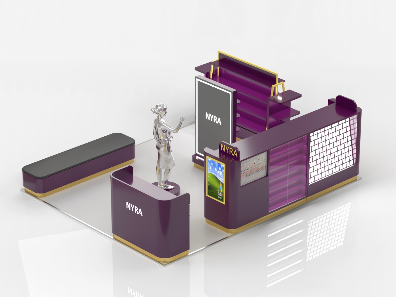
Visual style: symbolic construction of luxury and fashion
The entire kiosk carefully selects "purple + gold" as the main theme, and then embellishes it with silver metal elements, which together compose a strong sense of high-end fashion. This color combination accurately captures the soul of the nail industry "exquisite, beauty, and personalization":
1.The metaphor of purple
Purple is born with the gene of "noble, mysterious, and elegant". It not only reflects the deep yearning for beauty in the hearts of female customers, but also cleverly echoes the exclusive "customized" charm of nail services (think about those unique private nail designs). The kiosk uses a purple panel with a soft glow (it may be a sophisticated paint or transparent acrylic), which not only maximizes the exquisiteness of the space through gloss reflection, but also takes into account the practical nature of dirt resistance and easy care.
2.Gold is the finishing touch
Gold is like the exquisite trim on luxury goods here - it is transformed into smooth lines and outlined frames (such as the edge of the display stand and the base of the counter), which is just right for embellishment. This metallic gold can not only instantly focus the attention, but also silently convey the brand promise of "professional and high quality". Customers will subconsciously feel that: with such a space decorated with gold, its services and products must be trustworthy.
3.Silver agility
The silver human-shaped stand standing in the center is the key to breaking the heavy feeling of color. Its vivid posture (perhaps an elegant gesture to guide, or showing the effect of a perfect foot manicure) is like "a stunning appearance after the manicure is completed", and naturally becomes the visual core of the entire space, quietly guiding the eyes and footsteps of customers. The cold tone of silver collides with the warm purple and luxurious gold to create a unique fashion spark, injecting a light tension into the space.
Front-end display area
Nail tip display wall
In front of the counter, a unique grid panel (maybe metal mesh or translucent material) constitutes the nail tip display area. The grid is neatly arranged, allowing customers to scan the various samples at a glance. The cleverly designed backlight (implying the lighting plan) shines from the back, instantly lighting up the color and delicate texture of each nail tip, leaving no details hidden. This clear and bright display method makes it easier and more efficient for customers to choose.
Light box advertising
Next to the grid display wall, the vertical light box is particularly eye-catching. It displays "close-up of hands after manicure" - the real and moving beauty can instantly ignite the customer's yearning. The wonderful thing is that the picture in the light box can be changed at any time (for example, changing to the popular style of the season or the popular style), so that the whole space can always keep fresh and attract attention.
Service operation area
Black operation table: The black table at the back (perhaps scratch-resistant, wear-resistant, easy-to-wipe stone or artificial stone) is the core stage for manicurists to display their skills. The deep black is naturally "not eye-catching", allowing manicurists to focus on the delicate operation of their fingertips without distraction. At the same time, it is like a perfect canvas, setting off the bright colors of the nail art itself.
Surrounding display rack: The circle of purple display racks around the operation area cleverly stores commonly used tools, various nail polishes, etc. Its existence makes the process of "taking tools - instant operation - displaying effects" in one go, greatly improving the fluency and efficiency of the service.
Reception/Cashier area
Curved design: The reception counter on the left, with a smooth curved edge, is a gentle touch. It softens the hard lines of the space and makes customers feel more friendly and relaxed when they approach (compared to the straight right-angle counter, which makes people feel distant). The counter itself adopts a "yellow and purple splicing" design, using bright colors to quietly divide different functional areas (for example, the bright yellow part may be the cash register or hidden storage space).
Contact us:Karena
WhatsApp: +8613410560420
Email: sales01@myidea-kiosks.com