
check out over 200+


$15,000.00
Availability:
In stock
SKU
KFJK-1077
Support customization
High quality
Factory directly selling
Easy installation
Built-To-Order
Ships in approximately 5 business days; excludes artwork approval processing time of 2 business days
Complimentary Artwork Review
For a worry-free purchase, one of our artwork specialists will review your submission prior to printing to ensure crisp text and sharp imagery on your final product.
A well-designed juice kiosk can not only attract customers with its unique appearance but also provide customers with a pleasant and convenient consumption experience. The following is a design plan for a mango-themed juice kiosk, which takes into account the design concept, layout, color, and other aspects to create a vibrant and attractive space.
1. Design Concept
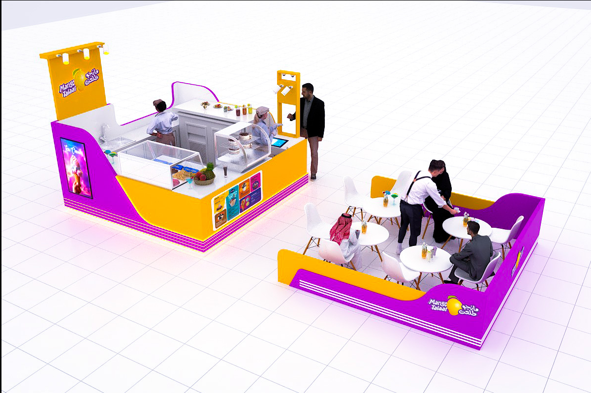
The design concept of this juice kiosk revolves around the theme of mango. Mango is not only a popular fruit but also represents vitality and tropical charm. The overall design aims to create a space that is both eye-catching and in line with the characteristics of mango. The use of bright colors and mango-related elements will make the kiosk stand out in the commercial area and attract the attention of passers-by.
2. Layout
A. Production area
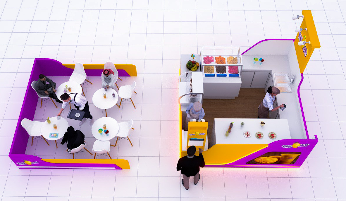
The production area is the core part of the kiosk. It is located in the center of the kiosk and is equipped with necessary juice-making equipment such as juicers, blenders, and refrigerators. The height of the counter design makes both employees and customers feel comfortable. There is a display area for fresh mangoes and other ingredients on the counter, and there is a menu board that clearly shows the types of mango juice and other products. The layout of the equipment ensures the smooth operation of employees and convenient access to ingredients and tools.
B. Customer Seating Area
Next to the service area is the customer seating area. This area is designed to provide customers with a place to enjoy juice on the spot. Several round tables and chairs are placed in the semi-open space. The number of seats depends on the size of the kiosk and is usually designed to accommodate 6-8 customers at the same time. The seating area and service area are separated by low partitions, which not only ensure a certain privacy for customers but also do not block the view of the kiosk.
C. Storage Area
A small storage area is set up behind the production area. This area is used to store ingredients, cups, straws, and other supplies, and is equipped with shelves and cabinets to keep items in order and convenient for access. Good ventilation and proper storage conditions are also considered to ensure the freshness of the ingredients.
3. Color
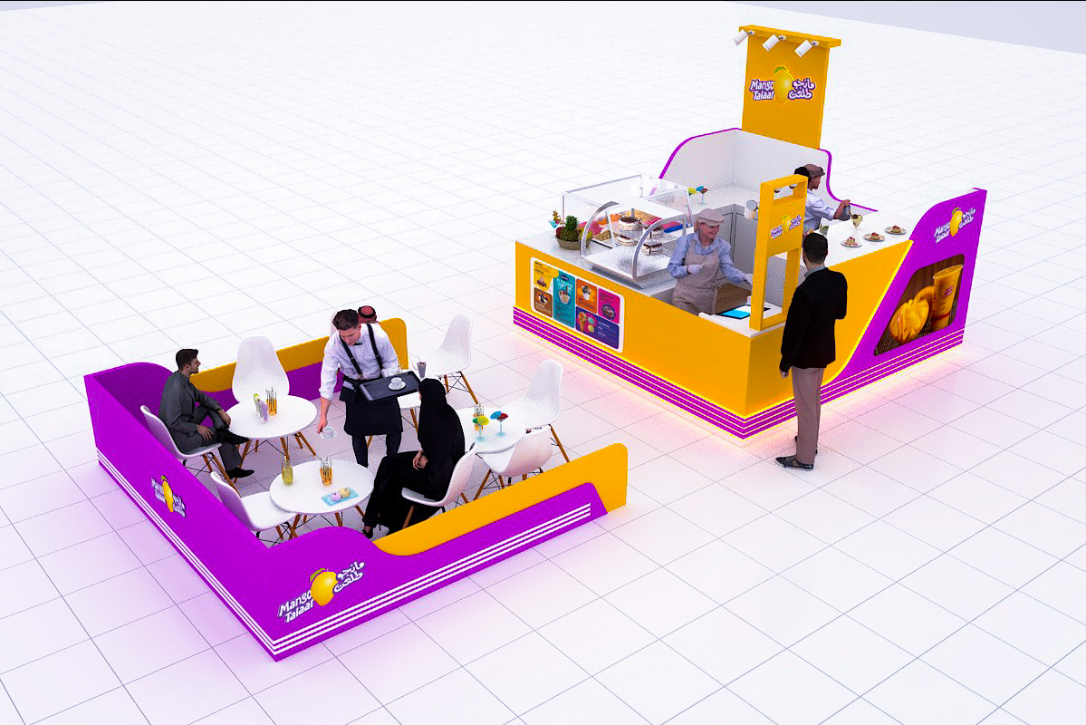
The main colors of the kiosk are bright yellow and purple. Yellow is reminiscent of ripe mangoes, representing freshness and vitality, while purple adds a touch of elegance and mystery. The combination of these two colors makes the kiosk visually eye-catching.
Yellow is mainly used on the exterior walls of the kiosk and some key decorative parts, such as the logo area and display windows. Purple is used in partitions and some interior decorations to create a sense of contrast and depth. In addition, white is used as a complementary color to make the overall color scheme more balanced and clean.
Conclusion
Through careful consideration of design, layout, and color, this mango-themed juice kiosk is designed to be a unique and attractive commercial space. It not only provides high-quality products but also provides customers with a pleasant and immersive consumption experience.