check out over 200+


$8,780.00
Availability:
In stock
SKU
KFCDK-1098
- Factory Direct Selling
- Custom 3D Design
- High Quality
- Not include machine
Built-To-Order
Ships in approximately 5 business days; excludes artwork approval processing time of 2 business days
Complimentary Artwork Review
For a worry-free purchase, one of our artwork specialists will review your submission prior to printing to ensure crisp text and sharp imagery on your final product.
Color matching: sweet and eye-catching
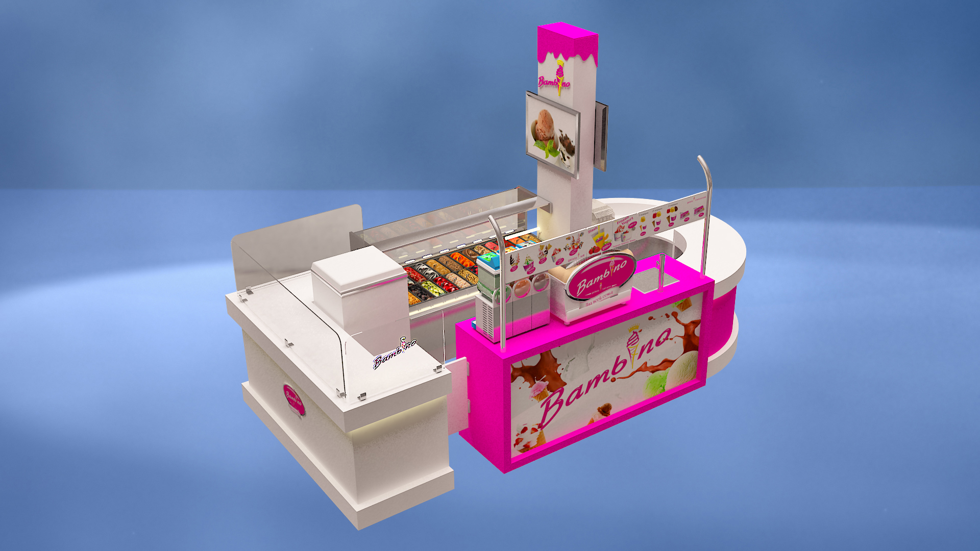
This ice cream kiosk is very clever in the use of colors. With pink and white as the main colors, pink is lively and bright, just like the sweet taste of ice cream, conveying a sweet and lovely feeling, which is easy to attract consumers' attention, especially young people and children. White is pure and simple, neutralizing the gorgeousness of pink, making the overall visual more refreshing. The combination of the two creates a relaxed and pleasant atmosphere, which fits the consumption scene of ice cream.
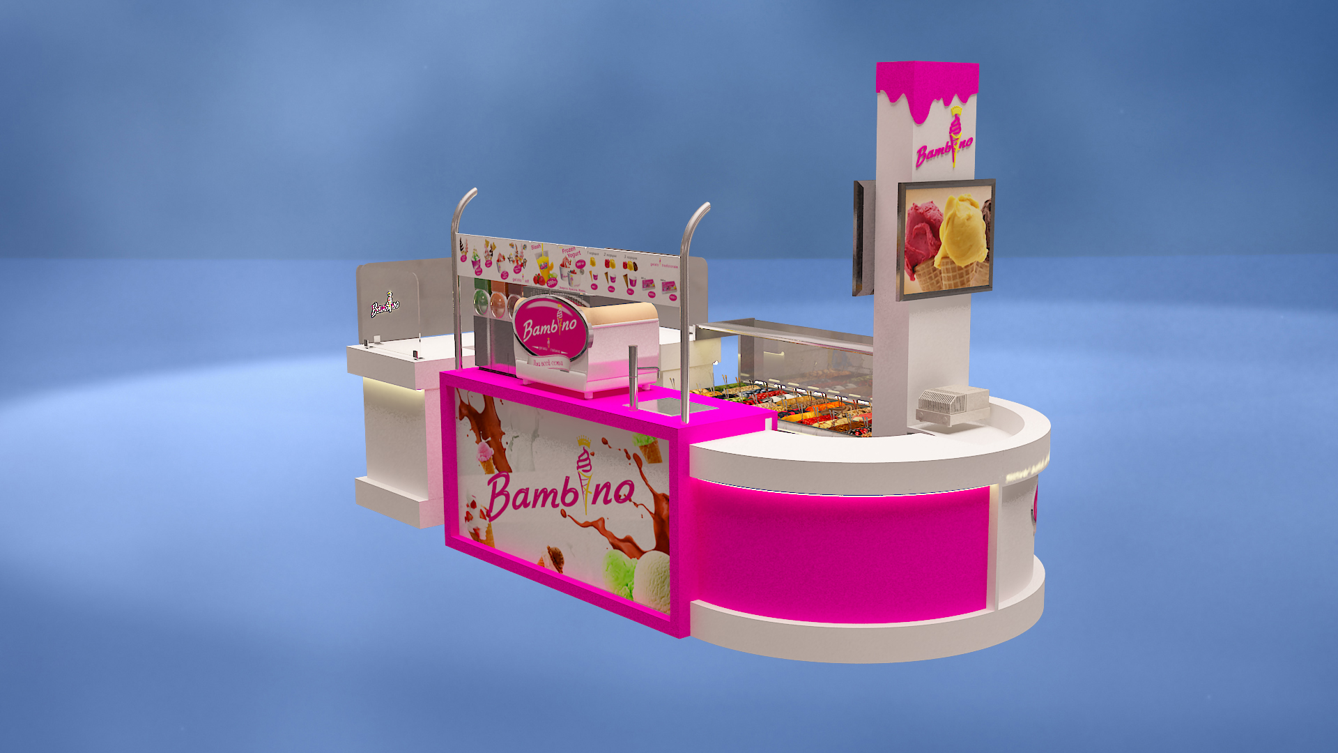
Layout design: clear functional division
From the layout point of view, it has clear functional divisions. The display area is equipped with a transparent freezer, which can intuitively present a variety of ice cream products, allowing customers to see the flavor selection at a glance and stimulate their desire to buy. The operation area is equipped with professional equipment to facilitate the staff in making and processing ice cream and improve the efficiency of serving. The ordering area is eye-catching, and the menu display board above clearly displays product information, which is convenient for customers to order quickly.
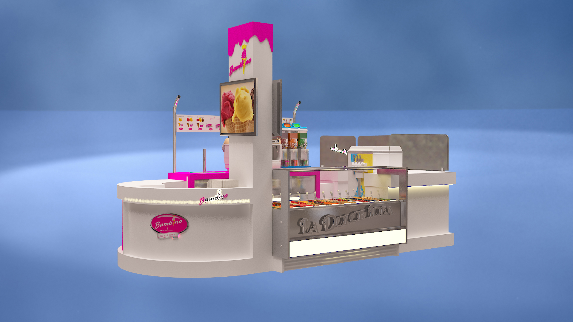
Decorative elements: Strengthen the theme
In terms of decoration, the ice cream shape decoration on the top and the brand logo "Bambino" strengthen the ice cream theme and enhance brand recognition. The overall design focuses on both aesthetics and practicality. Whether in shopping malls, scenic spots or streets, it can become a beautiful landscape, bringing a high-quality shopping experience to consumers and creating a good business environment for merchants.