
check out over 200+


$13,000.00
Availability:
In stock
SKU
HSKMJK-1117
- New 3D Design
- High Quality
- Easy Installation
- Factory Direct Selling
Built-To-Order
Ships in approximately 5 business days; excludes artwork approval processing time of 2 business days
Complimentary Artwork Review
For a worry-free purchase, one of our artwork specialists will review your submission prior to printing to ensure crisp text and sharp imagery on your final product.
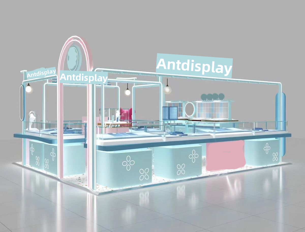
The jewelry kiosk is an open design with an overall square shape, which avoids a dull feel through clever color matching and line changes. Its structure is mainly composed of a main exhibition area and several auxiliary areas. The main exhibition area is located in the center of the kiosk, with a blue jewelry display table and glass display cases, which surround the area to form an open jewelry display space.
The auxiliary area includes some lockers and small display cabinets, which are reasonably arranged around the main display area to facilitate the storage and management of goods without affecting the browsing experience of customers. Soft LED lights hang from the top of the kiosk, creating a warm and comfortable shopping atmosphere.
Kiosk color
1.The main color of the kiosk is light blue and pink, both of which are highly recognizable, pink represents romance and sweetness, blue symbolizes tranquility and elegance, the clever combination of the two, the perfect fusion of feminine softness and nobility. This color match not only conforms to the exquisite temperament of jewelry, but also attracts the attention of target consumer groups. Especially the younger ones.
2.Blue is mainly used in display cases and display tables to create a cool and thorough feeling, which can highlight the gloss of the jewelry. The pink is mainly used for the arch structure and part of the side cabinet, playing a role of embellishment and balance, so that the overall tone is not too monotonous. The combination of pink and blue is neither too sweet nor too cold, and it accurately locates the aesthetic preferences of young female consumer groups.
Design detail
- Arch design: The entrance of the kiosk adopts a unique arch design, pink arch with blue lines, which has a great visual impact, but also gives the space a light and flexible charm. The arch design is not only beautiful, but also can guide the customer's sight and facilitate the customer to enter the kiosk interior.
- Jewelry display tables and cabinets: The main exhibition area uses multi-layer jewelry display tables and glass display cabinets to display different types of jewelry. The use of glass display cases maximizes the texture and luster of jewelry and improves the attractiveness of the goods. The height and size of the display stands and display cases have been carefully designed to ensure that customers can easily browse and select products.
- LED lights: The kiosk is equipped with LED lights, and the light is soft and not dazzling, which can better show the brilliance and details of the jewelry. The design of the LED lights is also coordinated with the overall style and will not destroy the overall beauty of the space.
- Lockers: There are lockers in the kiosk to store goods and daily necessities and keep the space clean and orderly. The design of the locker is simple and practical, in harmony with the overall style. The arrangement of its location also takes into account work efficiency and facilitates staff to pick up and drop off goods.
- Brand identity: The top and side of the kiosk are clearly marked with the brand name "Antdisplay", which has a good brand publicity effect. The design and color of the logo are unified with the overall style and do not appear obtrusive.