check out over 200+


$5,500.00
Availability:
In stock
SKU
KFCDK-1094
- High-End Quality
- Factory Direct Sale
- New Custom Design
- Easy Installation
Built-To-Order
Ships in approximately 5 business days; excludes artwork approval processing time of 2 business days
Complimentary Artwork Review
For a worry-free purchase, one of our artwork specialists will review your submission prior to printing to ensure crisp text and sharp imagery on your final product.
In the bustling crowds of the shopping mall, do you long to have a consumer magnet that can make customers stop in their tracks? This food kiosk, from the layout of the shelves to the brand logo, every detail is telling the story of a "quality choice" — by choosing it, you're not just purchasing a display tool, but also building an automatic customer-attracting commercial lighthouse for your brand.
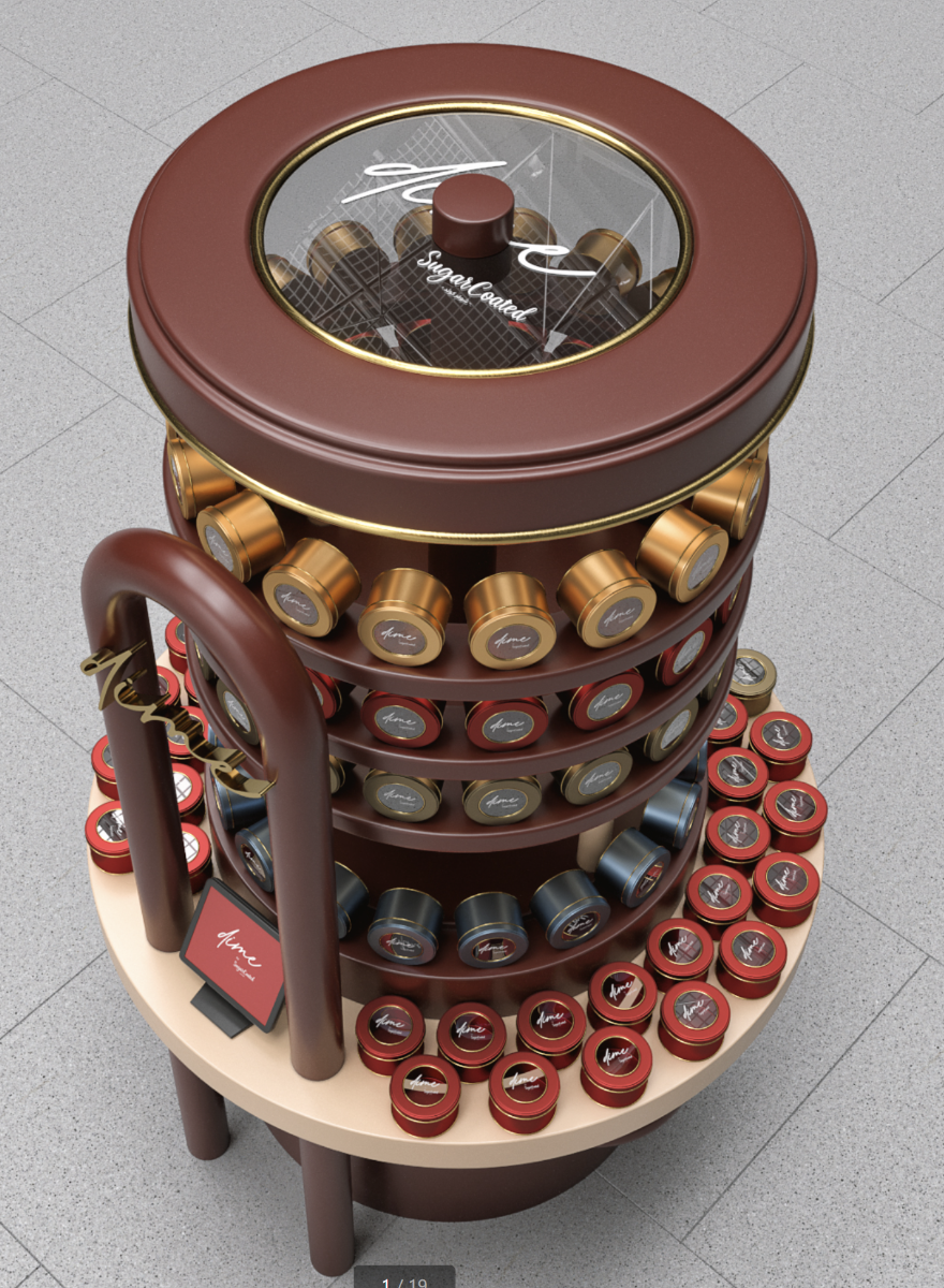
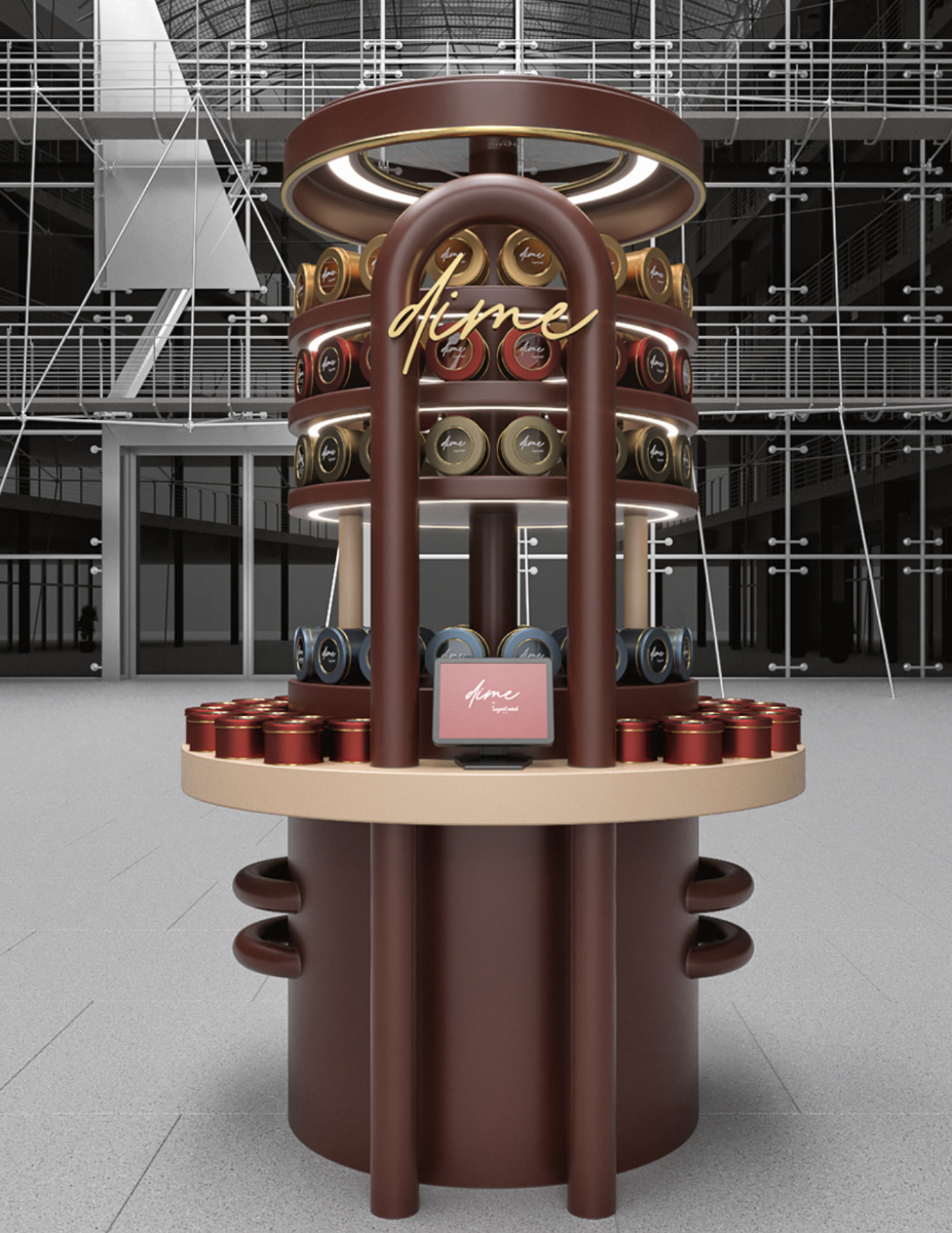
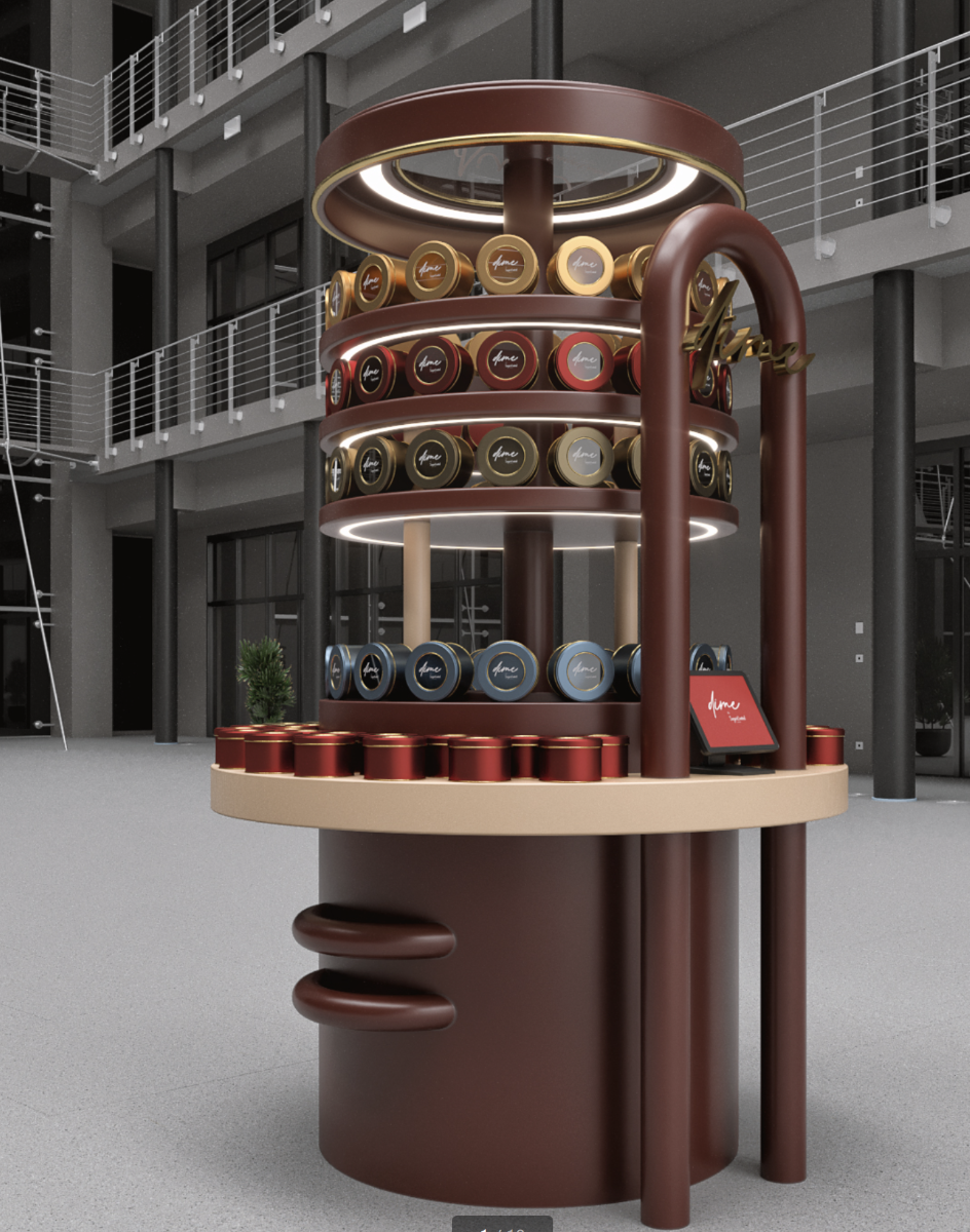
I. Overall Shape and Space Utilization
The overall shape of this food kiosk is highly recognizable, featuring a circular three-dimensional structure. The circular shape gives people a sense of completeness and softness visually. It can quickly capture the attention of customers and break the monotony brought about by the common regular layouts in shopping malls.
In terms of space utilization, it achieves efficient product display through multiple layers of circular shelves. The height of this kiosk is approximately between 2 and 2.5 meters. With such a height, within the limited floor area, it significantly increases the display area by expanding vertically. The diameter of the circular base at the bottom is about 1.5 to 2 meters, and the width of each layer of the shelf is roughly between 0.3 and 0.5 meters. Such dimensional design allows for a reasonable arrangement to display different types and series of canned teas or coffees, making it convenient for customers to browse and select. It fully meets the display function requirements of a small retail space.
II. Color Matching
In terms of color selection, dark brown is taken as the main color tone, complemented by gold and a small amount of red. Dark brown gives people a sense of stability and richness, which is in line with the product attributes of teas and coffees that possess a profound cultural heritage and rich flavor. It conveys a high-quality and classic brand image.
The application of gold elements plays a crucial finishing touch. Gold is usually associated with luxury and high-end. Whether it is the golden decorative lines on the edges of the shelves or the golden embellishments on the cans, they all enhance the delicacy and grade of the entire kiosk, attracting the attention of consumers who pursue quality.
The occasional appearance of a small amount of red, such as the red design on some parts of the cans, adds visual impact and vitality. It breaks the heaviness brought by the dark brown and gold, making the overall color matching more diverse and rich. It creates an atmosphere that is both high-end and full of enthusiasm.
III. Detail Design
(I) Logo and Brand Display
The eye-catching brand logo is set in a prominent position. The font design is elegant and smooth, presented in gold, which echoes the overall color matching. The size and position of the logo have been carefully considered. No matter from which angle customers approach the kiosk, they can notice the brand name at the first glance, strengthening the brand's recognition and memorability.
(II) Lighting Design
The lighting design between the top and each layer of the shelves is ingenious. The circular lighting at the top not only illuminates the products on the uppermost layer but also creates a sense of focus for the entire kiosk, making it stand out more in the shopping mall environment. The light strips between each layer of the shelves highlight the contours and textures of the canned products, making the colors of the tea cans or coffee cans more appealing and stimulating customers' desire to purchase. The color selection of the lights is also coordinated with the overall atmosphere. Warm-toned lights are used to further convey a sense of warmth and comfort, which is in line with the experience that the products bring to consumers.
(III) Structural Design
The structural design of the kiosk takes both aesthetics and practicality into account. The curved pillars not only add a sense of softness and smoothness to the shape but also play a role in supporting and stabilizing. The connection part between the pillars and the shelves is exquisitely processed, without any sense of abruptness, reflecting the integrity and coordination of the design. The circular base at the bottom is wide and stable, giving people a sense of solidity and reliability. At the same time, it can also be used to hide some wires or provide additional storage space. Without affecting the appearance, it enhances the functionality of the kiosk.