
check out over 200+


$16,800.00
Availability:
In stock
SKU
HSKFBK-1119
- Custom Design
- Factory Direct Selling
- High Quality
- Easy Installation
Built-To-Order
Ships in approximately 5 business days; excludes artwork approval processing time of 2 business days
Complimentary Artwork Review
For a worry-free purchase, one of our artwork specialists will review your submission prior to printing to ensure crisp text and sharp imagery on your final product.
The kiosk adopts an open layout, integrating the operation area, display area and interaction area. The front end of the cake display stand and glass display cabinet as the visual focus, intuitive presentation of products; The coffee making equipment is embedded in the middle to form the operation core; The reception desk on the right side takes into account both ordering and service functions, and the moving line is smooth and natural.
This partition is not only in line with the logic of customer purchase, but also to meet the operation efficiency of the clerk, reflecting the application of "ergonomics" in the design of commercial space - the customer's sight can quickly capture the dessert, and the service process is more convenient because of the orderly placement of equipment.
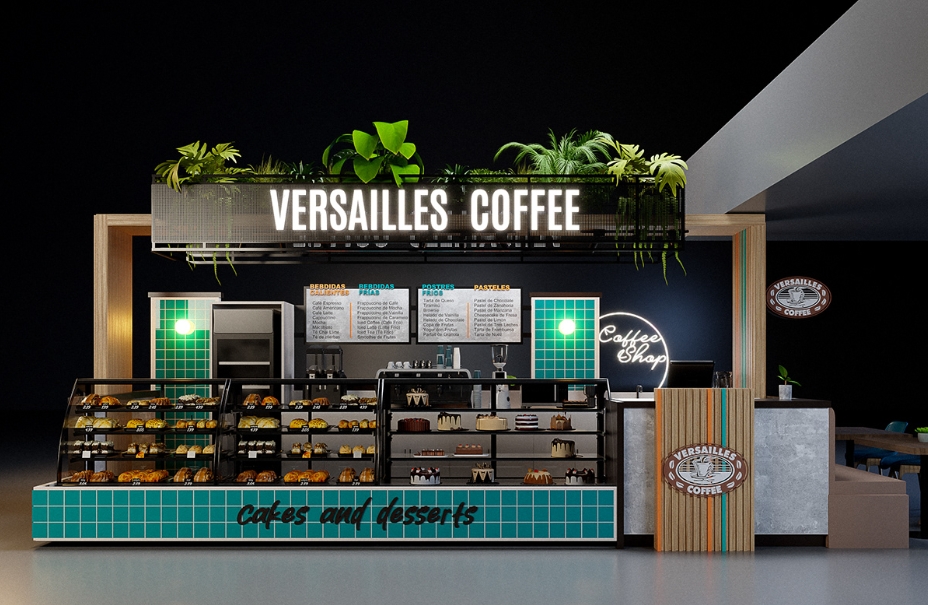
Blue tile
The bottom area is laid out in small blue-green square tiles, forming a strong visual identification symbol. The cool tones of the tiles contrast with the warm colors of desserts and coffee, highlighting the theme text of "cakes and desserts" while injecting freshness into the space. The choice of tile material is practical, its waterproof and easy to clean characteristics adapt to the dining environment, and strengthen the sense of order of the space through the regular geometric arrangement.
Batten element
The right column is decorated with wooden strips, and the longitudinal lines extend the height of the space, with a light wood tone to convey a natural and warm atmosphere. Wood strips form material collision with cold color tiles and metal equipment, both rigid and flexible, balancing the cold of industrial wind equipment, but also echoing the natural properties of the top green plants, building a "modern and natural integration" design language.
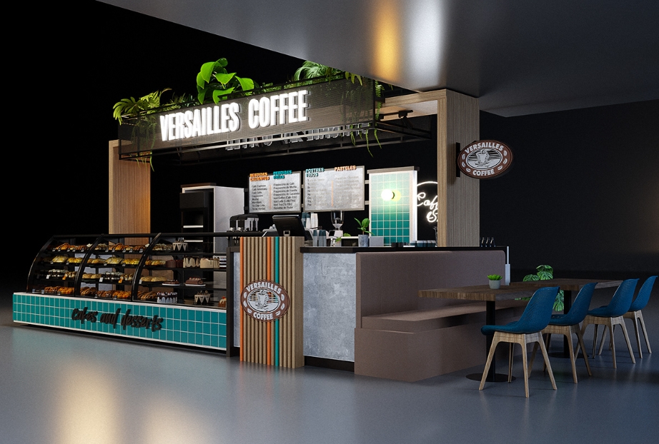
LOGO sign display
The brand identity "VERSAILLES COFFEE" is the visual core: the luminous words at the top are presented in a concise font, creating a strong contrast against a dark background and attracting distant customers; The brand logo is repeatedly embedded in the reception desk and wall on the right side to form a visual memory point.
- The combination of luminous characters and logo not only strengthens the brand identity, but also enriches the visual level through the material difference (transparent plate and three-dimensional logo).
- The neon logo of "Coffee Shop" adds a sense of fashion to the space with soft light, complements the overall industrial design, and accurately conveys the tone of the brand.
Glass display showcase
The front multi-layer cake display rack adopts an open design, the bakery products are clear at a glance, and the warm yellow light highlights the color and stimulates the desire to buy. Glass display cabinets are used to display delicate desserts and coffee around, transparent materials to eliminate visual barriers, with internal lighting, highlighting product texture. The combination of the two not only meets the display needs of different categories, but also forms a three-dimensional display effect through the layout of the height and height, and maximize the use of space visual surface.