check out over 200+


$17,000.00
Availability:
In stock
SKU
HKMJK-1200
- Custom Design
- Factory Direct Sell
- Easy Installation
- New 3D design
Built-To-Order
Ships in approximately 5 business days; excludes artwork approval processing time of 2 business days
Complimentary Artwork Review
For a worry-free purchase, one of our artwork specialists will review your submission prior to printing to ensure crisp text and sharp imagery on your final product.
In prime locations like shopping malls, a jewelry pop-up kiosk that instantly grabs attention and complements the brand's image is crucial for building the first bridge with customers. This dark green and gold kiosk we designed for a jewelry brand eschews flashy gimmicks, focusing instead on solid quality and functionality, weaving "affordable luxury" into every detail, making the jewelry itself the focal point.
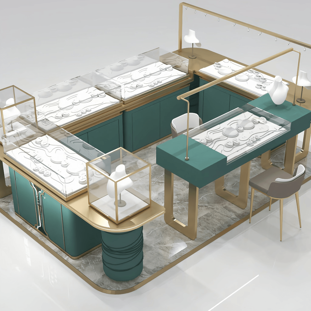
First, its aesthetics are naturally "high-end." The biggest mistake in jewelry display is overdoing it. This kiosk's color scheme and design take a low-key, sophisticated approach, timeless and universally appealing. The color scheme truly understands jewelry: it uses a serene and elegant dark green as the main color, paired with delicate matte champagne gold lines, avoiding the ubiquitous glossy gold. Whether it's diamonds, colored gemstones, or karat gold jewelry, none of these pieces overshadow the others; instead, they accentuate the natural brilliance of the jewelry, making them universally appealing regardless of brand or style.
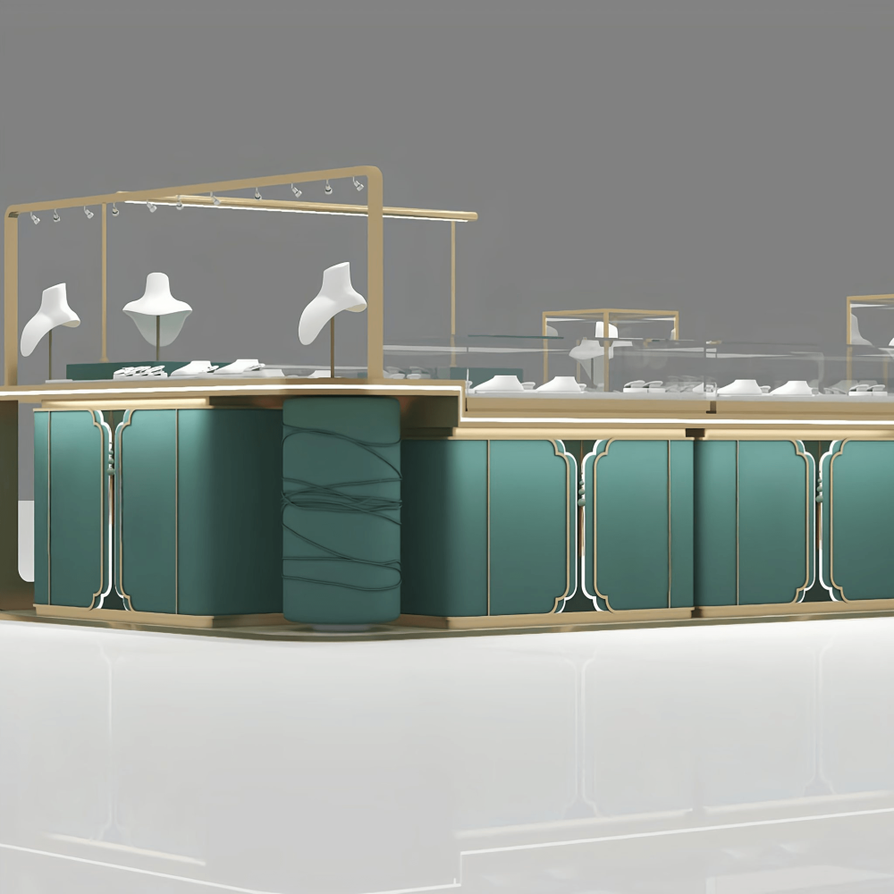
The details reveal thoughtful touches: the edges of the display cases are rounded, making them comfortable to the touch and visually appealing; the Chinese cloud patterns on the doors are not ostentatious decorations, but rather a subtle touch that adds a touch of understated Eastern charm to the modern display cases; the wraparound, softly padded columns on the sides break the monotony of the display cases, creating a layered effect from afar while remaining uncluttered up close.
Lighting is the "perfect supporting actor" for jewelry: track lighting is installed at the top, and LED light strips are hidden inside the cases. This dual light source illuminates the facets and luster of the jewelry clearly without being glaring like a spotlight. The warm light envelops the entire shop, encouraging customers to linger a few more minutes and immerse themselves in the jewelry.
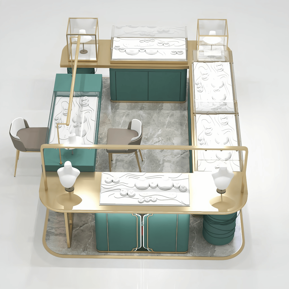
When we design display cases, we don't just create pretty shells. We follow the sales process, considering the needs of both customers and staff. Separate display areas allow customers to easily find what they want: Large, open display cases are dedicated to smaller items like rings, earrings, and bracelets, neatly arranged so customers can easily spot the styles; independent glass display cases with mannequins showcase necklaces and pendants—the main promotional items—catching the eye immediately; open shelves on the countertop allow for flexible display of themed collections or featured items, eliminating the hassle of arrangement.
Hidden storage keeps the countertop always clean: Hidden storage cabinets with double doors are integrated under the cabinets. Shelves and drawers can be added as needed to store inventory, packaging boxes, and sales tools, leaving only jewelry and props on the countertop—a tidy look that encourages customers to browse more. Small LED strips are also installed inside the cabinets, eliminating the need to fumble in the dark when searching for items, making it easier for staff.
Provide ample comfortable space for customers to try on jewelry: Dedicated seating is provided, with chairs that match the style of the display cases, offering a comfortable and stable feel. The counter height has been repeatedly adjusted, ensuring easy access for staff and allowing customers to try on jewelry without bending over. The entire process of viewing, trying on, and consulting is smooth and seamless.
Thirdly, not mass-produced, but customizable to your needs: Every jewelry brand has its own unique character. We don't create one-size-fits-all templates. From size to details, this kiosk can be customized to your requirements. Ring settings, necklace stands, and other display props can also be customized to match the style of the display cases, creating a unified look and enhancing the overall brand image.
Depending on the size and layout of your store, different locations and customer flow can vary. We can adjust the overall size and layout to suit your specific space, making the most of every inch of display space. The color, material, and hardware of the display cases can be changed. For example, you can replace the dark green with your brand's signature color or adjust the craftsmanship of the metal lines, ensuring the kiosk reflects your brand style from the inside out.
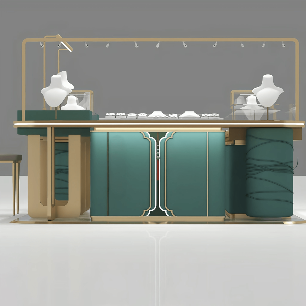
We know that display cases in shopping malls are touched and used daily, so even the slightest quality issue is unacceptable. Therefore, every aspect of the process is carried out to the standards required for long-term operation. The cabinet body uses high-density environmentally friendly board material with a moisture-proof and wear-resistant finish. It's scratch-resistant, moisture-proof, and won't easily deform under heavy traffic.
The metal frame uses thickened stainless steel with an anti-oxidation treatment, ensuring it won't peel or darken even after years of use, maintaining its delicate matte texture. The glass is ultra-clear tempered glass, offering excellent light transmission and safety. The hinges and slides are silent, ensuring quiet opening and closing of the cabinet doors without disturbing customers or disrupting the store's atmosphere.
In the bustling shopping mall, a high-quality, unpretentious kiosk is a silent business card for the brand. It doesn't need slogans; just looking at it conveys reliability and sophistication. This dark green and gold jewelry kiosk is beautiful, functional, and durable. It not only makes your jewelry visible but also helps your brand stand out, allowing you to capture more attention in a small space.