
check out over 200+


$4,200.00
Availability:
In stock
SKU
HKFCC-1018
High-quality
Customized Services
Easy Installation
Factory Direct Selling
Built-To-Order
Ships in approximately 5 business days; excludes artwork approval processing time of 2 business days
Complimentary Artwork Review
For a worry-free purchase, one of our artwork specialists will review your submission prior to printing to ensure crisp text and sharp imagery on your final product.
Size: 1600x600mm
Materials: Flame-retardant MDF and baking paint, stone
Production time: 25 working days
Payment methods: Wire transfer, Western Union
Design details
On the pink body of the car, the simple sketches of crepes and beverages are distributed in a staggered manner. The lines are simple yet full of childlike fun, subtly conveying the signal of "diverse products" - not only crepes but perhaps also matching beverages to choose from. The design at the bottom is more ingenious: the visual effect of red sauce dripping, like strawberry jam or chocolate sauce flowing slowly, instantly arouses the anticipation of the taste buds.
Two yellow neon-textured cream-shaped lights, when lit up at night, resemble sweet symbols, not only embellishing the vehicle body but also once again focusing on the product theme. The brand logo "The Perfect Spot" in the middle circle, with the classic combination of red, white and black, creates an exclusive brand visual imprint, allowing diners to remember the uniqueness of "this place".
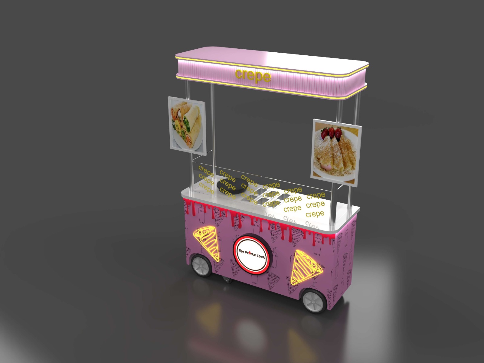
Size and mobility
The specification of 1600mm in length and 600mm in width is the carefully considered "golden size". It is compact enough to flexibly enter the corners of business districts, the entrances of markets and other high-traffic areas. Even in crowded pedestrian streets, it will not feel cramped. At the same time, it has sufficient "presence" and will not be overwhelmed by the complicated scenes on the street. The white wheels paired with silver rims not only have an attractive appearance but also endow the car with excellent mobility - the operator can adjust the position at any time according to the changes in passenger flow, truly achieving the business freedom of "going where there are more people".
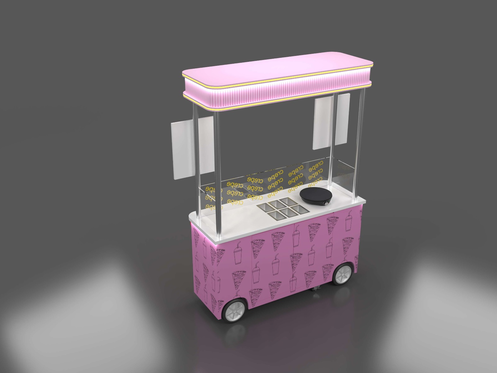
Material usage
The transparent partition in the operation area is printed with repeated yellow "crepe" characters, which not only serves as a display barrier - allowing customers to clearly see the entire process of crepes from batter preparation to ingredient addition, meeting the current consumers' demands for "hygiene and transparency". It has also been repeatedly reinforced as a brand symbol, making the category impression of "crepe" deeply rooted in people's hearts.
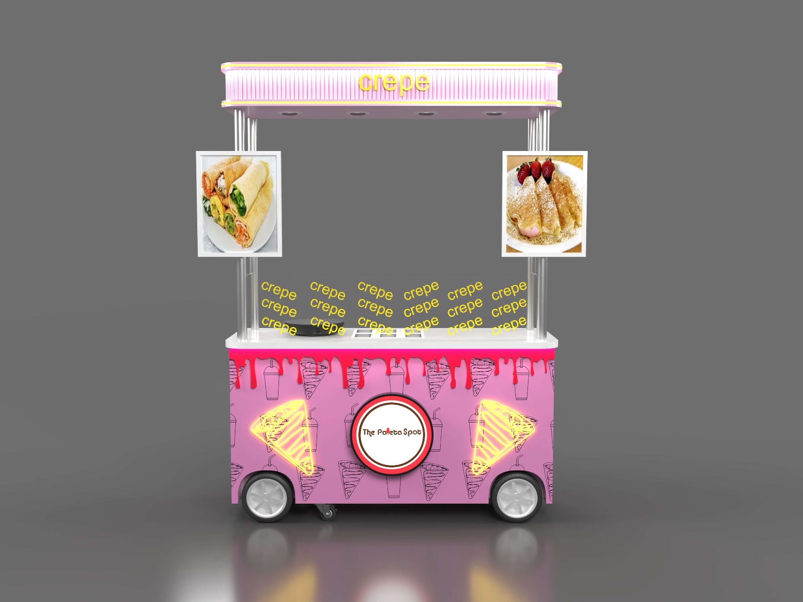
The countertop is made of stone, which strikes a balance between professionalism and durability: crepe making requires high-temperature frying, and the stone countertop can withstand high temperatures and conduct heat evenly, ensuring a balance between the crispness and softness of the crust. At the same time, its easy-to-clean feature makes daily hygiene maintenance efficient and worry-free.