
check out over 200+
Custom jewelry & Crystal stand design with glass showcase Necklace kiosk elegant design style for sale


$13,680.00
Availability:
In stock
SKU
HSKMJK-1134
- New 3D Design
- High Quality
- Easy Installation
- Factory Direct Selling
Built-To-Order
Ships in approximately 5 business days; excludes artwork approval processing time of 2 business days
Complimentary Artwork Review
For a worry-free purchase, one of our artwork specialists will review your submission prior to printing to ensure crisp text and sharp imagery on your final product.
Size: Customized
Materials: MDF and baking paint, tempered glass, light strips, etc
Design fee: 300 US dollars
Payment methods: Wire transfer, Western Union
Open layout design
It has no fixed "entrance" or "exit". Customers can approach from any direction and browse around the kiosking in a 360-degree view. This design is suitable for scenarios with complex crowds such as shopping malls and exhibitions, and also avoids the crowded feeling of traditional counters where people have to queue up for a position. Especially when multiple people are visiting at the same time, the island layout can disperse everyone in different areas without disturbing each other, and also ensure that each display stand is evenly noticed.
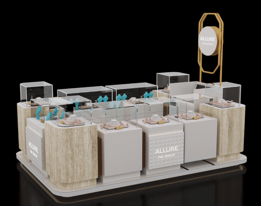
Hierarchical counter
The higher display stand (such as the area with stone texture trim) is the "main display position", which is usually used to place the brand's flagship items and more complex jewelry sets. The height is just at the same level as a person's line of sight when standing, allowing you to clearly see the details of the goods without looking down.
The lower display stands are "auxiliary display positions", used to showcase small items such as rings and stud earrings. The density of the lower stands is slightly higher, making it convenient for customers to quickly browse different styles.
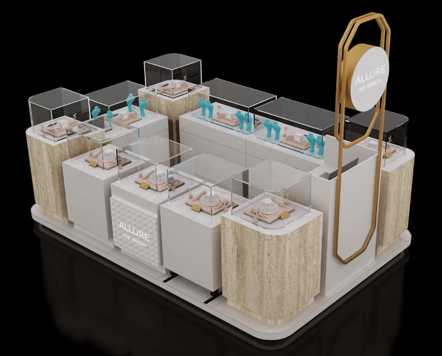
Main counter
The main display area is the most eye-catching part of the kiosk - the relatively high platform is paired with decorative panels that imitate the texture of marble. The texture is close to that of natural stone, but it is lighter (suitable for the mobility needs of pop-up kiosks). The light beige texture not only looks high-end but also does not steal the luster of the jewelry. The top of the table is covered with a highly transparent protective cover, which should be made of thickened acrylic (lighter and less fragile than glass). It can not only prevent dust and bumps but also avoid the dazzling reflection like ordinary glass, allowing the details of the jewelry to be clearly revealed.
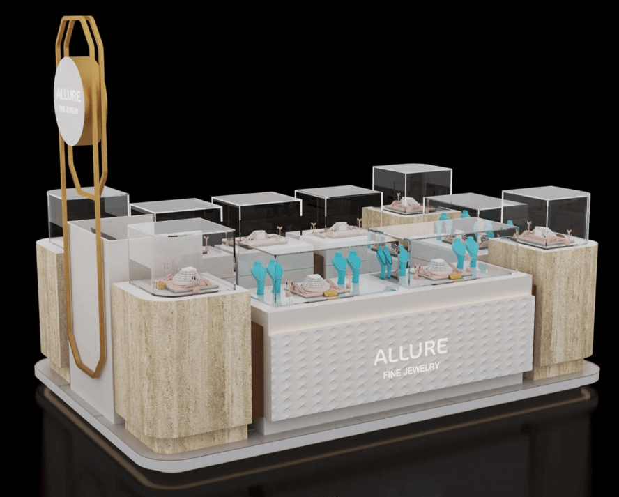
Low counter
The low counter is equipped with a matte white lacquered cabinet body. The advantage of this material is that it is less likely to leave fingerprints or get dirty. Even if frequently touched by customers, it can remain clean and tidy. The display prop on the countertop is a blue geometrically shaped stand - this color is chosen very ingeniously: it is neither a large area of bright color, which will not disrupt the overall "white + beige + gold" tone, nor can it serve as an embellishment to brighten the visual effect, making the small rings and stud earrings more prominent when hung on it, and not being submerged by the white countertop.
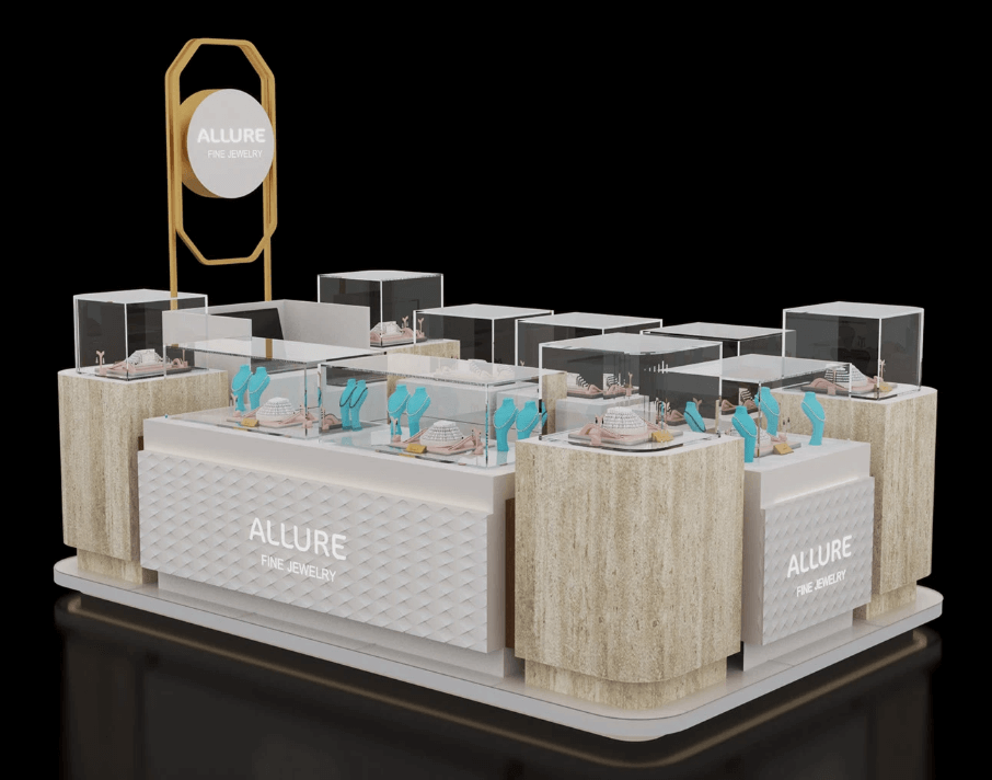
Some of the cabinets have "embossed brand logos" on their sides (serving both as decoration and to enhance the brand). The cabinets next to the logos are actually hidden storage compartments - they can be used to store jewelry packaging, cleaning cloths, receipts and other items. Staff members don't have to go to the back to get things; they can reach out and get them. This is not only convenient to operate but also won't damage the overall aesthetics of the storage space.
The golden geometric frame standing sign at the top is also part of the functional area: it is not only a brand logo sign, but the shape of the frame can also serve as a "hanging pole". If you need to hang some brochures or brand cards, you can directly hang them on the frame without adding additional hooks, maintaining the integrity of the design.