
check out over 200+


$3,200.00
Availability:
In stock
SKU
HSDWS-1082
- Special Design
- High Quality
- New Style
- Custom Design
Built-To-Order
Ships in approximately 5 business days; excludes artwork approval processing time of 2 business days
Complimentary Artwork Review
For a worry-free purchase, one of our artwork specialists will review your submission prior to printing to ensure crisp text and sharp imagery on your final product.
In today’s hyper-competitive FMCG world, retail shelves aren’t just where you stack your products—they’re the make-or-break spot where brands actually connect with shoppers. Take the custom promotional potato chips for example: we built it with three simple but critical goals in mind—get people to stop, remind them who you are, and get them to buy. The end result? A regular retail spot turned into a high-traffic “can’t miss” display that pulls people in.
Turn Brand Colors Into a “Walking Billboard”
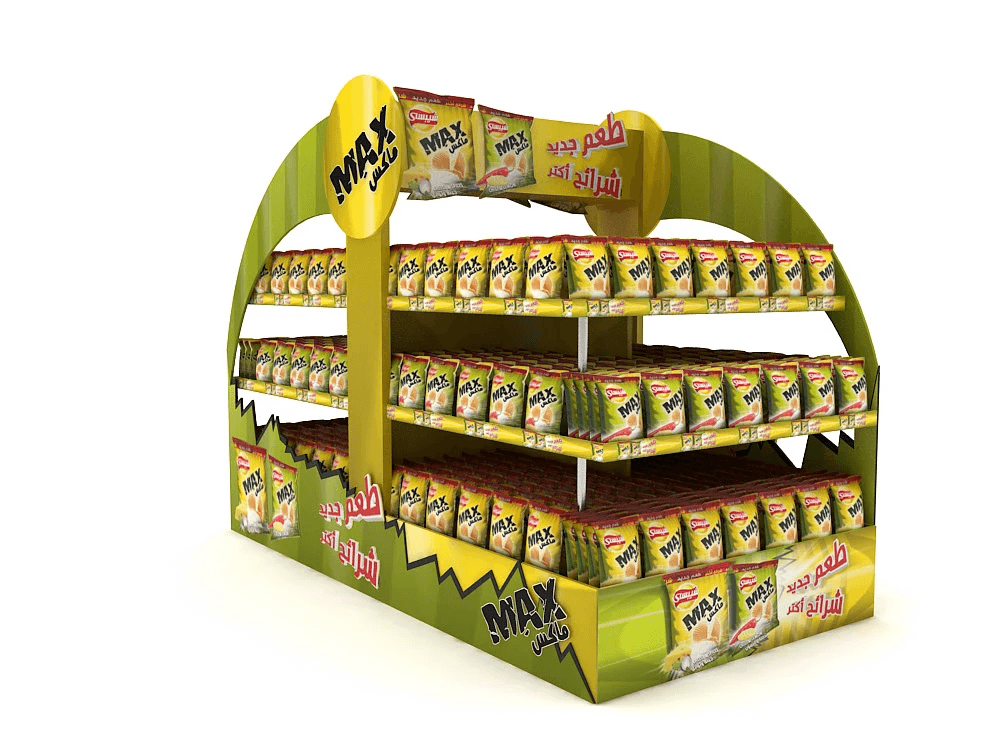
We leaned hard into the product’s signature lemon yellow and fresh grass green—exactly the same as the packaging—and paired those hues with jagged black lines that feel just like the crisp, crunchy bite of the chips. The payoff? A display that blends seamlessly with the product but stands out like a sore thumb against all the generic, boring shelves in any supermarket. No more getting lost in the crowd.
We strayed from the usual boxy, forgettable shelf design—instead, we went with a curved top that catches the eye right away. Add in the bold circular “MAX” logo and the Arabic text on the side (“طعم جديد شرائح أكثر” — which translates to “New flavor, more slices”) and you’ve got something that doesn’t need a big explanation. Passersby get the product’s main selling point in a split second, no extra effort required.
We printed big, clear images of the two chip flavors right on the front of the display. Shoppers don’t have to squint or guess what’s inside—they see their options immediately. That cuts down on the back-and-forth of decision-making, makes it easier for them to grab a bag, and keeps them from walking away frustrated.
Small Details That Drive Sales
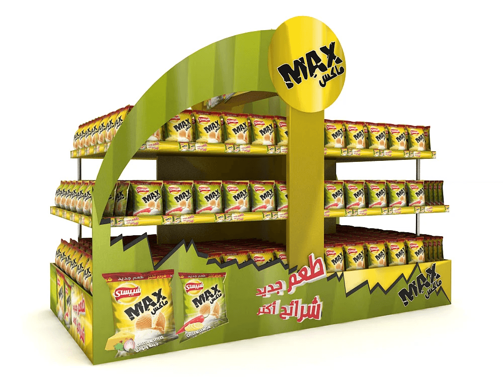
Tiered stacking for that “best-seller” vibe: We added three tiered shelves, each holding hundreds of chip bags stacked neatly. Why? Because a display that looks stocked and busy gives off that “everyone’s buying this” energy—and shoppers can’t help but be drawn to that. We also calibrated the shelf heights to fit the chip bags perfectly: every package stays fully visible, and customers can grab one without fumbling around or knocking over a whole stack.
Sturdy structure that works as hard as you do: We used heavy-duty, eco-friendly board—so even when it’s fully loaded with chips, it doesn’t wobble or fall apart. The modular design is a game-changer too: you can set it up anywhere in the supermarket—aisle endcap, floor display in the middle of the store, wherever—and it fits like it was made for that spot. Plus, there’s extra storage space at the bottom for quick restocks, so staff don’t have to run back and forth to the stockroom all day long. Less hassle, more time focusing on customers.
From the top logo to the side text to the product images on the bottom, every inch of this display screams the brand. Even if shoppers are walking by from the side or the back, they’ll still pick up on the brand and what the product is. It’s a 360-degree touchpoint—way more effective than a random poster stuck on the wall.
Operational flexibility
Whether you’re launching a new flavor, running a holiday sale, or just keeping your best-seller top of mind, this display adapts. You don’t need a whole new display—just swap out small graphics or rearrange the bags to match your campaign. It’s flexible, so it grows with your brand’s needs.
We’ve built similar custom displays for other FMCG brands, and they’ve helped lift in-store sales by over 30%. Why does it work? Because it cuts through all the noise in the store, makes shopping easier for customers, and turns a quick glance into a purchase. It’s not magic—it’s just good design focused on results.
For Customization
From the first draft of the design to the final build, we work closely with your team to make sure the display feels like an extension of your brand. No random, off-brand elements—every in-store touchpoint stays true to who you are, so shoppers recognize you instantly.