check out over 200+


$10,200.00
Availability:
In stock
SKU
HKFICK-1131
- New Custom Design
- High Quality
- Easy Installation
- Custom 3D Design
Built-To-Order
Ships in approximately 5 business days; excludes artwork approval processing time of 2 business days
Complimentary Artwork Review
For a worry-free purchase, one of our artwork specialists will review your submission prior to printing to ensure crisp text and sharp imagery on your final product.
Theme positioning: Focus on the core of "sweet healing"
The theme tone must be clarified first before designing an ice cream display. You can use the theme of "the dream world of ice cream" as the design, with giant cone devices and "melted" cream-shaped walls to instantly awaken customers' sweet associations with ice cream. Focusing on the keywords of "healing" and "childlike fun", the display space is built into a dual experience field of vision and taste, accurately attracting young people and parent-child customers so that customers are impressed by the scene atmosphere before tasting ice cream.
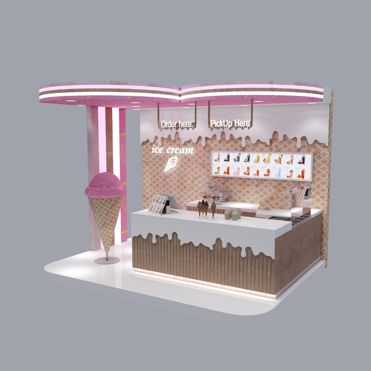
Color matching: rendering a sweet atmosphere
Color is the "emotion switch" of ice cream display. The pink ceiling is matched with a beige-brown base, simulating the classic color matching of ice cream cones, supplemented by white "cream" elements, creating a soft and sweet visual experience. Pink conveys gentleness and romance, beige-brown brings warm texture, and white enhances cleanliness. The three colors are interwoven like the layers of ice cream itself, which not only fits the product attributes but also forms a highly recognizable visual symbol, quickly catching customers' attention in the mall.
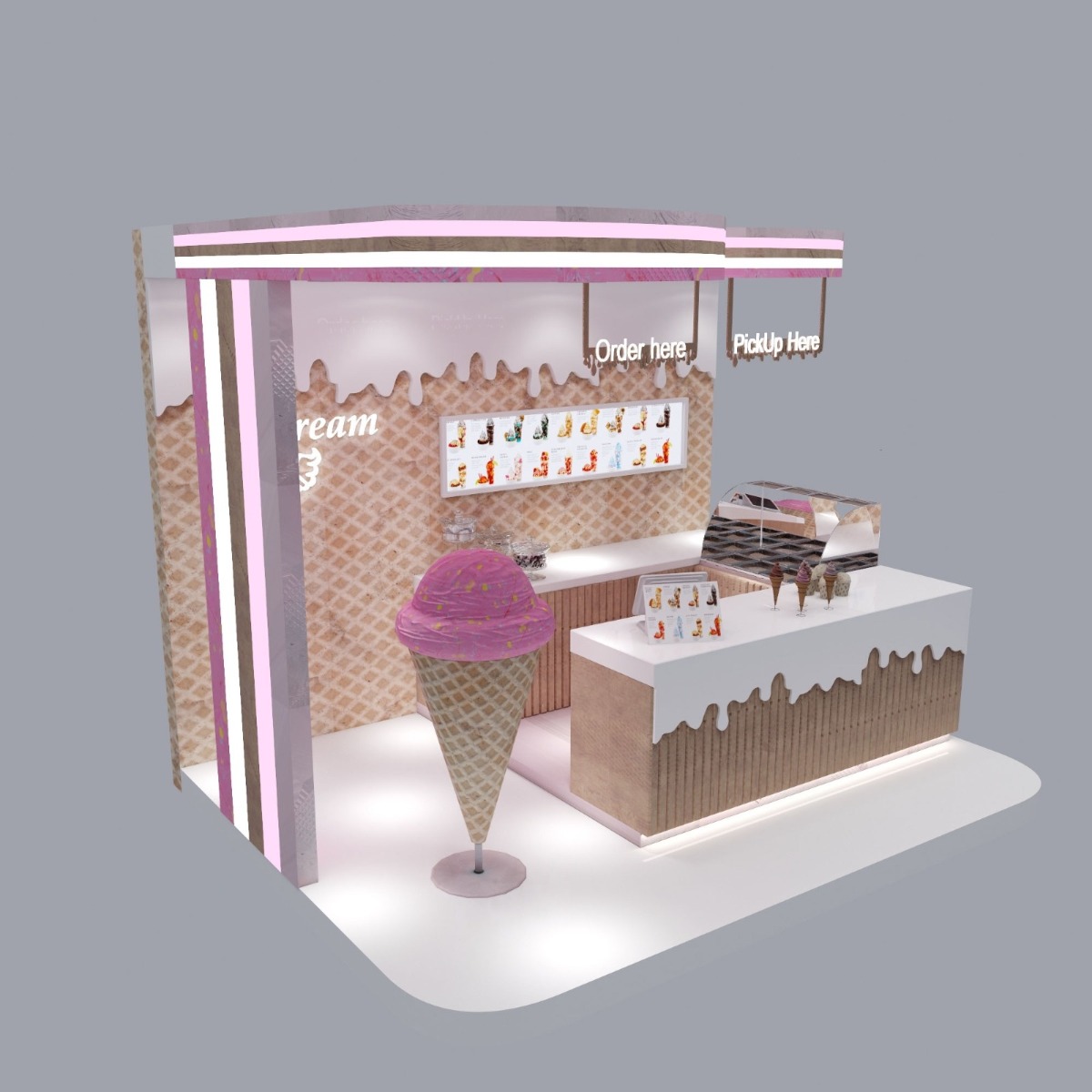
Detail design: Strengthen the memory point of ice cream
Details determine the appeal of the display. The giant ice cream cone device is the core memory point of the space. The three-dimensional shape is matched with the "ice cream" logo to strengthen brand awareness; the "melting" cream texture on the wall and the "flowing" design on the edge of the counter echo the smooth characteristics of ice cream, making the static display full of dynamic fun. The hanging "Order here" and "PickUp Here" logos use simple fonts to guide the consumer movement line. They are both practical and integrated into the overall style so that every detail serves the "ice cream theme".
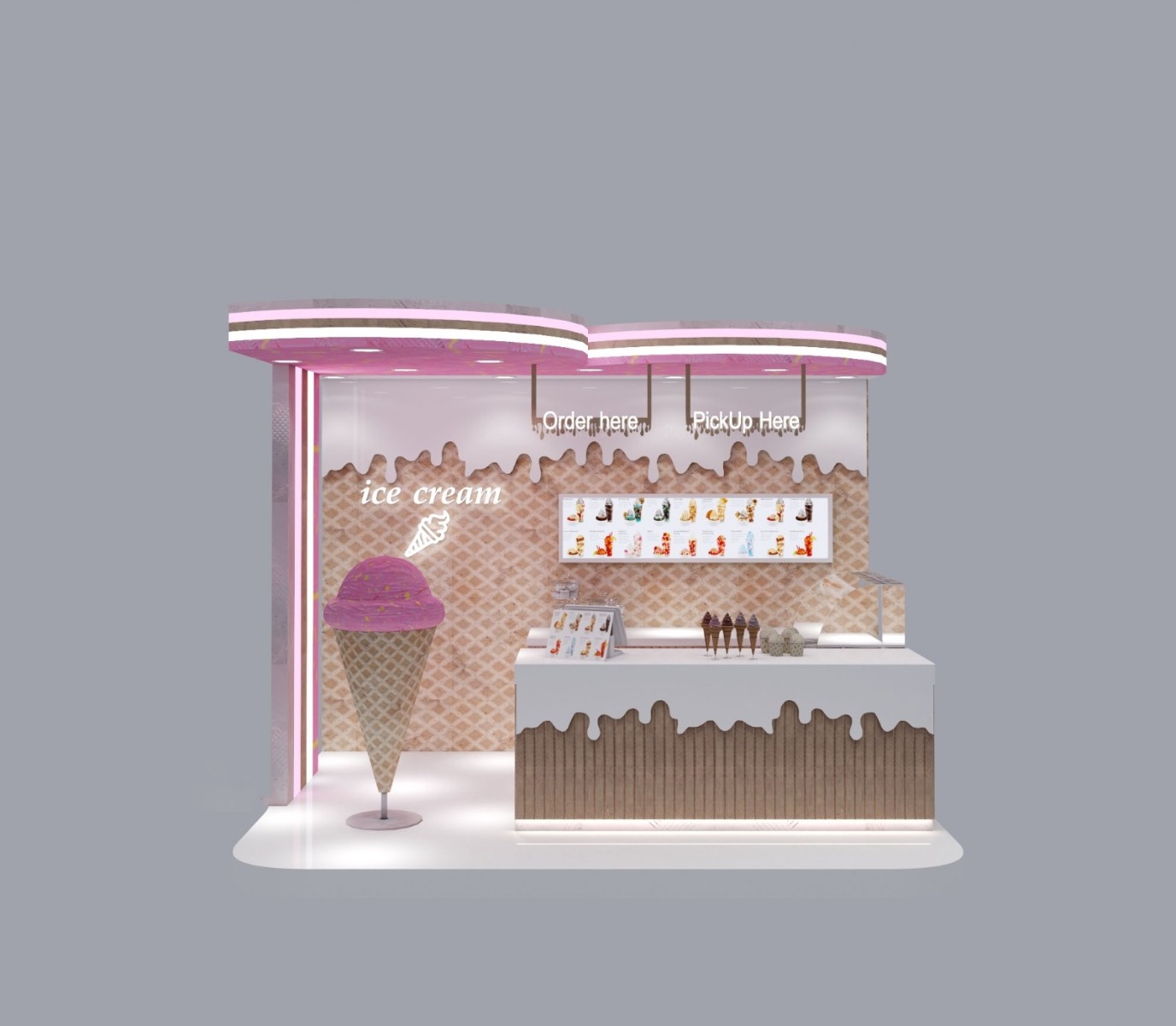
Functional layout: taking into account both beauty and practicality
Reasonable functional zoning is the basis of operation. The picture clearly divides the ordering area and the pick-up area. The light box above displays the product types, and the counter below displays the raw materials and finished products so that customers can choose intuitively. The open counter design shortens the service distance and improves the efficiency of ordering and picking up. The bottom light strip increases the sense of transparency of the space and avoids the heavy oppression of the display area. The combination of beauty and practicality not only ensures the visual experience but also makes the operation process smoother, allowing customers to enjoy the "good-looking and better-use" consumer experience.