check out over 200+


$6,750.00
Availability:
In stock
SKU
KFCDK-1096-1
- High-End Quality
- Factory Direct Sale
- New Custom Design
- Easy Installation
Built-To-Order
Ships in approximately 5 business days; excludes artwork approval processing time of 2 business days
Complimentary Artwork Review
For a worry-free purchase, one of our artwork specialists will review your submission prior to printing to ensure crisp text and sharp imagery on your final product.
Let's look at the most eye-catching color combination first! Mint green is refreshing and lively, like a cool breeze in summer; peach pink is sweet and sticky, full of candy flavor. The large-scale collision of the two colors immediately locks the eyes of passers-by. Who can resist such a vibrant color combination? It's hard not to take a look when passing by!
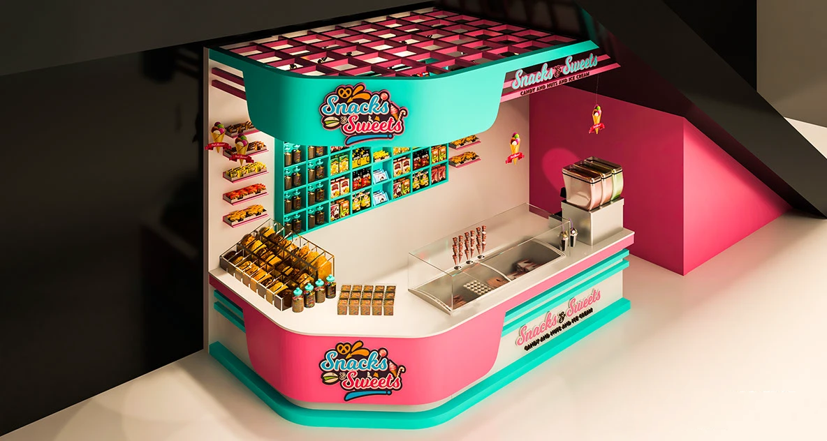
Then visit the display area, the shelves on the wall are the soul! The layered design is super intimate, and each small grid is neat and tidy. Whether it is round canned nuts, colorful bagged candies, or square boxed ice cream, they can all be displayed here. When customers look for things, they can see them at a glance and take them easily.
There is also an open display area in front of the counter. Popular snacks are placed here, such as freshly baked snacks and the hottest online celebrity candies. Passers-by can grab a few bags at will, which easily drives impulse consumption~
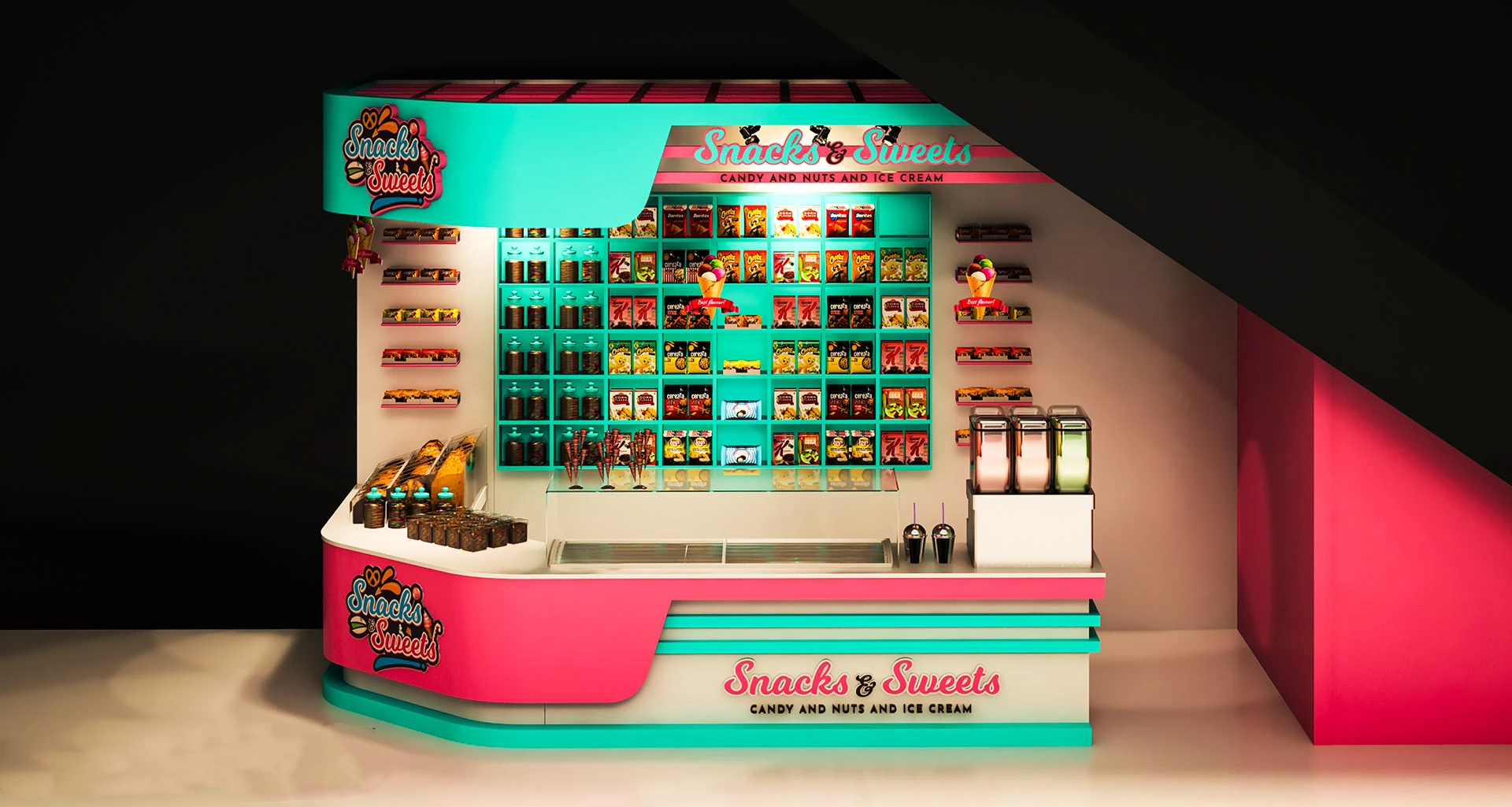
The lighting design also hides a little trick! The shelves are equipped with soft warm lights. Under this light, the snack packaging looks like it is under a spell, and the already attractive colors become brighter. The lights in the counter operation area are brighter.
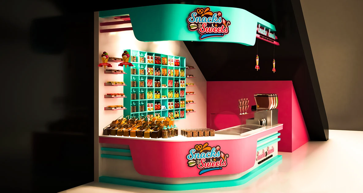
The spatial layout is a practical and flexible L-shaped route! This design saves a lot of space. You can be busy in the middle, receive customers and cashier in the front, and sort out goods and replenish goods in the back. The two sides do not disturb each other, and the efficiency is maximized. The hollow design on the top is also amazing. It not only makes the small space look more transparent and less cramped, but also quietly adds a sense of fashion, which is 100% compatible with the overall lively style!