check out over 200+


$13,500.00
Availability:
In stock
SKU
KMRK-1140
- Custom Design
- Easy Installation
- High Quality
- New professional design
Built-To-Order
Ships in approximately 5 business days; excludes artwork approval processing time of 2 business days
Complimentary Artwork Review
For a worry-free purchase, one of our artwork specialists will review your submission prior to printing to ensure crisp text and sharp imagery on your final product.
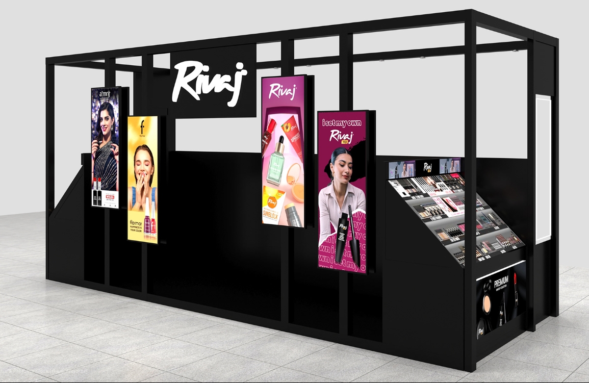
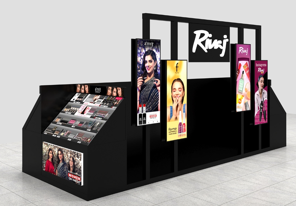
Black structural design
"How to let the product 'speak' for itself" is an eternal proposition. Rivaj's cosmetics kiosk demonstrates the visual alchemy of high-grade black. The all-metal matte black frame balances industrial tension and luxury with a cold texture - every edge is a silent declaration of quality, quietly implanting the cognitive imprint of "trustworthy".
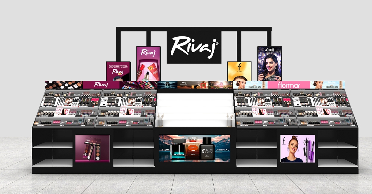
The fiery lipstick, the gilded eyeshadow, and the clear bottle of perfume burst out the ultimate color tension in the center of the black stage. This visual contraction effect more subtly enhances the style of the space, turning the miniature kiosk into a concentrated art installation.
1. Stepped shelves
Golden triangle area: The white step area in the middle is the "focus engine" - it can display new products, popular sets or limited editions, and use the "visual commanding heights" to attract customers' attention (psychology: people will instinctively pay attention to the most prominent area in the space).
Steps on both sides: display according to the **"category→color number→price" gradient (such as lipstick area from popular colors to limited colors, eye shadow area from daily palette to collection palette), helping customers "unconsciously complete the purchase path" and reduce decision fatigue.
2. Open shelves
Unobstructed design: cosmetics are directly exposed on the shelf, and customers can freely take, try and compare (research shows that touching the product can increase the purchase conversion rate by 40%).
Detail considerations: The edges of the shelf are rounded to avoid scratching the product; the shelf is tilted 15° so that the bottle label faces the customer for easy reading of information.
3. Bottom display area
The bottom open partition can display gift boxes, sets, and new product combinations (such as holiday limited gift boxes, "before makeup + after makeup" matching sets), using "scenario association" to stimulate joint consumption ("Why not buy a lip gloss instead of a lipstick?").
Brand communication
1. Top logo area: the "visual hammer" ofbrand DNA
LOGO design: Rivaj's handwritten LOGO not only retains the flexible characteristics of the beauty brand, but also appears eye-catching and memorable against the black background.
Lighting enhancement: The LOGO area has a built-in backlight (or a spotlight is installed on the top) to ensure that it is clearly visible even under the strong light of the mall, becoming a "brand symbol that can be recognized from a distance"
2. Side advertising screen: Capture the attention of "flowing customers"
Multi-screen layout: vertical screen ads on the left and right sides and the back, covering the three directions of customer flow: front, side, and back (for example, in the aisles of the mall, customers passing by from the left, right, and back can see the ads).
Contact us:Karena
WhatsApp: +8613410560420
Email: sales01@myidea-kiosks.com